
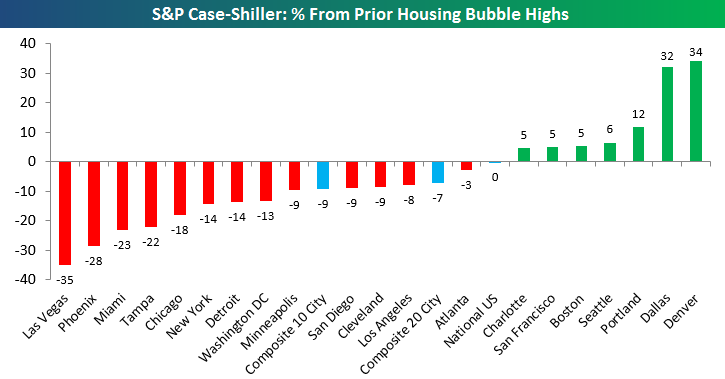
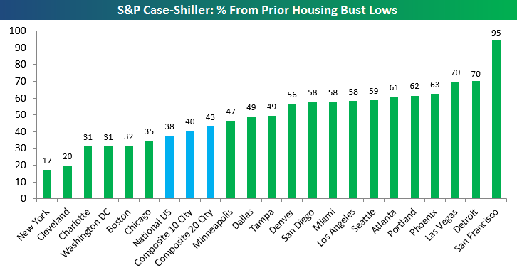
I am in the middle of doing some real estate related research, and I came across an old favorite set of charts: These two Case-Shiller charts (via Bespoke, updated October 25th) shows the changes in current RRE prices from both the boom top and the crash bottom, by metro regions.
They are still astonishing:
Source: Bespoke Investment Group
