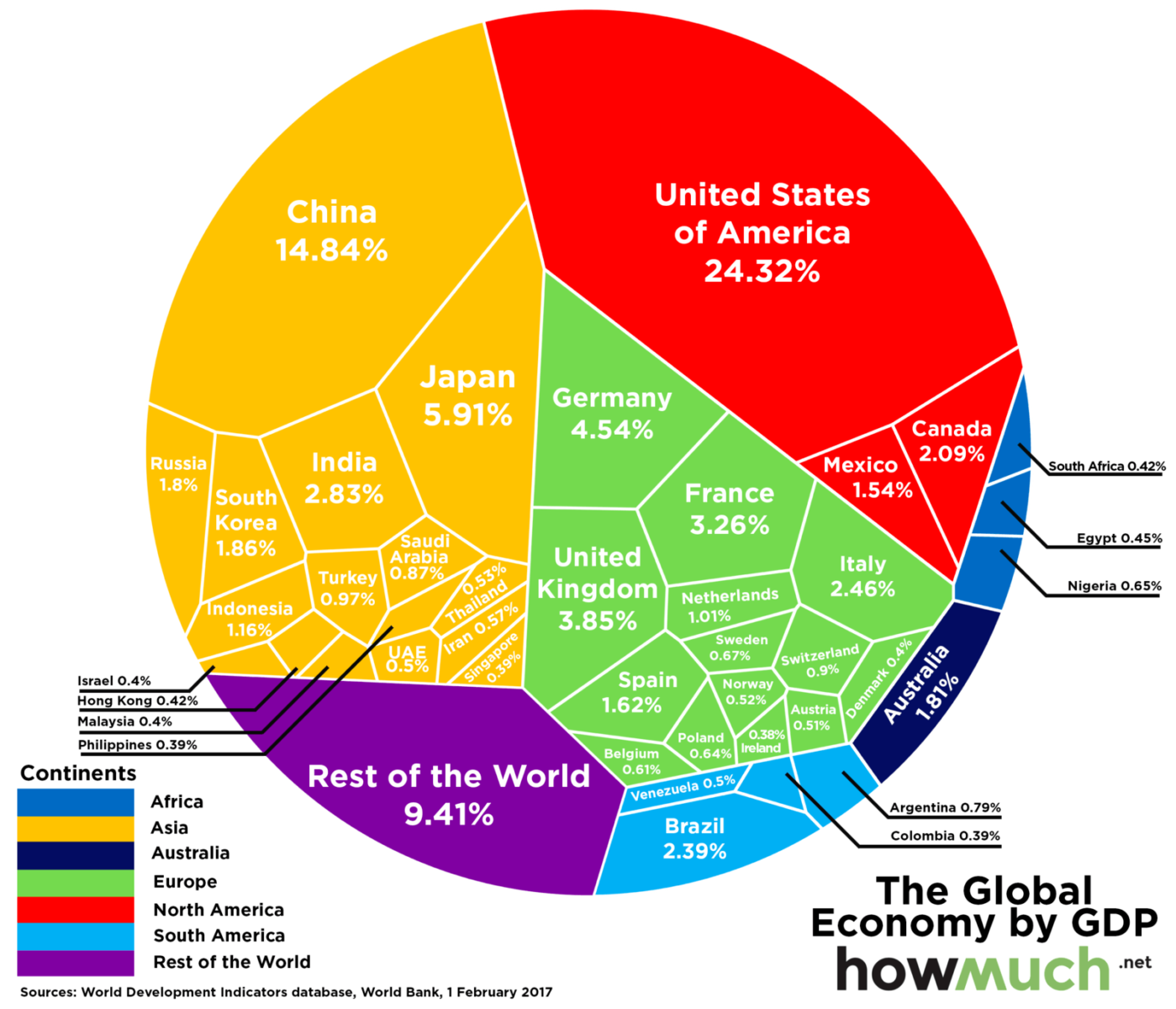
Fascinating depiction of the global economy, broken down by geographic region. Each country’s is sized according to their percentage of global GDP output. (GDP data is via the World Bank, effective February 2017).
South America is much smaller than I expected, as is China (still). Amazing that US is about the same size of Europe.

Source: Visual Capitalist


What's been said:
Discussions found on the web: