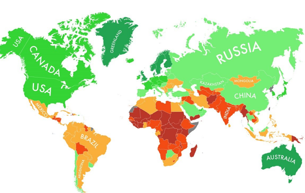
Very interesting graphic from the The Independent on what countries are likely to suffer the most due to global warming; note that red is worse, green is better:
“The map is based on rankings, not comprehensive evaluations of each country. In other words, the best-ranked countries are only as great as they seem compared against the countries that aren’t performing so well.
The map looks only at the country-level. All of the state-specific, region-specific, or city-specific data is somewhat lost in this zoomed-out perspective. While the US gets a green light on this map, for example, specific parts of the country are far less equipped to handle climate change, including Miami and New York City.”
The Telegraph notes “Developed countries as a whole have far more infrastructure to adapt to a warming planet…’
click for interactive map

Source: The Independent
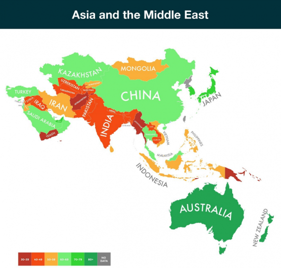
Africa is really in trouble if temps rise further; Asia close up is after the jump, and as you can see above, they also look bad . . .

Source: The Independent

