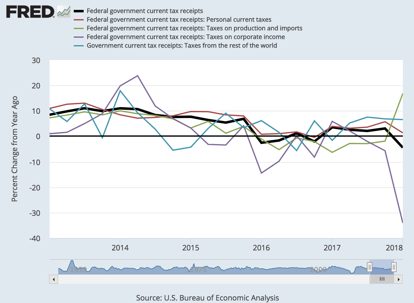
The Tax Cuts and Jobs Act of 2017 applies to taxes starting in 2018, and the first quarterly data on tax revenue are in. This graph compares current tax revenue categories with categories for the previous year. Most noticeable are a major drop in corporate tax income and the increase in taxes from production and imports. (In the latter case, both excise tax income and import duty income increased.) These changes are actually quite impressive: -35% for corporate tax income, +16% for production and import tax income. Personal income taxes are slightly down while taxes on foreign entities follow trend. How does all this pan out in the aggregate? The thick black line reveals that overall tax receipts are down by close to 5%. Will this persist or is this a one-time event? Revisit this blog post in the coming months to see how this graph updates.
How this graph was created: From the Federal Government Current Receipts and Expenditures release table, check the relevant series and click on “Add to Graph.” From the “Edit Graph” menu, make the first series black and increase its width to 4.
Suggested by Christian Zimmermann.
View on FRED, series used in this post:
A074RC1Q027SBEA, B075RC1Q027SBEA, W006RC1Q027SBEA,
W007RC1Q027SBEA, W008RC1Q027SBEA
Source: FRED Blog


