Source: Visual Capitalist
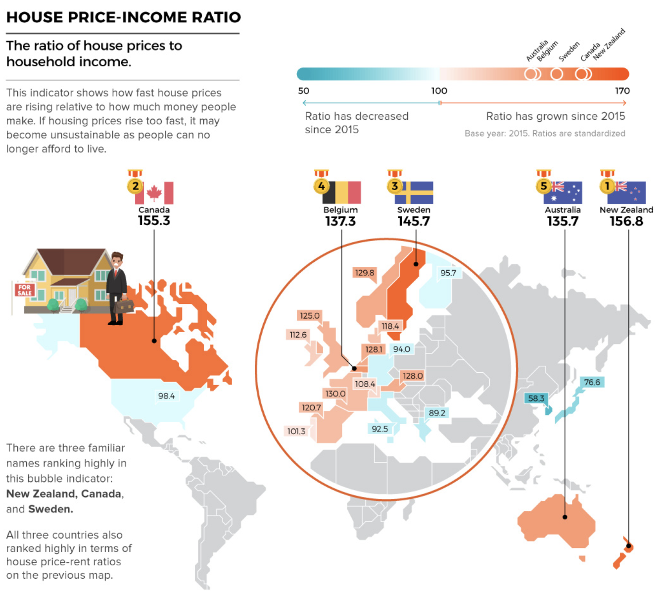
Really interesting graphic showing potential housing bubbles (based on a Bloomberg Housing Index) in 22 countries/regions, based on four different ratios:
1. House Price-Rent Ratio
2. House Price-Income Ratio
3. Real House Prices
4. Credit to Households (% of GDP)
The first three were instrumental in helping me to identify the US housing debacle way in advance…
Previously:
Real Estate and the Post-Crash Economy December 29, 2006)

