
Its very easy to get caught up in the emotions of a potentially life-threatening pandemic. Especially as we enter the phase where infection numbers begin to ramp up dramatically. That is now happening as near our office, new infection cases were found in Manhattan, Westchester County, NJ and Long Island. (Manhattan cases include Blackrock, RBC, Point72, & FDNY).
There are concrete steps you can take to protect yourself: Watch your hands, stop touching your face, avoid crowds, and if you are in a region where cases are appearing, work from home (we gave everyone that option this week and beyond).
Rather than get lost in the 24/7 news coverage, the misinformation and the fear, here are some informative charts worth pursuing that are revealing about what we face.
1. Canceled events and self-quarantines save lives
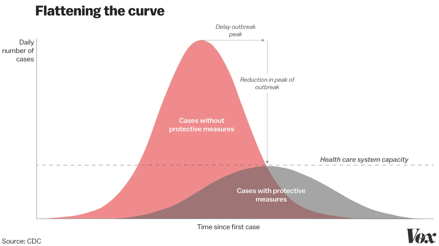
Source: Vox
Big crowds spread infections. We do not know how big this will get in the United States, and how fast it will spread. It only takes one infected person — “patient zero” — to infect an entire region. However, “flattening the curve” by cancelling large gathering of people — entertainment events like SXSW and Coachella, political rallies, Colleges sending students home to attend classes virtually, cancelling conferences — is a good way to reduce the spread of the coronavirus outbreak in the U.S.
Update: Political Calculations reminds us this chart is based on the 1918 Spanish Flu, when Philly & St. Louis deployed two different approaches with radically different results:
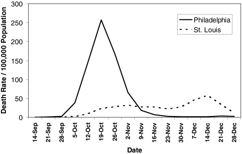
He notes:
“Philadelphia was the city that didn’t institute quarantine and self containment measures, while St. Louis did so early, but relaxed them too early, which is why you see that latter bump in the chart above (they quickly reinstated the measures).”
2. Countries doing widespread testing show tentative signs of flattening out
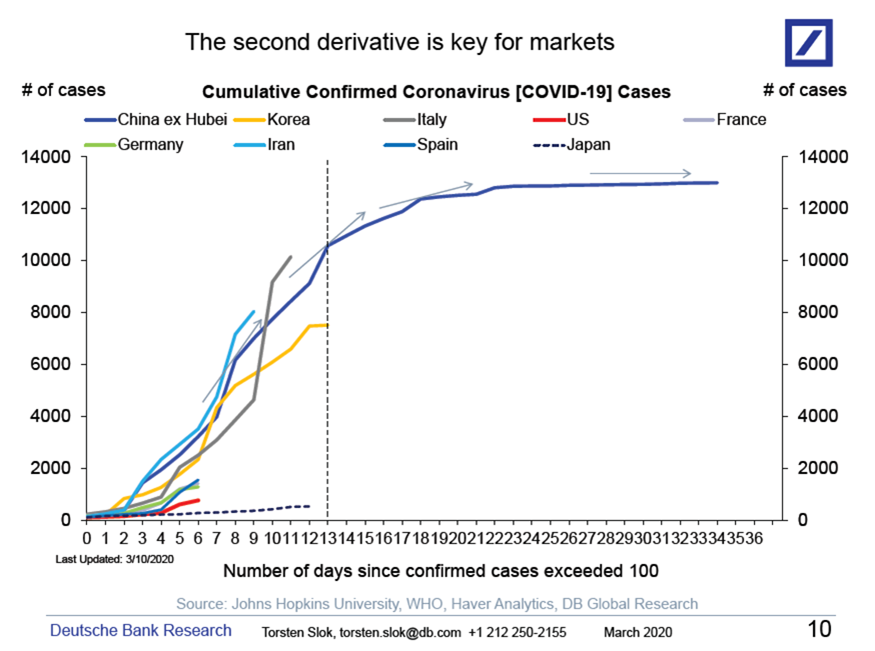
Source: Torsten Sløk, Deutsche Bank Securities
Once a country begins widespread testing, the total infection numbers ramp up quickly but flatten out after two weeks. Note that the US is still early days in this process.
3. The US is far behind the rest of the world in testing per capita
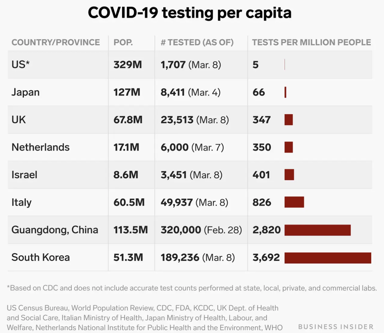
Source: Business Insider
We are badly lagging the rest of the world in testing the population, just barely topping 1,000 as of March 10. Whatever the official stats are, they are underreporting the number of infections, likely by a substantial amount, and possibly by orders of magnitude. This is moderately infectious virus, and the U.S. can go from 10,000 to 100,000 to 1,000,000 cases in very quick order. As a frame of reference, the CDC data on the Swine Flu (H1N1) shows the United States had 60 million people infected, 274,000 hospitalizations, and 12,469 people died. Covid-19 may possibly be more infectious. Rapid response is the key to containing outbreaks of this kind.
4. How Contagious Is Covid-19?
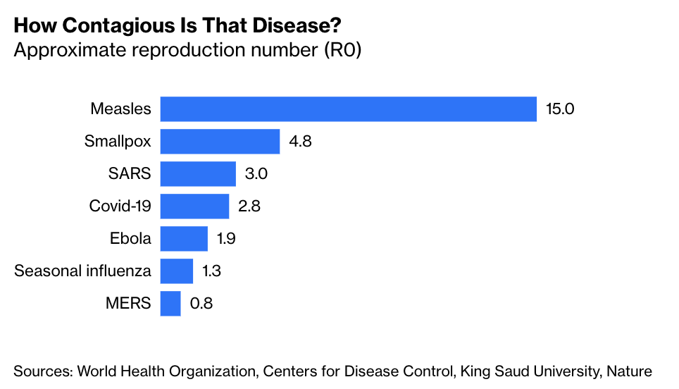
Source: Bloomberg
My colleague Justin Fox points out this is fairly contagious disease: The numbers also seem to indicate that Covid-19 is a lot more contagious than the seasonal flu (About 2X), but, far less communicable than the Measles or Small Pox. Each person with the Covid-19 can be expected to infect three more people.
5. How Bad Is the Coronavirus? Let’s Run the Numbers
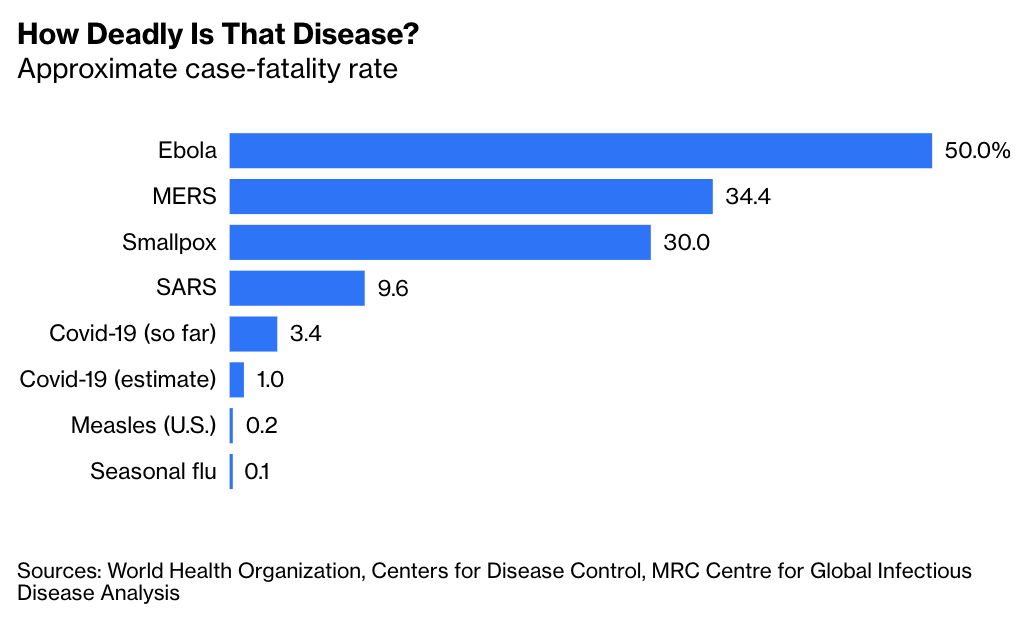
Source: Bloomberg
Fox also notes Covid-19 is at least 10X more deadly than the flu, but 1/10 as bad as SARS. It is still early days, and the initial numbers out of China — with high smoking rates — may be misleading in terms of mortality statistics. (About 70% of cases and deaths are in China). The US death rate appears high, but that is likely because as chart 3 shows, we are lagging in testing. Once we begin more testing all of the mild cases will put the mortality data into broader context.
UPDATE March 12 2020
6. How Prepared is the US Medical System for a Pandemic?
Not very. Aaron Carrol also notes we are “short ventilators and I.C.U. beds if there’s a significant surge of new cases.” The NYT reported “For years, cost-conscious hospitals have emulated the lean, just-in-time principles that have revolutionized manufacturing. The result has been a health-care system that is far more efficient, but unprepared to handle a sudden influx of seriously ill patients.”
As the chart below (and a similar one regarding nurses) shows that as a nation, we are medically understaffed:
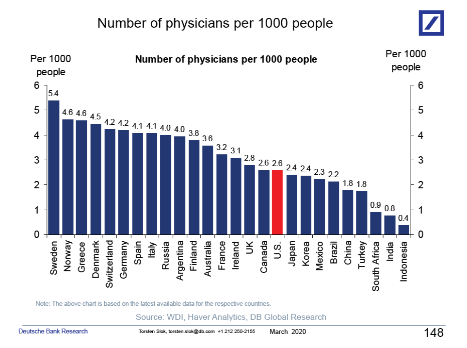
Source: Torsten Sløk, Deutsche Bank Securities
Sources:
How canceled events and self-quarantines save lives, in one chart (Vox)
One chart shows how many coronavirus tests per capita have been completed in 8 countries. The US is woefully behind. (Business Insider)
How Bad Is the Coronavirus? Let’s Run the Numbers (Bloomberg)
See also:
Bill Gates on Pandemics in 2015 (YouTube)
