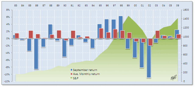
 chart courtesy of Meir Atazur > I love when graphics can depict a lot of information elegantly. The above chart (via Meir Atazur)...
Read More
 Michael Panzner recent commentary is very relevant to our earlier discussion today: "Many commentators note the fact that U.S....
Read More
 The table above is from this week’s Thoughts from the Frontline. Rob Arnott and John West, of Research Affiliates, note in...
Read More
In what has to be one of the most brazen examples of click whoring I have ever come across, is this list of “20 timeless money rules”...
Read More
 Via Jim Stack’s Investech, comes this interesting view of how prior Bear Markets compare relative to the most recent 9% correction....
Read More
What happens next? That’s a multi-trillion dollar question which both bulls and bears will wrestle with for the next few weeks, and...
Read More
ETD Trade: This morning’s WSJ reports: The online brokerage industry, which underwent a wave of consolidation after the bursting of...
Read More
 For yesterday’s info-porn, we looked at the YTD and QTD global returns. Today, we have this informative interactive map from the...
Read More
 This simple table shows how we have done Year-to-Date (past 8 months): Here are the same countries returns, Quarter-to-Date (beginning...
Read More
 if the S&P500 closes here, it will be Flat negative on the year:
Read More
