
@TBPInvictus here:
The New York Post’s editorial board apparently cares very little for factual data that disagree with their ideology. Don’t bother me with details and facts and data when I have an ideological narrative to push onto an unsuspecting public.
Exhibit 1 is the simple truth that AEI’s Mark Perry is not an honest broker of information. The Post published a March 12 editorial titled “How the $15 Wage is Already Killing Seattle Jobs,” which relied entirely on Perry’s thoroughly debunked and discredited work.
Perry’s recent piece on the alleged devastating effect of Seattle’s minimum wage – festooned with all manner of colorful and totally meaningless charts – informed us that the “…April to December 2015 drop in Seattle employment was the biggest decline over any 9 month period since between April and December 2009 period during the Great Recession when there were similar, but slightly larger job declines (see top chart above). And the loss of more than 10,000 Seattle jobs (on an unadjusted basis vs. a 9,950 job loss on a seasonally adjusted basis) in just the three months of September, October and November 2015 establishes a new record for the greatest number of Seattle jobs ever lost over a three month period…”.
The NY Post dutifully regurgitated Professor Perry’s now discredited claims:
The AEI study, worked up from Bureau of Labor Statistics’ monthly surveys, shows that, between April and December last year, Seattle saw the biggest employment drop in any nine-month period since 2009 — a full year into the Great Recession. […]
Furthermore, Seattle’s loss of 10,000 jobs in just the three months of September, October and November was a record for any three-month period dating back to 1990.
This is typical flat earth kind of nonsense that intelligent, informed people understand (apparently, none work for the NYP). We’ve been over this, but it bears repeating, and we’ll go through the math, just for the record. And, credit where it’s due, Michael Hiltzik at the LA Times simply knocked this one out of the park.
Perry is using BLS’s LAUS data. I explained right here – with the help of a BLS economist cited immediately below – exactly why Perry was wrong in doing so from the get-go (emphasis mine):
The LAUS program is a hierarchy of non-survey methodologies designed to produce topside estimates for subnational areas that are consistent with the CPS concepts of employment and unemployment. We model data for states, based primarily on their CPS subsamples. For counties, we used a building-block approach to estimate shares of statewide employment and unemployment. For cities, a disaggregation technique is used. Moving down this hierarchy of methodologies, the availability of relevant estimation inputs diminishes, and the role of assumptions correspondingly increases.
In other words, we essentially go Nation > State > MSA/MD > County > City/Other, and the further down the totem pole we move, the more difficult it becomes to accurately pinpoint such data as, to name four, Labor Force, Employment, Unemployment, and Unemployment Rate, and reliance on assumptions grows.
But let’s go through the math on Employment, just for the benefit of Professor Perry and the hacks at the Post. Here are the raw employment levels for six WA cities beginning in April 2015, when Seattle raised its minimum wage. The top line is the BLS series code identifier. These are the not-seasonally-adjusted number of employed in each city.
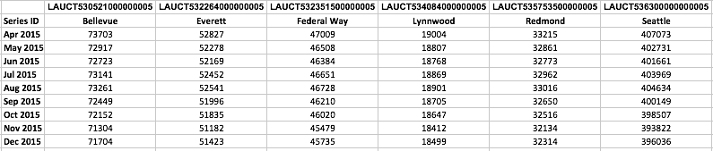
Now, in terms of having the ability to make comparisons, it doesn’t really help us when Seattle’s employment level is 400,000, Lynnwood’s is not even 20,000, and Everett’s in the 50,000 range.
What to do? Well, let’s index everyone to 100 at our starting point and do the appropriate calculations from there:
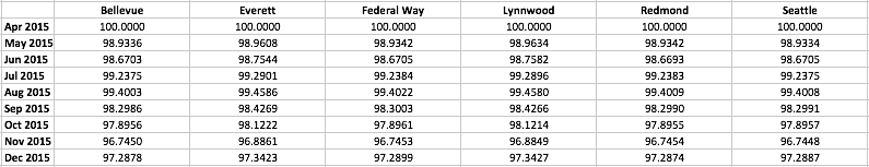
Amazing that some of the numbers are almost identical out to the fourth decimal place. But, then again, this is exactly what was explained to me when I reached out to BLS.
So, how do we look when we chart it out? Let’s put the table above into a chart and look at the six – yes, six – cities together. I’ve tried my best to adjust line widths so that they’re all visible, but I may have lost Redmond. Trust me, it’s in there (in black).
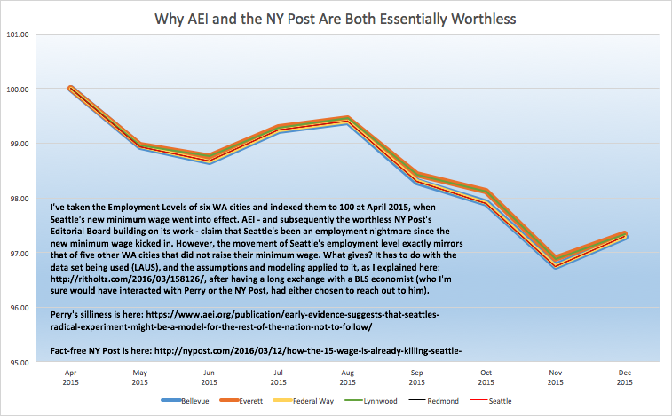
Perhaps Mark Perry, the NY Post, or Jazz Shaw over at Hotair.com can explain why Seattle looks exactly like its five neighbors and not much, much worse, despite Seattle raising its minimum wage and the other cities did not. More likely, though, they can’t.
The drill remains the same: It will take years to ascertain the effects of Seattle’s experiment. Folks like Perry care little for facts, ignore proper analytical techniques, and basically reveal themselves as either clueless dolts (or worse) who likely are fully aware of the malpractice they’re committing, but do not care.
They will continue to seize on any and every data point they can to twist it to their narrative, facts be damned. Don’t be fooled by these professional bullshit artists.
