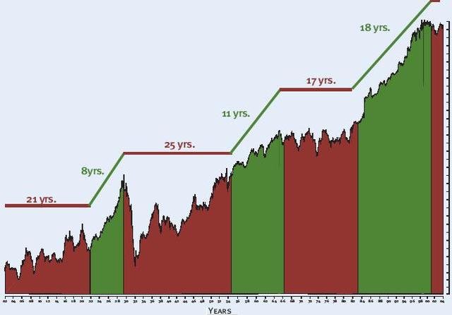
Yet another look (see prior takes here and here) at the concept of market cycles. The past century shows alternating Bullish and Bearish phases, secular periods each lasting for an extended time (between 10 to 20 years).
>
Dow Jones Industrials, 1903 – 2004
Note that markets are up slightly for 2005 since this chart was completed.
A few minor comments about this chart: To be fully accurate, the post 1929 period — starting from 1934 or so — was mostly positive, if for no other reason than the crash brought the market to such a low level by 1932. If one bought and held then — perhaps the equivalent of Summer 2002 — one did quite well. Of course, almost nobody did.
And I would start the post-war period in either 1944 or 1946, making the post WWII rally more like 20 years than 11.
But these are mere quibbles — the key point is that markets go through long secular cycles. Following the 18 year Bull market from 1982-2000, it would be unprecendented to see a mere 2 year Bear Market followed by a multi year, decade long Bull Market.
Instead, History implies a rangebound period of cyclical rallies and selloffs, lasting for quite a long time.
>
Source:
Investing —More of a Challenge
Rydex Funds
http://www.rydexfundsfp.com/pdf/ium_6pager.pdf


You ought to overlay a long term history of the stock market PE on this data. It follows long secular ( 20 or so years) swings from below 10 to over 20 and back to under 10. We are now in one of those long secular declines in the market PE.
No Coattail Ride in the Near Future
When the stock market surges (when there is a Bull Market) may people make money just because they are swept up in the market surge. When there is a Bear Market (a market in which sellers outnumber buyers) it is
Spencer — we did that last month:
http://bigpicture.typepad.com/comments/2005/08/dow_jones_chart.html
Its shows most of the gains in a bull market are the product of P/E mulitple expansion, rather than mere earnings gains
Dominant historical reality is the (proactively well-ignored) ‘severe roller-coaster’ on a 3.5 decade time scale:
“the compelling Real DJIA, 1924-now” at
http://homepage.mac.com/ttsmyf
“the 3 Fed Chair warnings, Real DJIA” at
http://homepage.mac.com/ttsmyf/3warnsRD.html
Dominant historical reality is the (proactively well-ignored) ‘severe roller-coaster’ on a 3.5 decade time scale:
“the compelling Real DJIA, 1924-now” at
http://homepage.mac.com/ttsmyf
“the 3 Fed Chair warnings, Real DJIA” at
http://homepage.mac.com/ttsmyf/3warnsRD.html
please add me to your mailing list.
Considering the recent stock market action,
the chart looks downright scary!