In our first installment of An Adult Approach, we attempted to scrub away some misconceptions related to inflation that are embedded in the contemporary economic and financial canon. We sought to raise doubt about the incentives of central banks to share the true loss of their currencies’ purchasing power with the public. When we began to write the follow-up, “Real Relative Value”, in which we apply a forward rate of inflation to current asset values, it quickly became clear that we were spending too much space discussing proper real value. So, this piece, which is now the second in a series of three (we think), will seek to provide a truer sense of money, inflation and real value today, all of which seem grossly misunderstood in the marketplace.
Money & Banking (Cliff Notes)
US dollars and all other world currencies today are not what most people think. The game starts when a central bank (on behalf of its sponsoring government) issues physical currency to you and me through its banking system. A bank can be a bank because it has already deposited assets that qualify as reserves at its central bank, not necessarily because it has deposits. Reserves are typically assets in the form of loans. The business of the bank is to issue credit, which is ultimately claims on physical currency, theoretically in an amount up to a level that does not breach its reserve ratio with its central bank.
 The Monetary Base (a.k.a. base money) is physical currency in circulation and bank reserves held at the central bank. Everything else in the monetary system is credit, even including deposit balances held at banks by you and us beyond the amount of aggregate reserves. So then, modern banking systems are fractionally reserved (as is deposit insurance, which as far as we understand has de minimus reserves and zero physical currency).
Credit, regardless of who is contracted to receive it and pay it, is ultimately backed by the physical money printing ability of the central bank. If you go to the bank tomorrow and ask for $10 billion in C-Notes that you have on deposit, your banker will call its central bank, which will then debit your bank’s reserves held there. The central bank will then literally print the C-Notes and put them on an unmarked military cargo plane destined for your personal landing strip deliver the C-Notes to your bank where you can withdraw it.
If your bank runs out of currency reserves held at the central bank, (because either depositors withdraw more than your bank has in reserve or because the value of your bank’s reserves depreciate in the marketplace), then your bank will ordinarily be subsumed by another fractionally reserved bank with enough reserves to make the new, larger entity properly reserved.
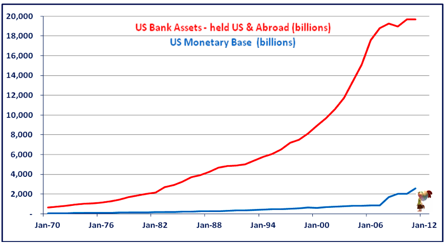
The US banking system currently has almost $20 trillion in assets (held in the US and abroad). The US dollar monetary system is supported by about $2.7 trillion in total base money, about $1 trillion of which is physical currency in our pockets and about $1.7 trillion in bank reserves held at the Fed. (The ratios are about the same globally — $95 trillion dollar equivalent bank assets and about $12 trillion in global base money.)
 Thus, the global banking system holds about 8.5% of its assets in reserve at global central banks to guard against the possibility that: a) you and we ask for our “money” back, and/or; b) the value of the assets it placed at central banks depreciates. We should not worry (nominally speaking, of course) if either (or both) of these events occurs because central banks can print all the money necessary to meet the demand for money. The good news is that everything else to be learned about modern money and banking is derivative (we mean that figuratively but feel free to apply it as you wish).
Inflation for Grown-Ups
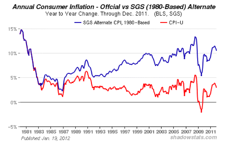
As we have argued, central banks and governments have great incentive to report inflation rates that do not fully capture the rate of purchasing power loss in the currencies they manufacture. If central banks and economic policy makers are not helpful to investors in providing reasonable inflation data, then it behooves investors to seek answers elsewhere. We believe a more accurate representation of manifest inflation may be found in Shadow Government Statistics’ Alternative 1980-based CPI Series[1] (“SGS 1980 CPI”), which calculates the CPI based on the methodology employed prior to 1980. As the graph below shows, were the 1980 methodology still being used today by the Bureau of Labor Statistics then the CPI would show an annual inflation rate of 10.57% (blue line) as opposed to its current version running at 3% (red line).
As we discussed in An Adult Approach I, the perception of “3% inflation” is still too high for the Fed’s tastes and so last month it again announced its preferred inflation benchmark would be the PCE deflator, calculated by the Bureau of Economic Analysis (BEA) within the Commerce Department. We further expect that if/when the PCE deflator no longer provides a sufficiently low public perception of inflation, then the Fed’s thinking will evolve to the point of benchmarking nominal GDP targeting as its objective. After all, who, besides savers and pensioners, will care about 3% or 4% inflation when nominal output is running at 5% or 6%? (Never mind true inflation will be substantially higher than 2% or 4%.) Such sleight of hand rivals those of illusionists who make 747s disappear.
There are real-world consequences when policy makers succumb to the perceived political imperatives of perverting economic data. The graph above provides a fascinating narrative that shows the practical inflationary impact on an economy. In July 2008 the annual inflation rate according to the SGS 1980 CPI peaked at 13.36%. This came just prior to the failure of Lehman Brothers, a credit event that acted as a deflationary catalyst for goods and service prices as well as a trigger for asset price declines. (After an economic lag, in July 2009 the SGS 1980 CPI dropped to a low of +5.4% and the BLS’s headline CPI dropped to -2.1%.)
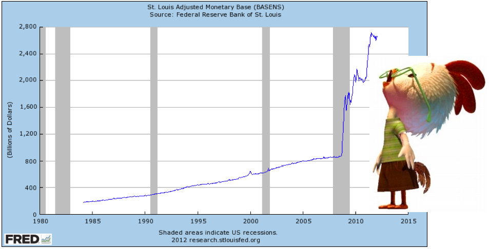
As we know, the Fed created new base money in the fall of 2008 for the benefit of its member banks (QE, asset purchases, swap and credit lines, etc). Over the three subsequent years banks used these new reserves to profit by buying cheapened assets for themselves, and to extend credit to worthy borrowers and levered buyers of liquid financial assets. Financial markets rebounded quickly. And as the graph above clearly shows, the prices goods and services also experienced a “V-bottom” in large part, we believe, because the new dilution in the USD and other global currencies gave incentive to global commodity manufacturers to demand more currency (higher prices). Commodity prices rebounded quickly and this flowed through to goods and service input costs.
Regardless of how well it is measured, all inflation is not created equal. There is a big difference between the driver of consumer inflation and asset inflation. Changes in goods and service prices are ultimately determined over time by the growth or contraction of physical currency in float plus unreserved bank deposits (what Austrians call “checkbook money”). Changes in asset prices are ultimately determined in an over-levered monetary system by changes in the availability of credit. (After all, that’s why they call them financial markets.)
Asset holders benefitted at the time of the 2008 base money inflation because the Fed deposited newly created reserves into the creditor banking system, re-funding banks and by extension their investors, and allowing investment asset prices to rebound. In fact, the growth of the permanent money stock and where it flowed since 2008 explains much about recent returns. The table immediately below shows how markets have performed in nominal terms since the Fed began substantially increasing US base money:
And the table below shows real returns — the nominal performance in the table above deflated for the SGS 1980 CPI, a more accurate measure of goods and service inflation:
According to the BLS, cumulative CPI has risen 3.6% since August 2008. However, the table above succinctly portrays what we believe American investors know intuitively — since 2008 their asset values have not kept pace with accurately calculated goods and service inflation. In other words, US wealth and income has declined materially since 2008 in real terms regardless of popularly-accepted data to the contrary. (We are reminded of the Texas cad who indignantly demanded of his wife when she caught him in flagrante; “are you going to believe me or your lyin’ eyes!”) In short, asset holdings today are broadly perceived as a “savings pool” that will be exchangeable at current relative valuations for consumables tomorrow. This seems a faulty assumption.
US output has been shrinking in real terms too. Since September 2008, cumulative GDP growth deflated for the cumulative SGS 1980 CPI has been -29.86%. This implies the US economy shrunk in real terms by almost 30% since the Lehman bankruptcy. Does such a startling figure resonate with you or do you find it hard to believe? Before you answer, please consider the current value of your consumption and investments in 2008 dollars. The BEA suggests real GDP since then has been +1.8%. This figure does not comport with our sense of output and pricing.
It should not be considered acceptable to be in a profession – as a political economist, policy maker or investor – in which self-delusion has become a necessary requirement for success and perpetuating that delusion is harmful to the broad economy over time. Yes, but the “public good” you say? Ah, but for how long?
Inflation Perspectives
As implied, expectations of future inflation in the general economy that drive consumption patterns, (should I consume now or later?), as portrayed by the CPI and PCE deflator, should theoretically correlate most tightly with physical currency in circulation; while expectations for the Dow Jones Industrial Average, home prices, college education costs, etc. (i.e. items sponsored with explicit or implicit leverage), should theoretically correlate most tightly with bank credit dynamics.
Further, we think the common notion that prices of goods, services and assets are solely determined by a rise or fall in aggregate demand should be summarily dismissed in today’s environment. While it is true that increasing demand for goods, services and assets correlated with steady price increases from 1945 to 1971, it seems more accurate to attribute that dependable glide path to the forces behind it. Production and consumption shifted from the public sector to the private sector after World War II and there was very little private sector leverage at the onset of the peace in 1945. Monetary and credit policy makers after the War could afford to show restraint every now and then while still allowing the economy to grow and eventually recover with new credit accommodation.
It also must be acknowledged that government spending and Fed money creation was hindered by the natural discipline of the gold-exchange standard under Bretton Woods, which greatly curtailed systemic leverage.
Then, as we know, from 1981 to 2006 asset prices rose far more than goods and service prices. A decade after the demise of Bretton Woods in 1973, balance sheets remained comparatively unlevered. Additionally, the baby-boomer bulge in Western populations had incentive to begin saving for retirement. As interest rates began their long descent in 1981, savers gradually moved out on the risk spectrum, investing directly in equity markets, indirectly in derivatives and structured financial products, and finally in levered real estate. Their more speculative actions were further validated along the way in the real economy. Productivity soared, domestically and globally, as new technologies and innovation provided greater efficiencies.
Finally, the fall of communism in the East provided a new, cheap global labor pool almost overnight. Throughout this golden age of investing from 1981 to 2006 there was also a great counter-factual at work: despite enormous productivity gains that would have otherwise greatly reduced prices of goods and services, easy monetary policies in developed economies led to ballooning balance sheets that stabilized the general price level (GPL). Global central banks led by the Fed did not stabilize goods and service prices by restricting credit, which would have tamped down price increases, but by promoting credit to levitate the price level.
For the last thirty years economic policy makers have been in the business of promoting asset prices higher through easy credit. (It seems “stable prices” being the primary objective of all central banks demands they spike the punchbowl rather than take it away?) Within this environment, price increases for goods and services badly lagged price increases of assets bought with unreserved deposits or unreserved bank credit. As asset prices rose, collateral values backing potential consumer credit rose too — a virtuous credit cycle.
Neither of these two circumstances – reemerging economies re-building their infrastructures or a virtuous credit cycle — exists today. Demand for goods and services in aging, highly-levered (i.e. “developed”) economies obviously remains intact but demand for assets has been largely replaced by the need to service and rollover debt. As these obligations come due, further pressures on asset prices should be expected. Cash on balance sheets is not net savings but, rather, quite literally encumbered credit held against obligations. To paraphrase Kyle Bass, most of the world is long things that are deflating and short things that are inflating — long levered assets (directly or indirectly) and short the necessary credit needed to support their lifestyles and asset values.
And so we think the leading indicator of inflation and real asset value today harkens back to the classic quip Milton Friedman made famous: inflation is always and everywhere a monetary phenomenon. What many monetarists like Friedman’s followers seem to have forgotten though is that the majority of what passes for money today is not money at all but rather unreserved bank credit that must someday be made whole at “par”. Otherwise it will simply vanish through repayment or default. While creating enough new money is easily achieved by central banks (without limit), there can be no “par” in real terms. There is only outstanding unreserved debt that must amortize.
Magnitude of the Problem
Central bankers struck a match under the global economy in 1981 and it continues to burn. The match began to burn their fingers in 2008 when the process of “re-collateralizing” unreserved credit got underway.
The familiar graph above shows the increase in USD base money that began to de-lever the US banking system in 2008. Though we have written in the past about total dollar-denominated debt exceeding $50 trillion, all of that debt does not have to be paid down. (Most of it is fully-reserved because its creditors are not levered.) But there is an identifiable portion of dollar–denominated debt issued by highly levered creditors – banks.
We believe the debt-to-money gap that must and will be greatly reconciled in short order is the ratio of bank assets to the monetary base. As the graph below shows, the US Monetary Base was only 13% of US Bank Assets on December 31, 2011.The banking system is the source of unreserved credit and is on the hook to use its collective balance sheet to be the transfer mechanism for economic stimulation through monetary policy. And as they have already demonstrated repeatedly, monetary policy makers feel the need to de-lever the banking system today so it may then extend credit to the rest of the economy tomorrow.
Of course, the US banking system is not alone. According to the Financial Stability Board, worldwide bank assets (including US bank assets) were approximately $95 trillion in October 2011 (USD terms). Meanwhile the IMF reported that as of December 2010 the global supply of base money was approximately $12 trillion (USD terms). These figures put the worldwide proportion of base money-to-bank leverage roughly in line with the US.
Given: 1) the exorbitant leverage currently in the global banking system, 2) current negative real output growth in developed economies, 3) current negative real interest rates, 4) uniformly poor monetary, fiscal and demographic conditions across most developed economies, and 5) already wary populations beginning to get restless; we have difficulty imagining that global banks, labor, savers, politicians and investors will be able to endure current conditions much longer before demanding the financial reset button be pressed to complete bank de-levering.
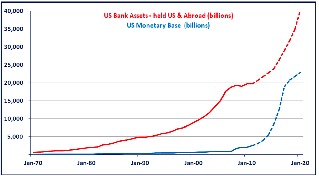
We provide the graph below merely to make it easier to conceptualize the nature of such a de-levering, as we see it. (This is not necessarily a prediction of timing or magnitude.) The takeaway is that base money (in the form of physical currency in circulation) and bank deposits will have to rise at a much steeper rate than bank assets until the banking system is more fully reserved. (At some point we think bank animal spirits will once again take over and we will have a new leveraging cycle.)
The graph above illustrates the forces behind a high-tech jubilee. The burden of repaying past systemic debt will have been greatly reduced through base money inflation, (that shifts the GPL higher, including revenues and wages), while the integrity of systemic debt remains intact (nominally). The integrity of the banking system will also remain intact, as would the creditworthiness of most debtors.
So we anticipate the sum of physical currency and bank deposits to continue to rise to stimulate nominal GDP growth and the ratio of bank credit-to-base money to contract further. Will the lines meet or cross? We don’t believe so but we do think the gap will narrow substantially before bank assets can grow materially again. Thus, we expect the rate of change of the General Price Level to equal the rate of change of the sum of physical currency and bank credit LESS some accommodation for productivity gains. It is reasonable to expect:
1) A higher General Price Level
2) A CPI rate higher than the rate at which the GPL rises
3) Levered asset inflation rates that very likely will be nominally positive but negative in GPL terms and, even more so in CPI terms
Relative Real Value Today
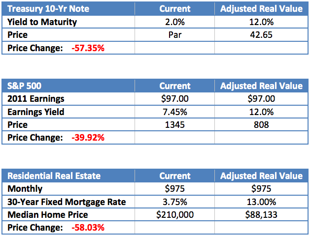
Before we can project future asset prices according to our framework for future inflation, we must first re-price assets according to our sense of current real value, as indicated by a more accurate current inflation rate. For this
we will use the SGS 1980 CPI, discussed above, which is presently 10.57%. To simplify matters we will assume an 11% inflation rate (we are more interested here in identifying the overall potential magnitude of change using our framework than identifying targets).
The following tables adjust price and return levels of three major market benchmarks to reflect positive real returns in the current environment:
We must caution that the shocks above make many assumptions. However, the significant price declines capture mathematically the loss of value in the event asset levels adjust suddenly to reflect an inflation rate we believe to be more accurate. (We do not place a high likelihood on such a sudden event occurring.) Still, we believe such is the magnitude of general mispricing today in these asset classes when SGP CPI-U is indexed to produce contemporaneous real returns.
In our next report, we will estimate future CPI given the inflationary operations we presume major central banks will embark upon. We will also seek to apply the substantial future inflation we envision to various asset classes, in absolute and relative terms.
This month marks QBAMCO’s fifth anniversary and we have finally gotten clever enough to know what to call ourselves – a relative real value fund. We would be all set to try to market the fund except it seems few investors have a bid for such a thing. (Where is the “RRV” hedge fund bucket anyway?) Oh Well. What we lack in assets we make up for in a quantity of hope…and words. J
Kind regards,
Lee Quaintance & Paul Brodsky
[1] http://www.shadowstats.com/alternate_data/inflation-charts




What's been said:
Discussions found on the web: