Source: Business Insider
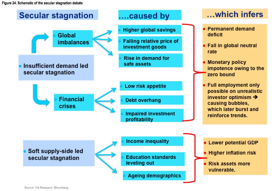
Secular Stagnation Schematic
March 3, 2015 1:00pm by Barry Ritholtz
This content, which contains security-related opinions and/or information, is provided for informational purposes only and should not be relied upon in any manner as professional advice, or an endorsement of any practices, products or services. There can be no guarantees or assurances that the views expressed here will be applicable for any particular facts or circumstances, and should not be relied upon in any manner. You should consult your own advisers as to legal, business, tax, and other related matters concerning any investment. The commentary in this “post” (including any related blog, podcasts, videos, and social media) reflects the personal opinions, viewpoints, and analyses of the Ritholtz Wealth Management employees providing such comments, and should not be regarded the views of Ritholtz Wealth Management LLC. or its respective affiliates or as a description of advisory services provided by Ritholtz Wealth Management or performance returns of any Ritholtz Wealth Management Investments client. References to any securities or digital assets, or performance data, are for illustrative purposes only and do not constitute an investment recommendation or offer to provide investment advisory services. Charts and graphs provided within are for informational purposes solely and should not be relied upon when making any investment decision. Past performance is not indicative of future results. The content speaks only as of the date indicated. Any projections, estimates, forecasts, targets, prospects, and/or opinions expressed in these materials are subject to change without notice and may differ or be contrary to opinions expressed by others. The Compound Media, Inc., an affiliate of Ritholtz Wealth Management, receives payment from various entities for advertisements in affiliated podcasts, blogs and emails. Inclusion of such advertisements does not constitute or imply endorsement, sponsorship or recommendation thereof, or any affiliation therewith, by the Content Creator or by Ritholtz Wealth Management or any of its employees. Investments in securities involve the risk of loss. For additional advertisement disclaimers see here: https://www.ritholtzwealth.com/advertising-disclaimers Please see disclosures here: https://ritholtzwealth.com/blog-disclosures/
What's been said:
Discussions found on the web:Posted Under
Previous Post
Macro Hedge Funds ‘Stinking Up the Joint’

Whenever we see a graphic like this, it is always important to remember that the answer may be D) All of the Above.
I have done forensics on a number of engineering failures over the years. the key lesson I have learned from it is that they are generally complex requiring a combination of causes that occur during the planning and design phases, the construction phase, and the response phase.
A full-blown financial crisis and extended period of economic stagnation will also require all of these. I think the only reason that we did not get a full-blown 1930s depression is because the Fed had learned from that experience and was able to put enough stop gap measures in place in the response phase over the past 6 years to just get us into a stagnation period. However, the political fiscal leadership in the US and elsewhere have generally been sadly lacking.
Things like the S&L crisis, the emerging markets financial crisis, the LTCM crisis, the 2000 stock market crash all had the opportunity to cause major economic disaster, but they didn’t. The house of cards tower was still in the early stages of construction and all of the floors were not yet installed. That required a few more years in the 2000s before it was ready to go after all of the elements outlined in the flow chart above had been installed.
Demographics, the financial crisis, and our broken educational system are certainly factors however in my view over regulation, a bloated government, and tax/class uncertainty in the country that was the economic leader of the world stifled growth and opportunity globally. Not mentioning these issues when discussing the “lower potential GDP” and a “permanent demand deficit” is missing a big part of the equation.
The demand-side argument is the more persuasive since it relied mainly upon neo-Kenysian and heterodox (e.g. Minsky) economic models that not only projected probability of financial crisis ahead of time but performed well during the aftermath whereas supply-side models universally failed, usually in both categories.
However it looks to me like some elements of the chart are variables in both domains and not in one alone; e.g., income inequality really belongs in the demand side too for rather obvious reasons and a rise in demand for safe assets creates supply problems when the only issuers of such assets are governments controlled by austerity regimes.
This is a rather weird chart. To start with, shouldn’t the causes be on the left and cause things. Why are they using the passive voice, so to speak? Besides, it doesn’t always make sense. Did debt overhang cause the financial crisis? I thought it was a consequence. Did income inequality cause supply side secular stagnation? Most economists would argue that income inequality leads to demand side problems. Does the falling relative price of investment goods really lead to global imbalances? You’d imagine that it would lead to global balancing.
What do the blue arrows connecting the insufficient demand box to the global imbalances and financial crises boxes mean? Is this another is-caused-by relationship? It almost looks like they’ve flipped supply and demand.
Then there’s the which infers column. How does impaired investment profitability infer a permanent demand deficit? Do they mean implies or indicates?
That chart is a real mish-mash and doesn’t really say anything, at least not anything coherent. I hate to go all Tufte on a lightweight chart like this, but really guys.