Goldman Sachs – David Mericle: Has Employment Growth Been Running Too Hot? (No Link)
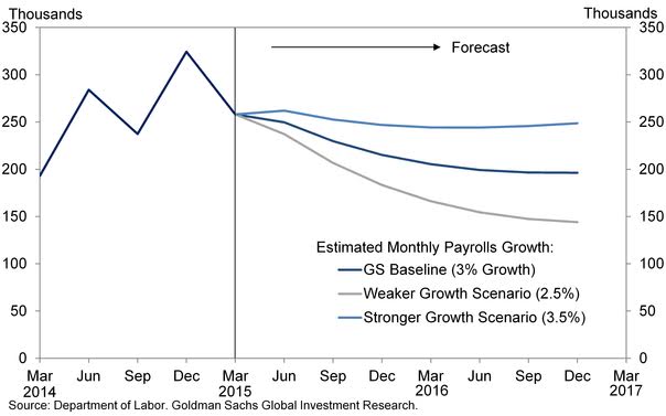
We use the model to project employment growth through 2016. To do so, we use our baseline growth and investment forecasts and assume that the recent rate of multi-factor productivity growth remains unchanged. To be clear, we assume that GDP growth returns to a 3% rate starting in 2015Q2 rather than continuing at the softer rate implied by the CAI and our Q1 GDP tracking estimate of 2.0%. We also consider two alternative growth forecasts in which GDP grows 0.5pp faster or slower than in our baseline. Exhibit 3 shows the results, translated into monthly employment gains. The model implies that payroll employment growth has indeed been running “too hot” recently. While the significant weight on the momentum variables in the short-run equation suggests that the deceleration is likely to be gradual, we expect payroll growth to eventually decline to just under 200k/month under our baseline forecast. This forecast is roughly in line with a simpler Okun’s law rule-of-thumb, which says that growth roughly 1pp above potential for one year should reduce the unemployment rate by about 0.5pp, requiring an extra 65k jobs a month. Adding that figure to trend employment growth implies total monthly employment gains in the neighborhood of 200k.
Comment
The above Goldman report caught our eye recently. The baseline scenario of their nonfarm payroll model concludes job growth will eventually decline to just under 200k jobs per month. As with any model, however, the output is only as good as the assumptions used when calculating the figures. Consider the following regarding Goldman’s GDP assumptions:
- The baseline scenario (3.0% GDP in 2015) is something that has not happened on a yearly basis in the post-crisis era. So Goldman is predicting 2015 will be the best growth year of the recovery.
- The stronger growth scenario (3.5% GDP in 2015) last happened on a yearly basis in 2004. You have to go back to the dotcom mania of the late 90s to find a period when 3.5% GDP in a given year was the norm.
- The weaker growth scenario (2.5% GDP in 2015) is still a higher bar than occurred 2014 (2.4%), 2013 (2.2%), 2012 (2.3%) and 2011 (1.6%). So a five-year high in growth is now the “weak” scenario?
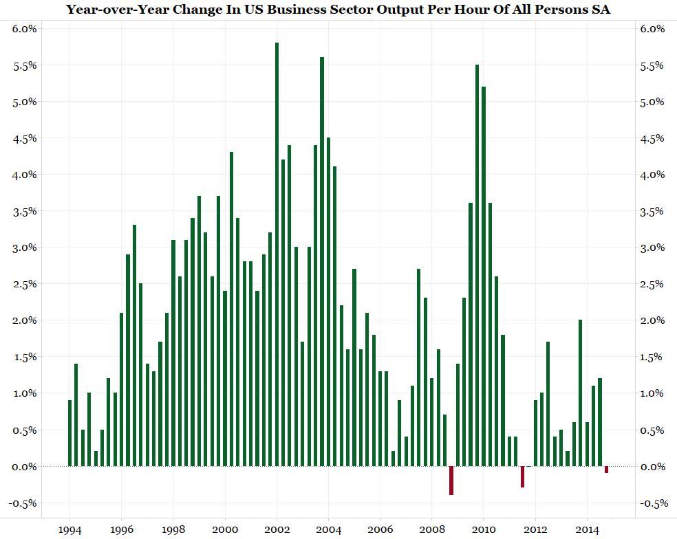
Payrolls have actually been outpacing GDP growth to such a degree that productivity is collapsing. Note the chart below is through Q4. If the Atlanta Fed’s GDPNow current level holds, we could see an even bigger plunge in productivity when Q1 data is released. As we wrote last week:
- Has the American economic suddenly become inefficient? We doubt it, so maybe some of the data is wrong. Most are inclined to explain away the poor data by pointing to factors such as weather. Maybe the weak data, which constitutes the majority of economic releases, is not wrong though. Perhaps we should be re-examining the one data point that is strong, non-farm payrolls.
- According to Occam’s Razor, the simplest answer is often the best. Rather than trying to explain away the myriad of poor economic releases, wouldn’t it be easier to be suspect of the one outlier that is pointing to robust growth?
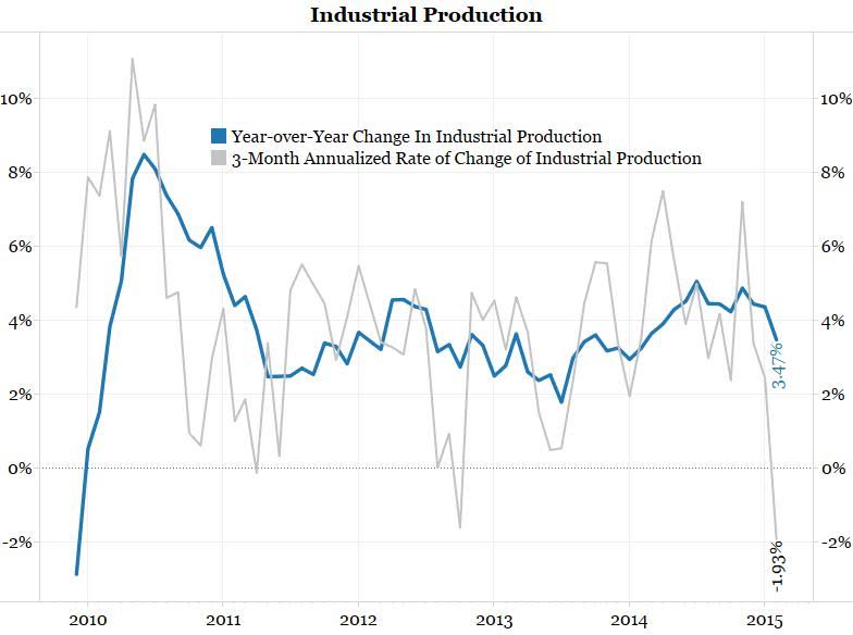
On top of productivity declining and the low level of the Atlanta Fed’s GDPNow, the chart below shows industrial production has also fallen off a cliff.
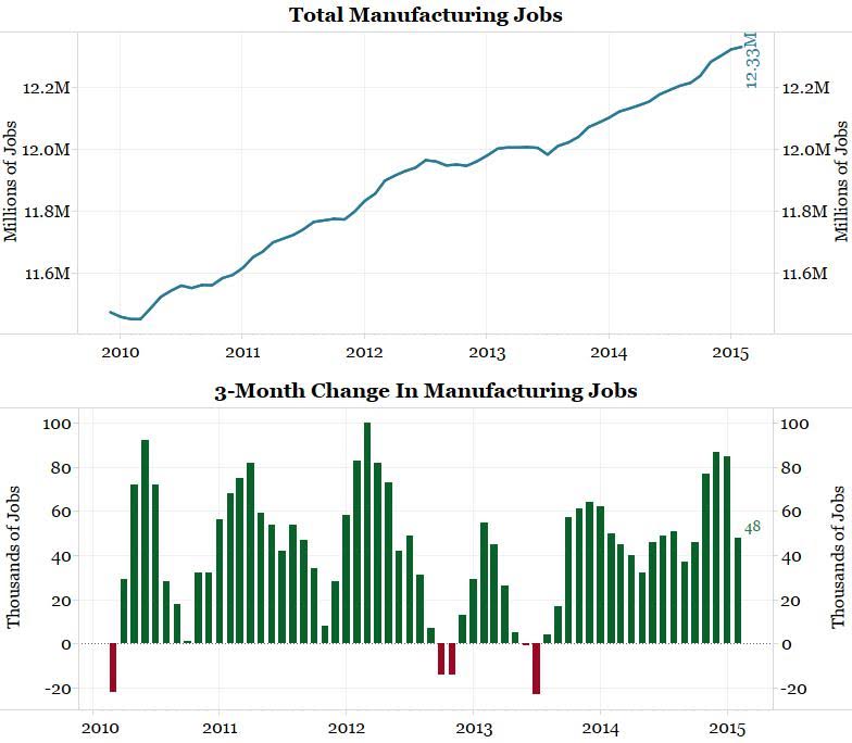
The narrative told by the charts above have led us to question why the jobs numbers have been so robust lately. Why are companies supposedly hiring at such a healthy pace in the face of slowing growth? As the chart below shows, manufacturing hiring is picking up nicely.
As the red line in the chart below shows, housing starts also fell considerably from January to February.
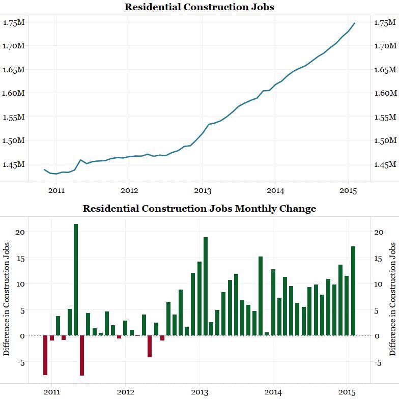
This has not affected residential construction job growth though. Note the chart below shows residential construction jobs grew by 17,200 in February. This is the second-best month of hiring since 2011. This number is seasonally adjusted. The unadjusted number grew by exactly 10,000. So what did these 10,000 new jobs do if far fewer homes were being built?
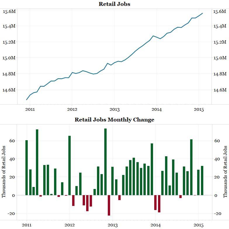
The next two charts look closely at job growth in the retail sector. As the first chart shows, hiring has continued in this sector despite a slowdown in retail sales.
Conclusion
Job growth in manufacturing, residential construction and retailing accounted for almost a third of February’s blow-out nonfarm payroll number. Are we to believe all these industries were hiring at such a healthy pace despite the decline in growth? If this is the case, the productivity numbers will continue to collapse and the Fed will have a serious problem on its hands. We, on the other hand, suspect something might be amiss with the payroll numbers. These numbers are telling a far different narrative from most other economic data.




What's been said:
Discussions found on the web: