One of my favorite — and most instructive charts — is the asset allocation quilt:
Click for ginormous graphic
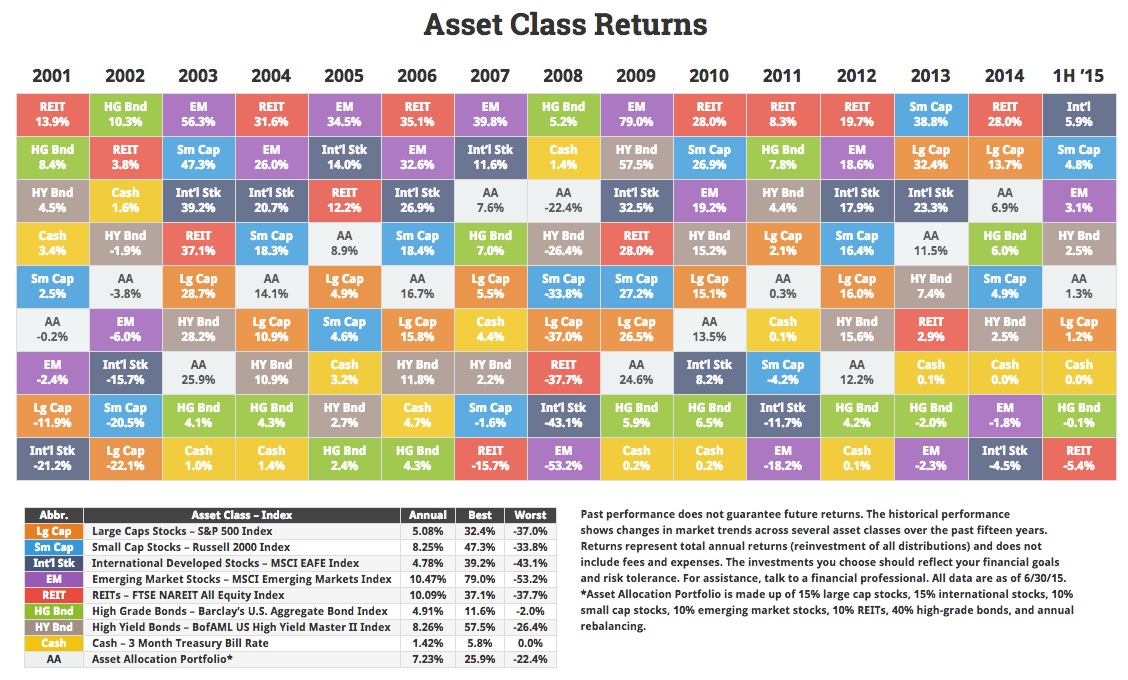
Source: Novel Investor


One of my favorite — and most instructive charts — is the asset allocation quilt:
Click for ginormous graphic
Source: Novel Investor
Get subscriber-only insights and news delivered by Barry every two weeks.
Large Cap looks better than a savings account unless there’s an accounting scandal!!!
“So the last shall be first, and the first last: for many be called, but few chosen.” – Matthew 20:16
The markets are becoming biblical, if not apocalyptic.
We’re due for major divergence – the gap between high and low so far this year is 11.3%.
2014 was 32.5%
2013 was 41.1%
2012 was 19.8%
2011 was 26.5%
2010 was 27.8%
2009 was 78.8%
etc….