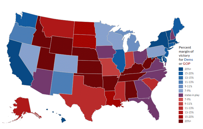
Red, blue and … purple? Changing demographics could make a major difference in the next election in some key states.

Source: Brilliant Maps
Red, blue and … purple? Changing demographics could make a major difference in the next election in some key states.

Source: Brilliant Maps
Can this map be updated with electoral votes per state?
Or at least some useful information in addition to the pretty colors.
That information would be helpful but I think the takeaway from this map is that a small handful of states will be the focus of a lot of spending, campaigning, and voter mobilization/suppression. For Democrats hoping to improve representation in congress and at the state level, that is not promising.
– VERY interesting charts. It only confirms that the percentage of US cititzens with Europeans descent is decreasing. No surprise here.
– Too many people assume that an increasing Hispanic & Asian percentage of US citizens is good for the Democrats. I doubt it, it could also mean that we could see more Republican election victories.