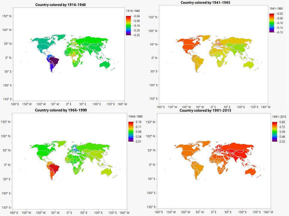
There has been a gripping amount of global warming, worldwide, since the start of this millennium. The latest policy attention has come in the form of an agreement, hammered out at last year’s United Nations climate conference –COP21– in Paris. But what is lesser known about this critical topic is to what degree this glowing of Earth is as steady and as vicious, equally spread around the world. What we see from this colorful diagram below is that major regions of the world randomly vacillate, between warming in cooling. What we show below are the temperature snapshots 100 years ago, and then reel through time in ¼ century increments, until today.
Of course these temperature oscillations have allowed for fabled misconceptions about the underlying temperature trend. Earth’s temperature is now roughly 1° warmer today, versus the late 1800’s. Not a lot, except it is statistically significant and we are now locked in at this higher plateau; but only if you elect to extrapolate these results into the future, does the temperature change amount get detrimental. Our sophisticated modeling of official data below shows that Asia, and to a smaller degree South America, have led the way and shoulder ~40% of our current global searing evidence. Citizens of most other regions are experiencing more neutral effects. Hypotheses concerning population density or deforestation don’t strongly match the outcomes here, though high levels of carbon emissions from emerging market polluters do match. We are importing lower prices, but at a cost to our health!
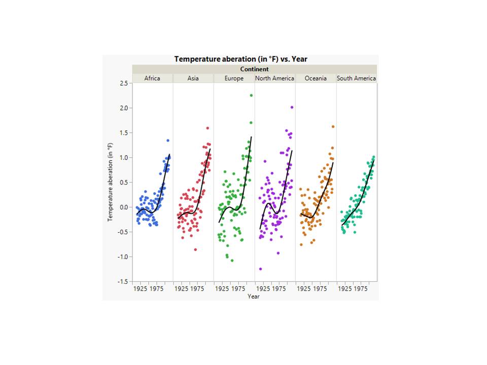
To describe how we arrive at these results above, let’s take a step back and analyze the overall official temperature series below. NOAA and NASA track these high-level values and they are at times labeled “anomalies”, though we will use the term “aberration” in this article. It refers to the temperature deviation versus the entire 20th century average. This method of advanced and now globally recognized mathematical modeling among scientists, leads the early part of the time series to always balance about 0. But the data anyway has a lot of chaotic statistical noise, as we can see, and some very intense random changes as well. Therefore it is very sensitive and must be modeled and interpreted with great care- deciding among all of the climate dimensions we discuss here!
This first stage of probability modeling it to disaggregate the global temperature pattern into the arranged regional breakouts so that they can be analyzed meaningfully, in a way concealed in the chief chart immediately above. For example notice the precipitous icing oscillation for North America (in purple color below)? More on that in a moment.
Only with hindsight, does one criticize those who suggested temperatures were cooling in the 2nd half of the 20th century. See how widespread this thought was, through the now naive-appearing Time magazine covers, from that era:
The only thing important to see, in the segregated regional data further above, is that to some degree Asia and South America had a slow initial pattern and now dire change pattern in their climate. This raw data, which we painstakingly modeled into the global time series patterns illustrated at the top of the article. You can now handily move across time, in 1/4 century time chunks, to interpret the overall temperature differences and their consistency over time, particularly for one country versus another.
The statistics software had a coding bug that refused to color in a couple South African countries (e.g., Uganda, and the Congo), though those countries align with their neighbors in an immaterial way. We do see the glaring impact of high carbon emissions from -say- BRIC countries (Brazil, Russia, India, and China). This explanation matches quite well to the temperature difference between these countries, and the rest of the globe. Other ideas surrounding deforestation and population density do not do anywhere near as satisfying of a job. South America is less dense than North America, even though over the longer term the former is warmer. Trees continue to be chopped in the Amazon, while the temperature there has cooled recently. It’s likely that there are a number of causal explanatory factors in play however, in addition to high carbon emissions being the most powerful one.
And we need to educate each other, as we enter the 21st century industrial age: before things get even worse for many of us!
It is also conceivable, similar to what we’ve detected so far above, that we again enter a new decade of slight global temperate cooling. That’s the soundest reality of randomness in scientific data! Meanwhile, there is popular environmental quote from the mid-20th century: “Think globally, act locally”. It’s one I hope we all have in our hearts, when thinking about making decisions in this new year.
This content, which contains security-related opinions and/or information, is provided for informational purposes only and should not be relied upon in any manner as professional advice, or an endorsement of any practices, products or services. There can be no guarantees or assurances that the views expressed here will be applicable for any particular facts or circumstances, and should not be relied upon in any manner. You should consult your own advisers as to legal, business, tax, and other related matters concerning any investment. The commentary in this “post” (including any related blog, podcasts, videos, and social media) reflects the personal opinions, viewpoints, and analyses of the Ritholtz Wealth Management employees providing such comments, and should not be regarded the views of Ritholtz Wealth Management LLC. or its respective affiliates or as a description of advisory services provided by Ritholtz Wealth Management or performance returns of any Ritholtz Wealth Management Investments client. References to any securities or digital assets, or performance data, are for illustrative purposes only and do not constitute an investment recommendation or offer to provide investment advisory services. Charts and graphs provided within are for informational purposes solely and should not be relied upon when making any investment decision. Past performance is not indicative of future results. The content speaks only as of the date indicated. Any projections, estimates, forecasts, targets, prospects, and/or opinions expressed in these materials are subject to change without notice and may differ or be contrary to opinions expressed by others. The Compound Media, Inc., an affiliate of Ritholtz Wealth Management, receives payment from various entities for advertisements in affiliated podcasts, blogs and emails. Inclusion of such advertisements does not constitute or imply endorsement, sponsorship or recommendation thereof, or any affiliation therewith, by the Content Creator or by Ritholtz Wealth Management or any of its employees. Investments in securities involve the risk of loss. For additional advertisement disclaimers see here: https://www.ritholtzwealth.com/advertising-disclaimers Please see disclosures here: https://ritholtzwealth.com/blog-disclosures/