Let Me Tell You How It Will Be . . . ’Cause I’m the Taxman
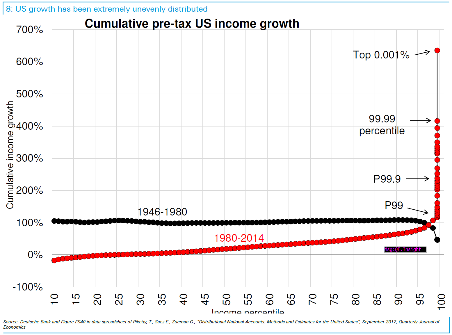
Source: Bloomberg
Yesterday, I mentioned that several billionaires who were not lefty socialists were noticing that the Middle Class was shrinking. It is clear to me that at least some of the 0.01% understand there is a major problem here.
The chart above, via John Authers, puts that into stark relief. Compare the gains achieved by the top 1% in the post war era to those they have garnered since the 1980s.
It is always healthy to see the pie grow — but that is not what this discussion is about. Over both of the time frames shown above, the pie was expanding. What the present discussion is referencing is how that pie gets divided. It is a zero sum game, and someone’s gain is someone else’s loss.
When Dalio or Dimon point out that the pie is no longer being divided fairly, this is precisely what they are referring to — a tiny percentage of the population is now capturing all of the gains. This is not how it used to be.
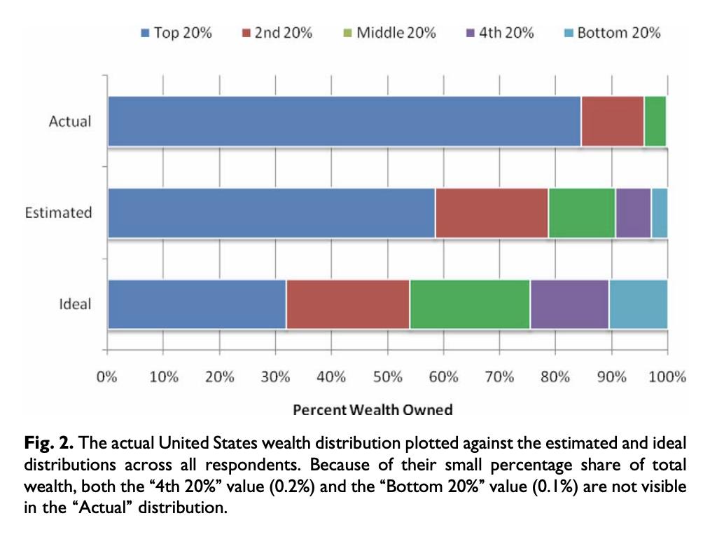
What is astonishing is how disproportionate the divisions have become, people’s conception of the actual allocation within society wildly under-estimates how bad it is. The chart below, via Michael I. Norton and Dan Ariely, asks people what they believe the ideal United States wealth distribution should be (bottom), and what they estimate it to be (middle). The top line is what it is actually.
As unequal as most people believe the wealth distribution in America is these days, the reality is actually far, far worse than they estimate it . . .
Actual wealth distribution in USA, estimate of that distribution, and ideal distribution