In the process of assembling the morning reads (sign up here!), I come across lots of really interesting things. A perfect example is these sets of charts via More in Common (hat tip Brent X Donnelly).
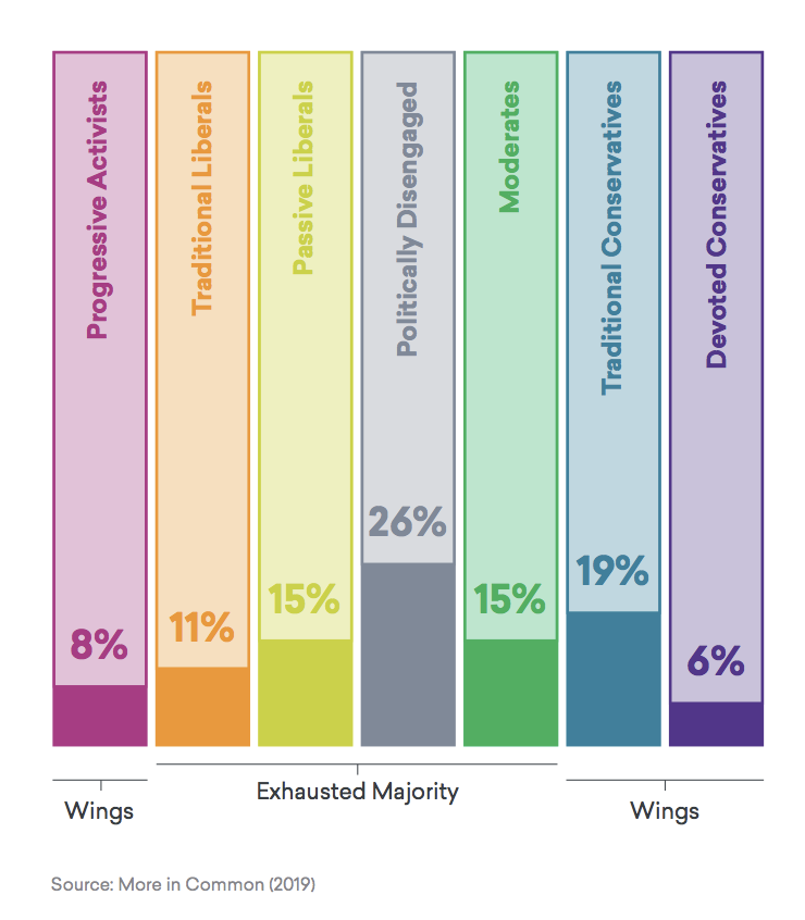
These show the “exhausted political majority” of America, driven to annoyed distraction by the extreme partisan wings of the country’s outlier political groups — 25% on the far right and the 8% on the far left — are really vexing to the 67% (literally 2/3rds) of the rest of the country :
Source: More in Common
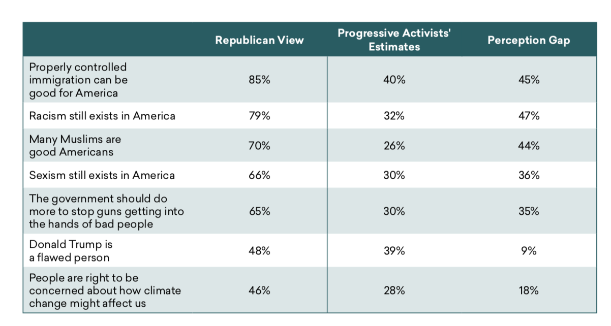
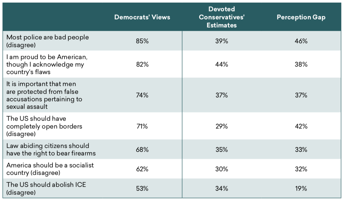
Here is another example of an underreported datapoint: The perception gap, or how the left and right (mis)see each other:
Progressive Activists’ estimates of Republicans’ views
The table shows, for each issue, what percent of Republicans Progressive Activists think hold each view, and what percent actually do

Devoted Conservatives’ estimates of Democrats’ views
The table shows, for each issue, what percent of Democrats Devoted Conservatives think hold each view, and what percent actually do

Source: More in Common


