
I have always hated those red & blue election maps — they are a highly misleading model of reality for several reasons. First, people vote, not land. Presenting a vast sea of desert as if it was the same as a populated region is inherently misleading.
And second, the country is far less divided than presented in most media. There are huge swaths of issues that there is a broad consensus about. Even in issues like Abortion or Guns, there is bog agreement on many aspects to what has been portrayed as a Red/Blue divide.
Sure, the outrage manufacturing complex loves to inflame the passions, as it serves their financial purposes. But the reality is Americans have a lot more in common than the way it typically gets depicted.
In the past, I have tried to show this using Cartographs (See this). Kudos to the New York Times for their excellent visual explainer:
Election Maps Are Everywhere: Don’t Let Them Fool You
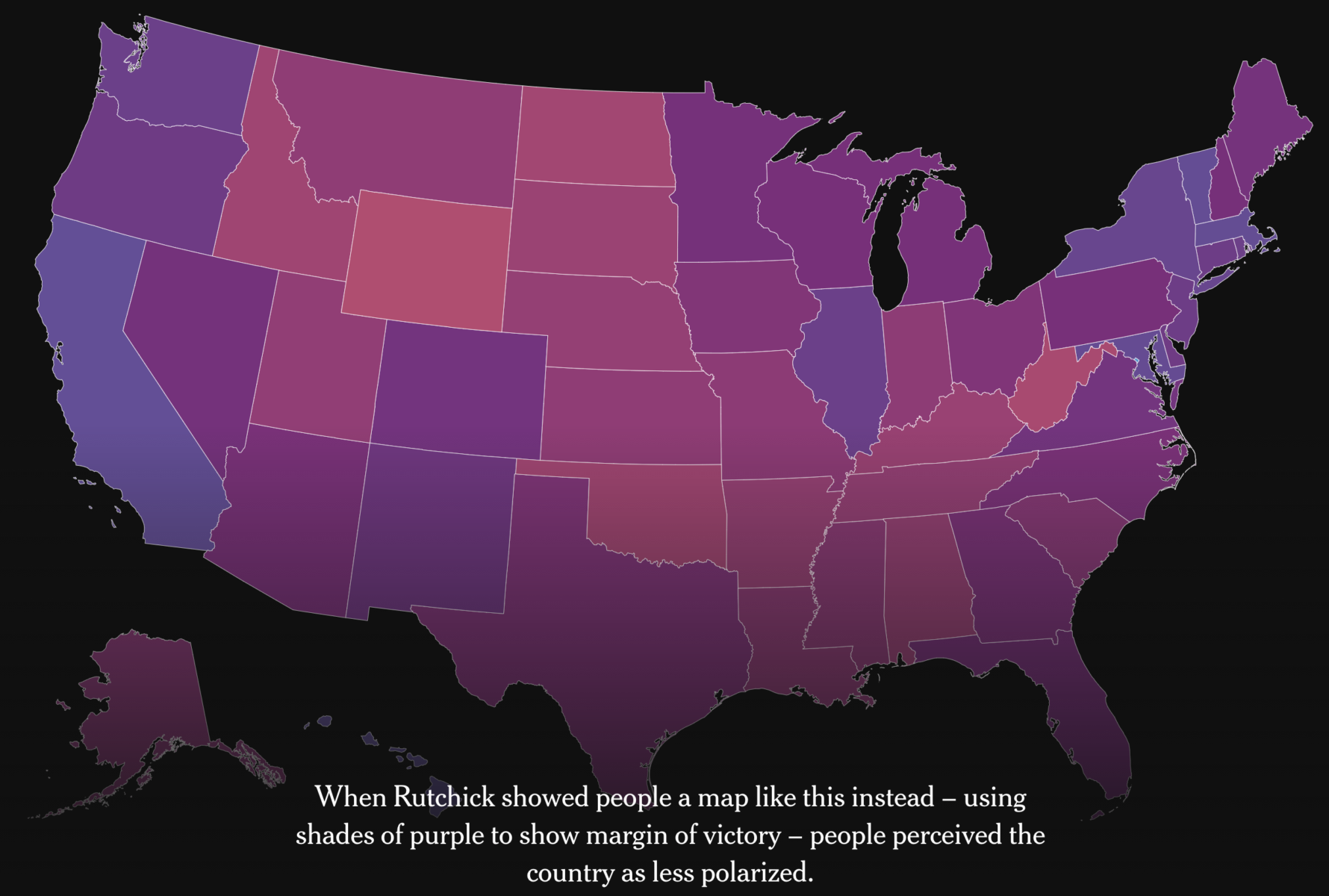
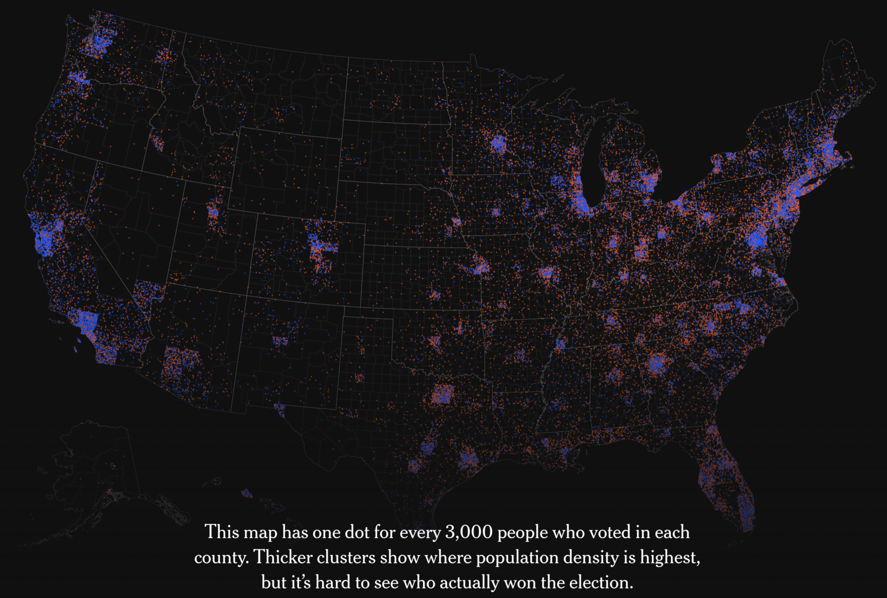
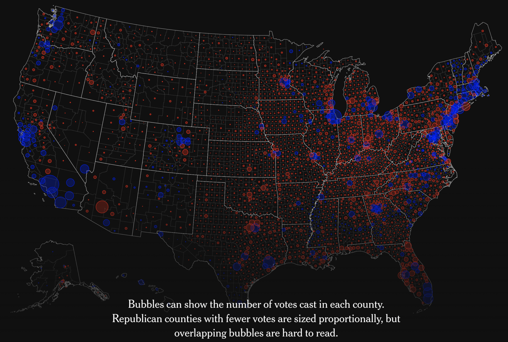
Source: New York Times
Previously:
Cartographs of 2008 US Election Results (November 10, 2008)
Electoral-Vote Cartograph (November 2, 2008)
