
Source: JPM Chase
My favorite market chart book is out, and as always, its filled with 86 pages of great charts and insightful ideas. There are a few new(ish) sides in the deck and a couple of unusual charts worth highlighting.
My suggestion: Download the deck, work your way through it, identifying:
1. What each slides states overtly?
2. What is suggested more subtly?
3. What does second order thinking (ala Howard Marks) of each slide suggest?
4. What pushback can you muster versus the dominant narrative of each?
Not counting the one above — it needs no explanation — these four caught my eye:
Year Over Year Operating EPS Growth
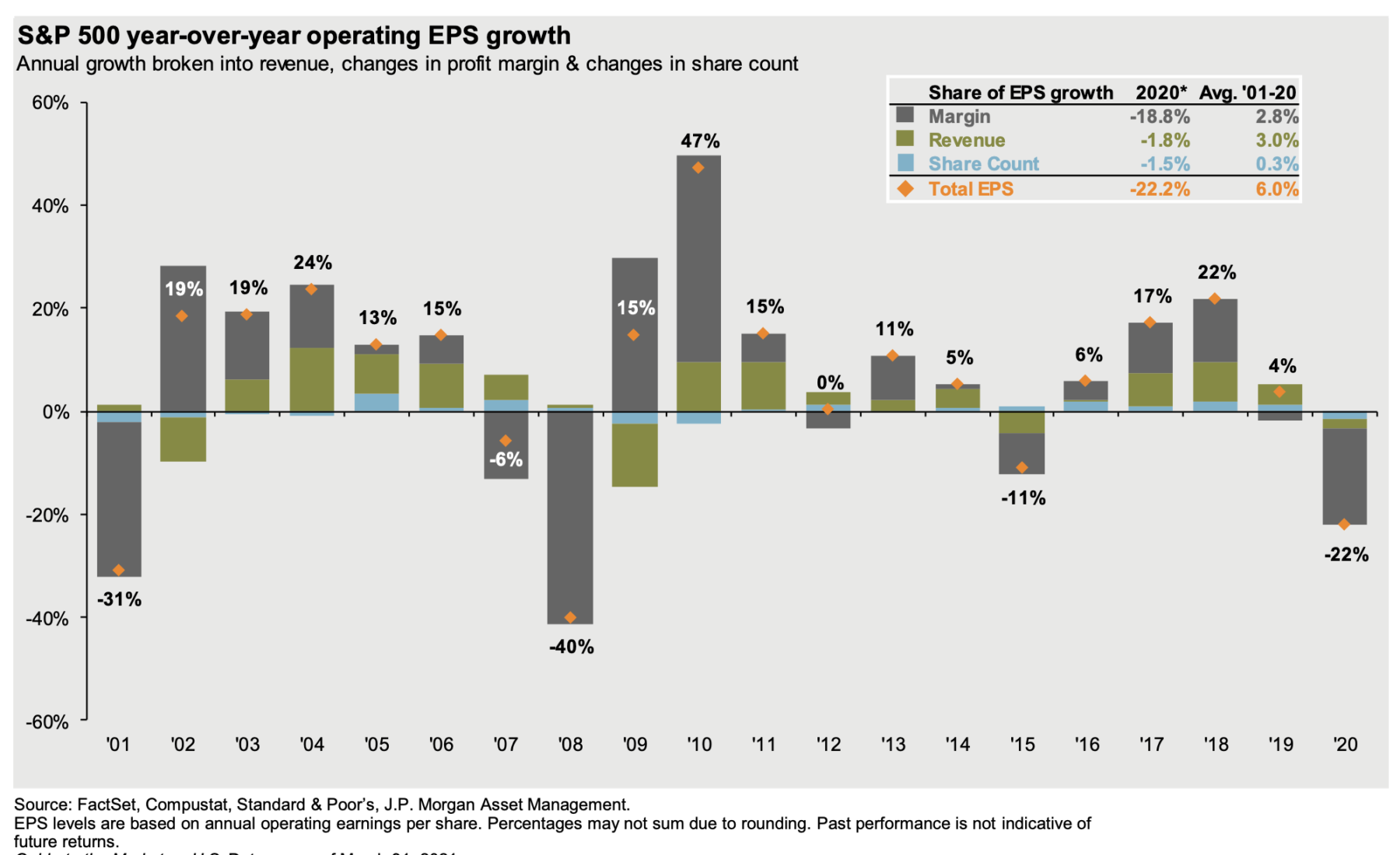
Let’s begin with this chart of the S&P 500 year over year earnings growth a number of things stand out on this chart beginning with the entire year of 2020 down 22% from the year before. This is obviously terrible but to be fair it’s much better than a lot of worst case scenarios we’re projecting end of Q1 beginning of Q2 2020 .
Indeed it’s not nearly as bad as but down 40% in earnings of 2008. This either means that the government and Federal Reserve response was unnecessary or effective depending on your personal politics. My view is that The Fed and more importantly the federal government and there are two trillion plus in spending put a floor under the economy .
The snap back in ’09 and 2010 raises prospects that 21 will see a similar snapback; my question is whether that is already priced into the markets.
~~~
Market Pullbacks & Volatility (1994-2021)
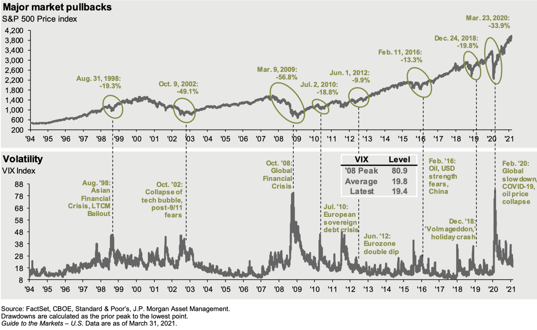
The chart of pullbacks and volatility – especially over the past ~20 years – is really quite revealing: Pullbacks occur all too regularly as do corrections and crashes (however you define those).
It is a classic example of what I would describe as “A feature, not a bug.”
It is inherent in the nature of markets so long as they are driven by human beings and all of their cognitive errors an emotional foibles to overshoot too far to the upside and the downside. The question for investors is simply this are you prepared for these overreactions and do you have the discipline, capital and constitution to behave opportunistically when they come along?
~~~
Relative Performance of US vs Rest of World
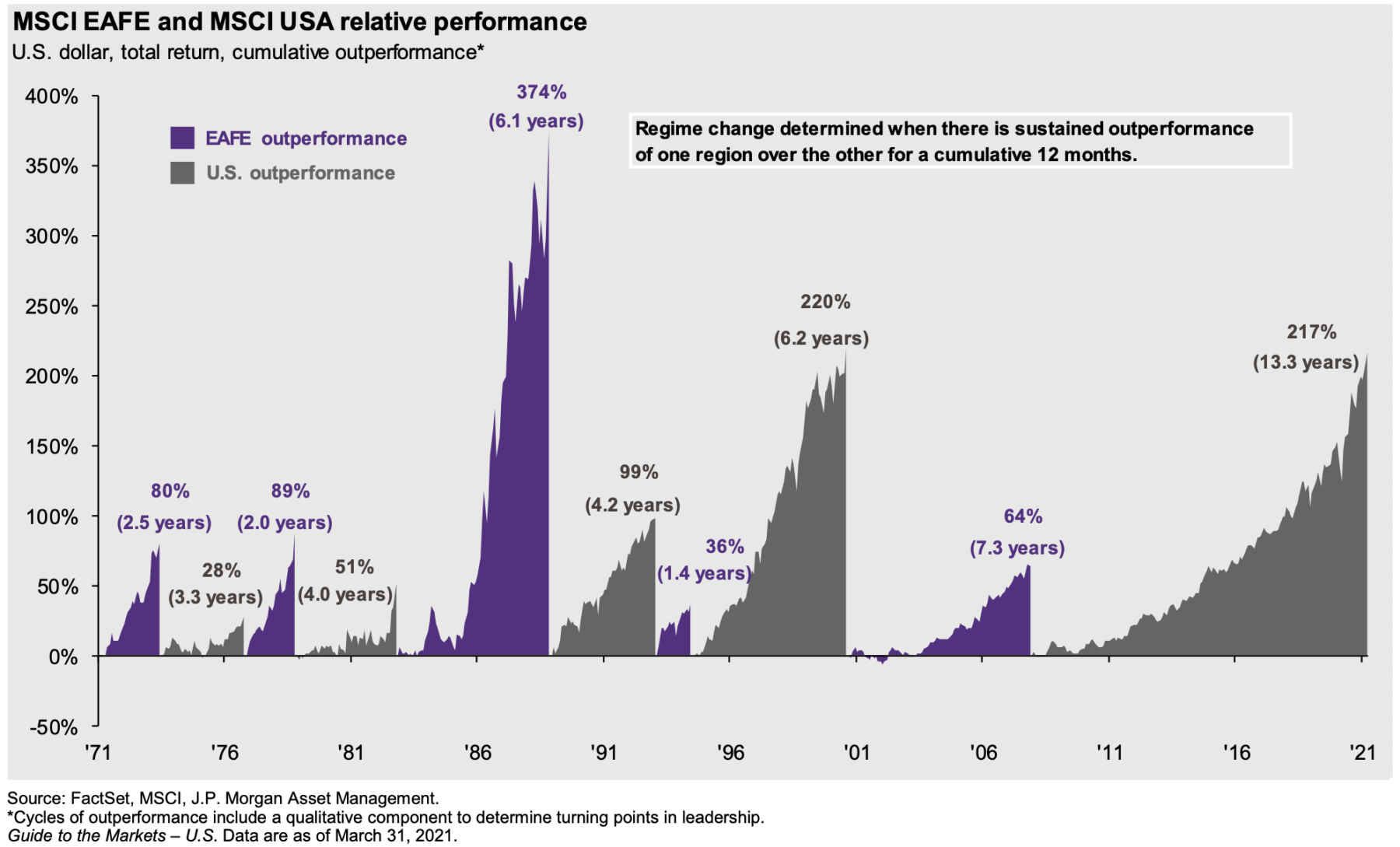
The chart of the relative performance of US equities versus EAFE (Europe Asia and Far East) equities is fascinating: the change in leadership has moved back and forth between regions for half a century. Note the intensity and duration of leadership has expanded over those 50 years.
Two astonishing points:
1. Outperformance of the rest of the world versus the US in the late 80s is amazing but was in large part driven by the Japanese stock bubble — arguably 5X thew dsotcom NASDAQ bubble in the late 90s. That created a wild 374% outperformance prior to the massive crash in the Nikkei Dow.
2. The length of time the US has outperformed during the post financial crisis era. This dates back to 2008-09 U.S. emergency response – it was sooner, larger and longer than most (albeit mostly monetary stimulus). Similarly, the mostly fiscal stimulus by the U.S.
~~~
100 Year Chart S&P500
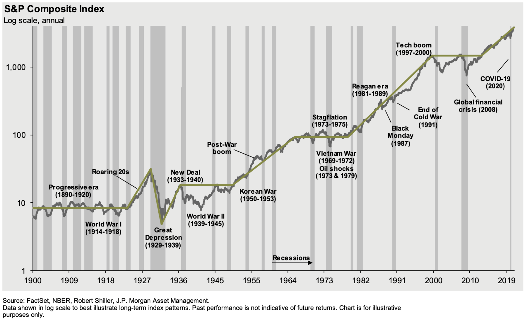
Finally, that 120-year long chart of the broad index.
1. Recessions come along far less frequently than they did 80 to 120 years ago.
2. Wars depressions panics economic shocks market crashes an other crises come along on a regular basis asdu as does economic growth spurts government interventions periods of inflation and deflation booms and busts and global political cooperation. Good luck timing this.
3. Whether it was the United States century or simply reflects global growth there can be no doubt that Business has been a key driver of the United States in the modern era.
Triumph of the optimists, indeed.
