Today’s digression will be about prices. In particular, why and how they are rising and what this means to your portfolio.
My preface is that I have been writing about Inflation for quite a while; typically, when (for a variety of reasons) the mainstream consensus gets inflation wrong. More on this in a moment.
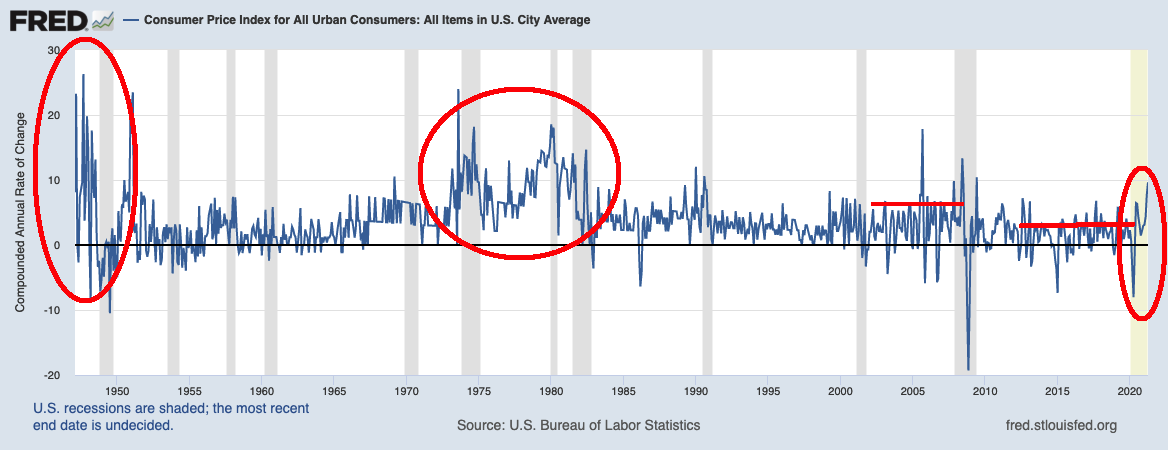
Have a look at the CPI chart nearby, via FRED. It shows the Compounded Annual Rate of Change (Seasonally Adjusted) to demonstrate longer-term price trends.
My five annotations in the chart are in red, and are detailed as follows:
• Post WW2: The first era shows the late 1940s, and it reflects the transition from Wartime footing to civilian economy. There were spot shortages of materials, delays as factories ramped up, not enough housing, all manner of challenges in finding employees. Inflation went to almost 20% in the late 1940s, rates didn’t budge and then inflation fell off a cliff. The immediate post war period sounds a lot like today’s economy, only a larger transition, more government spending, and an even hotter economy.
• 1970s-82: Oil embargo and energy rationing, stagflation, the Vietnam war, Watergate, disco & polyester made this an ugly period. But it is not debatable that inflation was persistent, high and problematic. I suspect this era was formative for many economists (and others) who have been left seeing ghosts of inflation for decades after.
• Pre GFC: 2000-08: You had to be sight impaired to miss inflation as prices soared: Oil hit $150/ barrel; Milk was $7 gallon, meat prices went up and up. And yet, so many missed this — including Greenspan’s Fed and the BLS.
• Post GFC: 2009-16: The ghost of inflation haunted the Post-GFC era, and yet, the phantasm was never actually found. Crisis deficits caused no inflation, the FOMC did not cause hyper-inflation. Austerity did ensure a weak recovery, and the monetary but not fiscal driven stimulus expanded wealth + income inequality. Unemployment fell, but Underemployment remained a problem.
• 2017-2020: Deficits used to be blamed as a source of inflation, but somehow, they were forgotten when unfunded tax cuts were proposed. The fiscal stimulus of the CARES Act was the right way to go (I supported it), but the usual scolds were mostly nowhere to be found (TBF, there were some). A continuation of the earlier era of Underemployment + wealth inequality.
• 2021 to present: Once again, the specter of inflation rears its head. Spot shortages and supply bottlenecks are present. The lockdown attempt to halt the spread of Covid-19 worked, but caused massive economic damage. Unemployment AND Underemployment persists, and we still see wide wealth inequality.
In the mid-2000s, I was railing against “Inflation Ex-Inflation.” This was my description of the annoying tendency of the Fed to ignore food and energy price increases because they were volatile; even worse was the BLS tendency to pull out of its basket things going up in price. Inflation Ex-Inflation suggests that if only we don’t count the things rising in price, there is no inflation. Despite rising prices and robust inflation, most somehow missed it.
Things changed in 2009: The GFC rescue plan and increased Money Supply was going to send inflation soaring (Arthur Laffer: Get Ready for Inflation and Higher Interest Rates, 2009). In 2010, it was the fear-mongerers warning that hyper-inflation was acomin’ (Open Letter to Ben Bernanke, 2010). But in 2017, somehow, there was no concern about pro-cyclical tax cuts causing inflation (or deficits). Funny how that worked out.
And now, we have the same people who have gone “0 for 3” . . . they step into the batter’s box . . . point their bat to the left field fence, and (if history means anything) they go down swinging, striking out.
I don’t want to get all political on you, but it sure looks like a funny coincidence that so many see inflation only when a Democrat is in the White House and are blind to it when a Republican holds that office. A sample set of just 4 is kinda small, but damn, it sure looks like a funny coincidence.
~~~
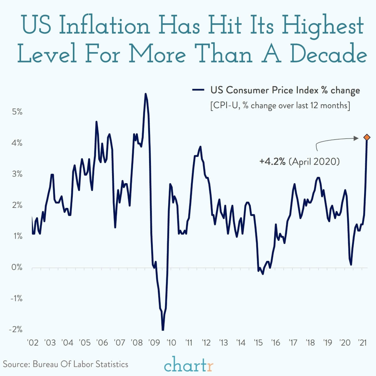
One last thing: Year over year charts — from the depth of recession to the recent recovery — is a misleading way to depict this. That is why I went for the FRED chart showing 75 years of Compounded Annual Rate of Change.
Chart Crime?

Source: Chartr
Previously:
Inflation
Stop Stressing About Inflation (February 11, 2021)
Wildly Wrong About Interest Rates, Jobs & Inflation (June 11, 2019)
An Open Letter to Bernanke of Dubious Authorship (November 15, 2010)


