
Source: Statistics_Data_Facts
This table was making the rounds over the summer, and it popped up again, ostensibly as proof of massive asset inflation.
I am not a fan of these kinds of things. It is technically accurate but lacks context. If we consider the related market history, and what occurred prior, we have a framework to better understand what occurred among the top 5 names over that decade.
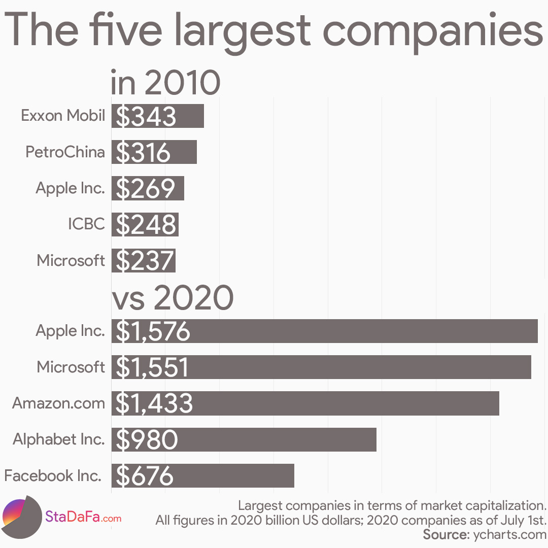
The start date of this era is 2010, not long after the Great Financial Crisis (GFC) ended, but a full 3 years before markets eclipsed their pre-GFC highs. As such, it begins at artificially low levels — in mid-2010, the S&P500 was higher than its March 2009 lows (down 57%) but still were off relative to the October 2007 S&P500 highs by 34%. It would take until March 2013 for the SPX to recover its pre-GFC levels.
The 2010-2020 period does include the pandemic crash, (coincidentally) down 34%. But it also includes the start of its recovery. The broad-based S&P500 was back to breakeven by August 2020. But those companies in the top 5 were the ones that benefitted from the unique circumstances of the pandemic lockdown and work from home; they drove the stock market recovery.
And, not surprisingly, they got back to breakeven even sooner: Amazon was over its pre-pandemic 2020 high by April; Apple, Facebook, and Microsoft by May. It is no surprise these names blew up as much as they did: the circumstances were unique in the modern era, their strengths were ideally suited to meet the challenges of the times.
Over the course of any 10-year run, it should not surprise you to see stocks gain 100%. Anything that compounds at 7.2% annually should take a decade to double. Hence, it is a fair guess that any randomly selected 10-year period should average a total of 100% gains.1
Consider how unusual the circumstances of this past decade have been: In 2010, Apple was selling the iPhone 3G versus today’s iPhone 13. Its market cap was $180B versus today’s $2.45 trillion. Amazon had an even smaller market cap at $56B in its pre-AWS days versus $174 trillion today. Since 2010, the tech sector has transformed the world, and in the process became its most valuable companies.
I would be curious to see how the 5 largest companies do against the broader S&P over rolling 10-year periods. How much are the mega-cap stocks the drivers of the overall market? Does their strength show up at different parts of the cycle? It’s an intriguing question.
~~~
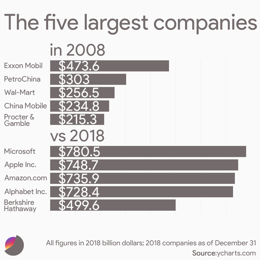
For even greater context, let’s consider a slightly different example.
What If we go back 2 years, showing 2008 – 2018? As it turns out, incorporating the complete GFC crash and recovery changes the results dramatically. It is not the usual decade, but the top 5 do (more or less) show that doubling:
_______
1. In real life, it likely will not be an exact double, because all 10-year periods are not the exact average (they are distributed around that average).
