
Housing and expenditures: before, during, and after the bubble
By Geoffrey Paulin
BLS, June 2018
Beyond the Numbers, Vol. 7 / No. 9. PDF

Housing prices in the U.S. rose sharply from the early to mid-2000s, followed by a sharp drop after 2007.1This period of accelerated price increases is often called the “housing bubble” and its decline is known as the “housing bubble burst.”
Concurrent with this housing bubble bursting was a serious economic downturn. According to the National Bureau of Economic Research (NBER), the U.S. economy entered a recession in December 2007, from which it started to recover in June 2009.2 The period of contraction, popularly known as “the Great Recession,” was particularly serious because, for example, the monthly unemployment rate (seasonally adjusted) peaked at 10.0 percent in October 2009—a rate either reached or surpassed only one other time since the unemployment data series started in 1948. That recession ended a quarter of a century earlier, in November 1982.3
It is reasonable to argue that the housing bubble and its bursting contributed to the onset, and exacerbated the consequences, of the Great Recession. For example, consumers purchasing near the peak of the bubble presumably faced larger mortgage payments than longer time homeowners, leading them to cut back on expenditures they might have made for other goods and services. Then, once the recession started, and home prices fell, some owners—especially new ones—presumably at minimum felt less wealthy, and therefore more constrained in spending, while others—especially those who lost their jobs because of recessionary pressures—found themselves unable to afford their homes any longer.
Given these events, details of this period deserve a closer look. For example, the housing bubble and burst is usually discussed as a national phenomenon. Yet, according to the familiar saying in real estate, “three factors matter: location, location, and location.” Therefore, did the housing bubble manifest itself differently in different parts of the country? Did the bubble affect renters as well as homeowners? And, given the importance of basic housing in the typical family’s budget—ranging from about 24 percent to 27 percent of total expenditures for the average consumer unit between 1995 and 2015—how did expenditures for other goods and services change during this period? 4
This Beyond the Numbers article examines the lead up to, and aftermath of, the housing bubble and burst, including changes in housing prices, housing tenure (homeownership and rental rates), and consumer spending. For these purposes, this analysis uses mainly data from the Bureau of Labor Statistics (BLS) Consumer Expenditure (CE) surveys and some data from the Census Bureau. Based on evidence from these data, the “pre-bubble” period is defined as 1995 to 2001; the “bubble” period is defined as 2002 to 2007; and the “burst” and its aftermath cover 2008 through 2015, coincident with the Great Recession (essentially 2008 to 2009) and the first years of recovery therefrom (2010 through 2015).
Background on the bubble
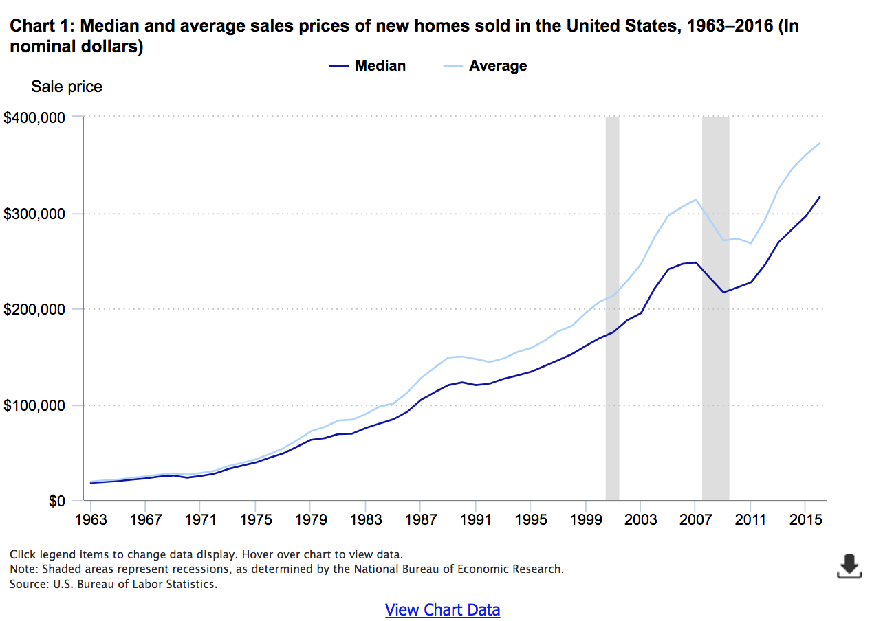
The U.S. Census Bureau provides data on median and average sales prices of new houses sold from 1963 to 2016.5 The data show that there have been changes in trends for housing (for example, 1963–69 compared with 1970–79), and possibly some bubbles (for example, 1985 to 1992), but in no period was a sharp rise and subsequent fall more evident than in the period from the end of the 2001 recession to the start of the Great Recession at the end of 2007. According to the NBER, this was a period of uninterrupted economic expansion.6
As a measure of both the magnitude and unusualness of this housing bubble bursting, chart 1 shows that the immediate post-bubble era—that is, 2008 and 2009—is the only period covered by the Census data in which both median and average housing prices fell for 2 consecutive years.
Effects on homeownership rates, by region
Two “symptoms” of the housing bubble are readily apparent from CE data. First, the proportion of homeowners increased before, and then decreased after, the mid-2000s. Second, the increase in homeownership rates likely reflects an increase in demand for owned housing, which presumably led to higher housing prices. These higher prices meant increased expenditures for owned dwellings, as higher home prices meant higher mortgages for both first-time purchasers and for current owners who were moving to new homes. Both events (increased homeownership rates and higher expenditures for owned dwellings) are observed in the national data in the period before the bubble burst. But, some parts of the country experienced more change than others.
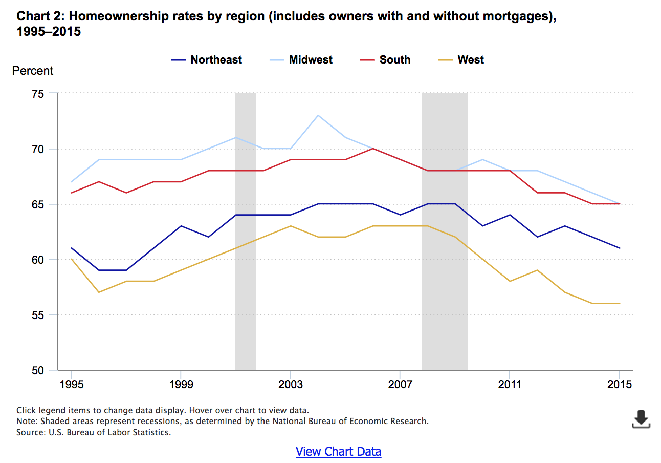
As shown in chart 2, all regions had higher homeownership rates in the late bubble period (2004–07) than they did in 1995. While rates fell slightly in two regions (Northeast and West) in 1996, after 1997, rates in each region generally rose or remained stable from one year to the next until the peak of the bubble. Most evident is the trend in the West, where the homeownership rate grew by 1 percentage point each year from 1998 (58 percent) to 2003 (63 percent), where it generally remained through 2008. This was the largest sustained percentage-point increase in homeownership rates over the 1995–2015 period.7 In comparison, the South had a slow but steady increase in homeownership rates during the first half of this period (1997 to 2006), with small increases followed by periods of stability, but no decreases, from year to year. Regardless, all regions had noticeably lower rates of homeownership in 2015 than they did before 2008, the first full year of the Great Recession. In the Northeast, the rate of homeownership in 2015 fell to equal a level not seen since 1998; for the Midwest, South, and West, rates were the lowest they had been in the series shown in chart 2, which starts in 1995.
Effects on mortgage payments, by region
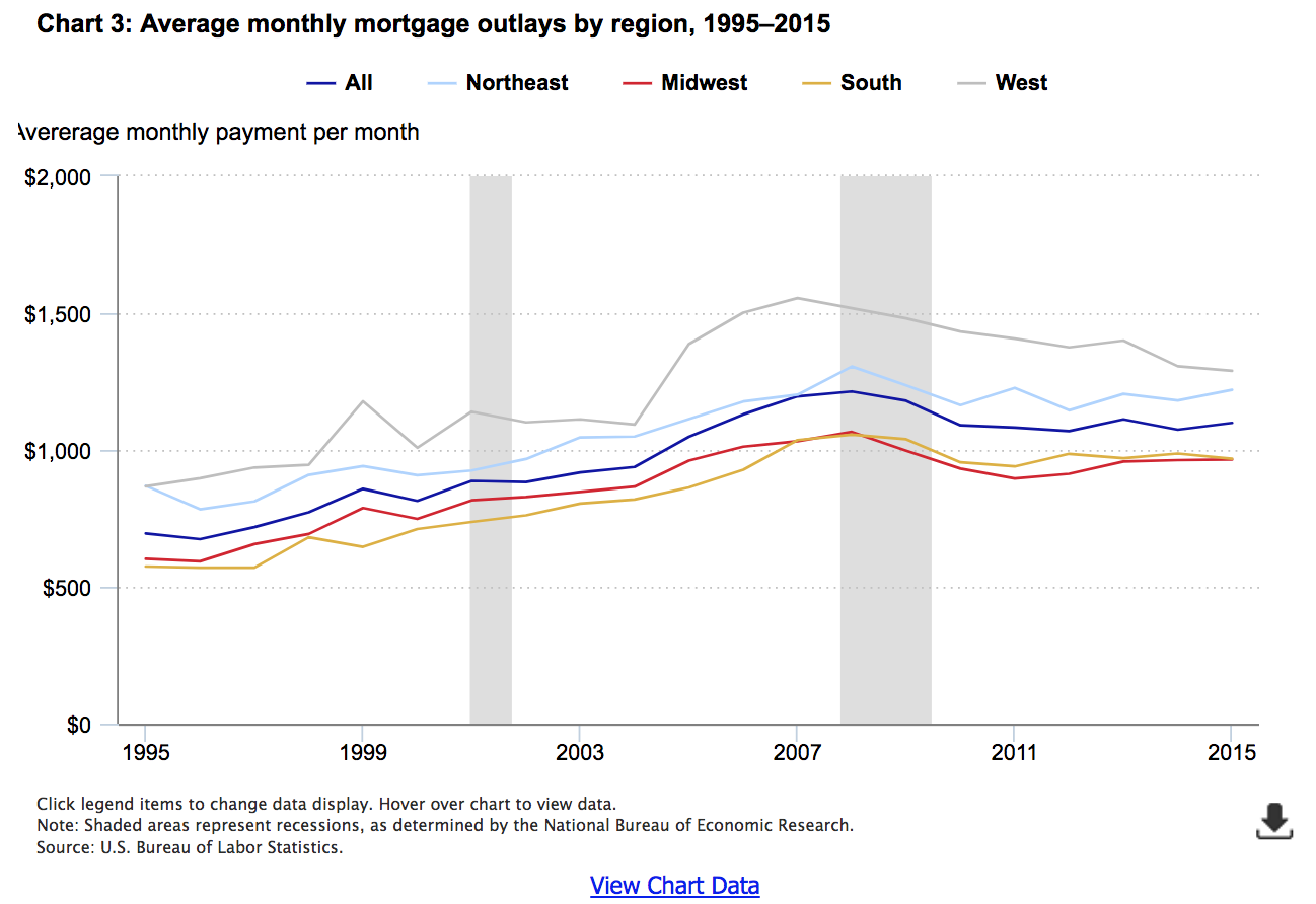
The change in monthly mortgage outlays (sum of principal and interest payments) follows the pattern of homeownership rates, but is even more readily apparent in chart 3.8 The center chart line of the series (“All”) shows that while the bubble was national in scope—with these outlays sharply increasing after 2004, peaking in 2008, and falling back to approximately 2005 levels by 2015—its effects are most evident in the West. Monthly mortgage payments rose more than 42 percent from 2004 ($1,093) to 2007 ($1,555), and fell 17 percent by 2015 ($1,289) in the West. The rise is least apparent in the Northeast, where mortgage payments peaked a year later in 2008, but rose less than 20 percent over this period (2004 to 2008), and fell less than 7 percent by 2015. Nationally, mortgage payments rose 29 percent from 2004 to their peak in 2008, and fell less than 10 percent by 2015.
Impact on homeownership rates in urban and rural areas
In addition to regional differences, the housing bubble affected owners in urban and rural areas differently. Furthermore, effects differed in magnitude, if not necessarily direction, depending on the degree of urbanization (central city or other urban area) in which the housing was located.
Prior to 2003, the CE published tables comparing urban and rural consumer units. Starting in 2003, the data for urban consumer units were further refined to show the major subcomponents: residents of the central city, compared with other urban residents. Although not known at the time, the bubble was in its growth stage then and therefore, through a fortunate coincidence, this allows one to compare homeownership before and after the bubble burst period in these areas.
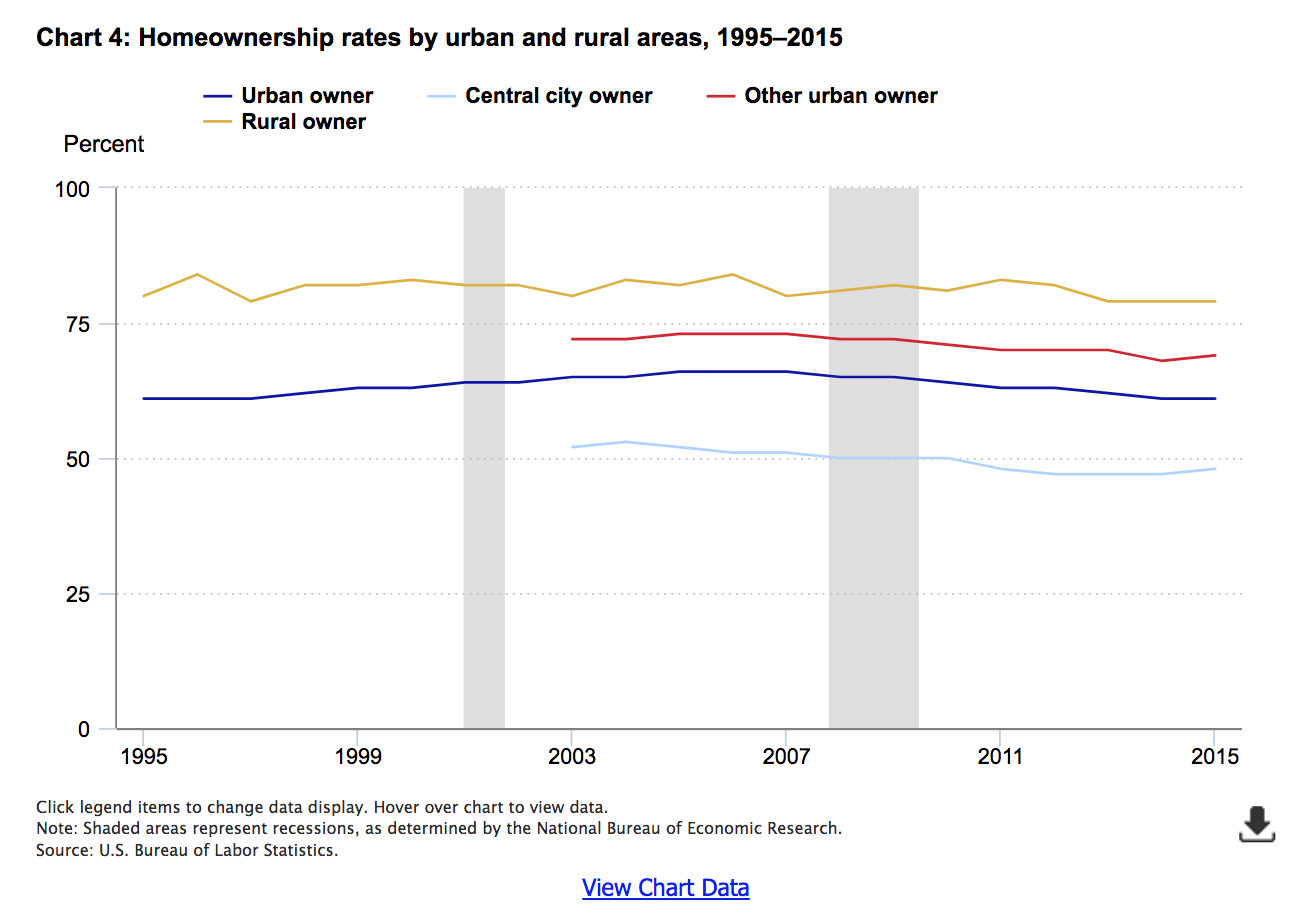
Although rural homeownership rates varied without a discernable pattern between 1995 and 2015, the trend is clearly upward for urban consumers from 1995 (61 percent) to 2005–07 (66 percent), and downward thereafter, returning to 1995 levels in 2014–15.
As chart 4 shows, the trend in homeownership rates was more pronounced in central cities, rising to a peak of 53 percent in 2004 then falling to 47 percent in 2012–14. While other urban areas also experienced a decline from a peak of 73 percent (2005–07) to 68 percent (2014), the slope of the decline was steeper for central city residents than for those in other urban areas. Therefore, the more urbanized the area, the stronger the effect of the bubble.
Effects on homeownership rates in metropolitan statistical areas
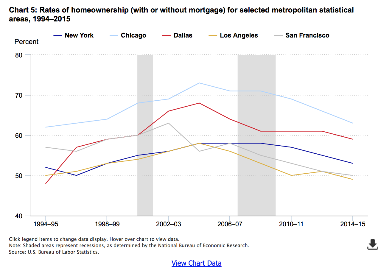
The previous analysis looked at differences in homeownership rates among regions and between urban and rural areas. Combining the two, this section examines differences by the largest metropolitan statistical areas (MSA) within each region. For three regions—Northeast, Midwest, and South—the MSA with the most consumer units in all or most years is included here.9 In the West, the two largest MSAs (Los Angeles and San Francisco) are included. This is because, unlike the other regions, the two largest MSAs in the West are in one state (California). Therefore, owners in each city are subject to identical state laws and regulations affecting homeownership. At the same time, these cities are very different in climate, density, and other factors affecting homeownership rates. In addition, as shown earlier, the West experienced the bubble and its aftermath in more extreme ways than other regions. Given that the two largest cities within this region are likely driving the experience for the region as a whole, it is useful and interesting to compare them to each other, as well as to other large MSAs.
Chart 5 demonstrates some interesting patterns. First, Chicago had the highest rate of homeownership in each 2-year period studied.10 New York and Los Angeles typically had the lowest rates until through 2004–05, after which the rates for both MSAs fell, but much more sharply for Los Angeles than New York. At the same time, the rate for San Francisco rose steadily through the start of the bubble (2002–03), and decreased sharply immediately after its onset (2004–05). Therefore, after having rates about the same as or higher than New York through 2004–05, both San Francisco and Los Angeles had lower rates than New York for most two-year periods thereafter.
All MSAs shown had higher rates of homeownership in 2002–03 than in 1994–95, with some continuing to rise through 2004–05. And although all MSAs shown had lower rates of homeownership in 2014–15 than in 2002–03, the timing and patterns of decline differed. For example, the homeownership rates for Chicago, Dallas, and Los Angeles all peaked in the 2004–05 period. But, Dallas had a sharp drop in its rate from then through the bottom of the recession (2008–09), after which, the rate stabilized before falling again in 2014–15. Chicago’s rate was almost the reverse of this pattern, falling in 2006–07 and stabilizing through 2008–09, before falling more sharply through 2014–15. Rates fell most years in the West, especially after 2006–07. In addition, the Western cities experienced large changes in homeownership rates during this period (2002–03 through 2014–15) ranging from 58 to 49 percent in Los Angeles, and 63 percent to 50 percent in San Francisco. In fact, the drop for San Francisco (13 percentage points) was the largest of any MSA shown.
In contrast, the New York MSA’s rate was least affected, at least until the onset of the recession. The homeownership rate rose only 2 percentage points from 2002–03 to 2008–09, after which it fell 5 percentage points by 2014–15.
Effects on expenditures for owned dwellings in major metropolitan statistical areas
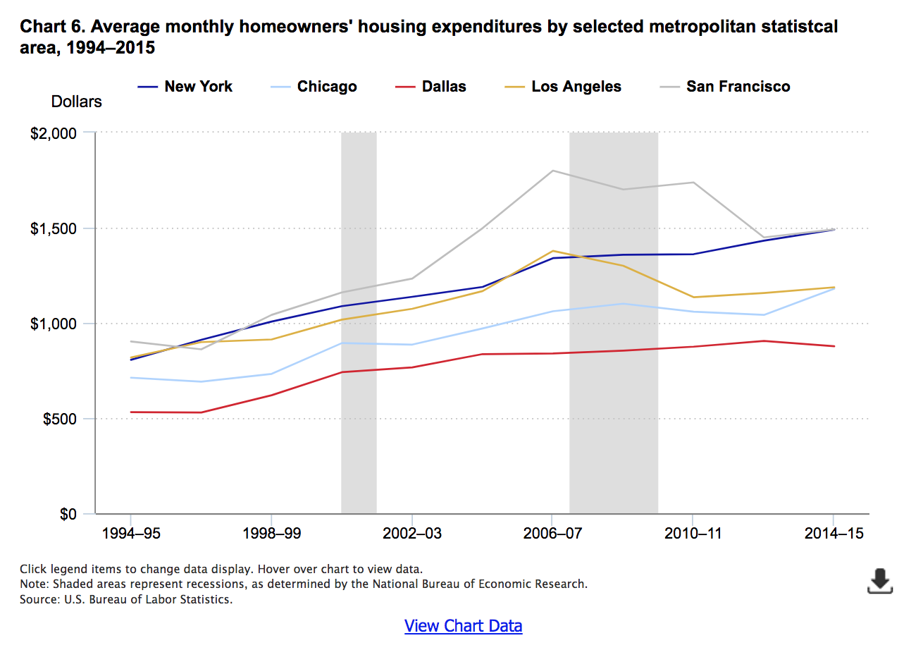
Chart 6 shows that expenditures for owned dwellings (defined below) differed across the selected metropolitan statistical areas (MSAs).11 In Dallas, there is very little “bubble-and-burst effect” demonstrated. Expenditures for owned dwellings rose only 18 percent from 2002–03 ($766) to their peak in 2012–13 ($905), after which they declined slightly in 2014–15 ($877).12 Similarly, New York exhibits no obvious bubble-and-burst pattern.13 However, unlike Dallas, these expenditures never fell in New York for the periods studied. Rising steadily from a monthly average of $806 in 1994–95 to $1,189 in 2004–05, these expenditures exhibited a strong one-period leap—more than 12 percent—to $1,340 in 2006–07, before peaking at $1,490 in 2014–15, an increase of just over 11 percent in what were elsewhere “burst” years.14
In contrast, Los Angeles, and especially San Francisco, show strong “bubble effects.” In each MSA, expenditures peak in 2006–07. However, unique among MSAs displayed, expenditures for Los Angeles bottom out at a level only slightly higher ($1,157) than they were ($1,074) at the start of the bubble period (2002–03); for all other MSAs, the post-peak bottom is noticeably above the bubble period starting point. And while Dallas exhibits the most clearly linear long-run trend during the bubble period (2002–03 through 2006–07), for Los Angeles, the relatively high peak and low points mean that the bubble period trend is the flattest observed among the MSAs examined.
The results were somewhere in the middle for Chicago, the remaining MSA for which results are displayed in Chart 6. After generally rising each period from 1994–95 to 2008–09, expenditures fell for the next two consecutive periods, to reach a peak in the final (2014–15) period. The 2014–15 peak ($1,180) was about 7 percent higher than the previous (2008–09) peak ($1,101), but was up more than 13 percent from the previous (2012–13) level ($1,042).
The MSA tables that the CE publishes include expenditures for owned dwellings. However, they do not show detailed breakdowns of these expenditures. So while they include mortgage interest payments, as well as property taxes, maintenance and repairs, and similar expenditures, these subcomponents are not separately identifiable. Furthermore, because they are expenditures, they do not include mortgage principal payments; unlike other CE tables, the MSA tables do not include an addendum showing these principal payments. Therefore, chart 6 is not directly comparable to chart 3, which shows mortgage outlays by themselves. Nevertheless, the chart shows some interesting differences across the MSAs displayed.
Bubble’s effects on renters: a regional perspective
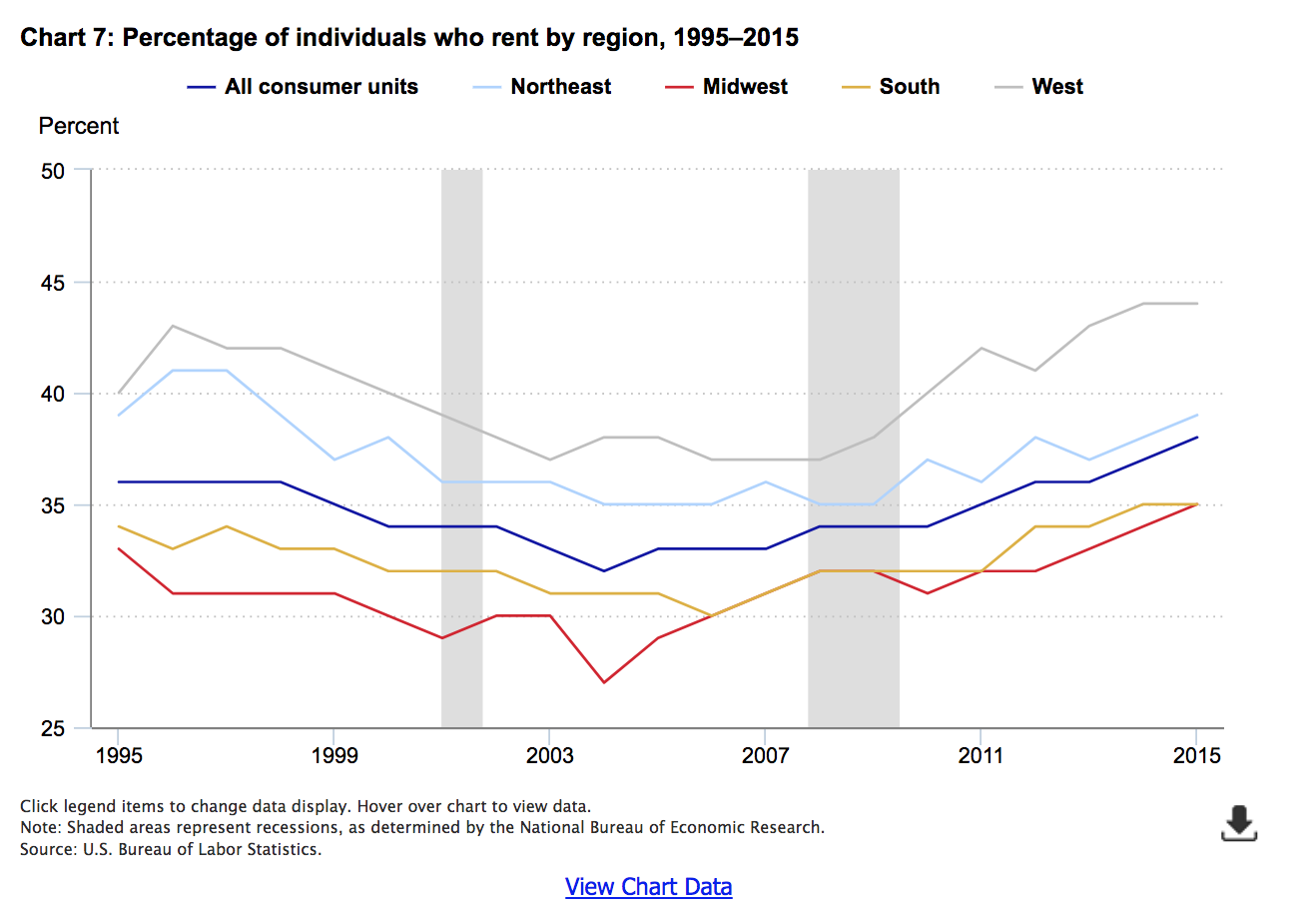
In the CE data, consumer units are classified either as homeowners or renters.15 Therefore, it is not surprising that chart 7, showing the percentage of renters by region, is the “mirror image” of chart 2, highlighting homeownership.
As expected, the West shows the most variability in renter percentages, dropping steadily from 1996 through 2004, stabilizing through 2008, and then rising sharply afterward. As with the rate of homeowners, renter rates are very similar for the South and Midwest after the bursting of the bubble.
Effects on monthly rents by region
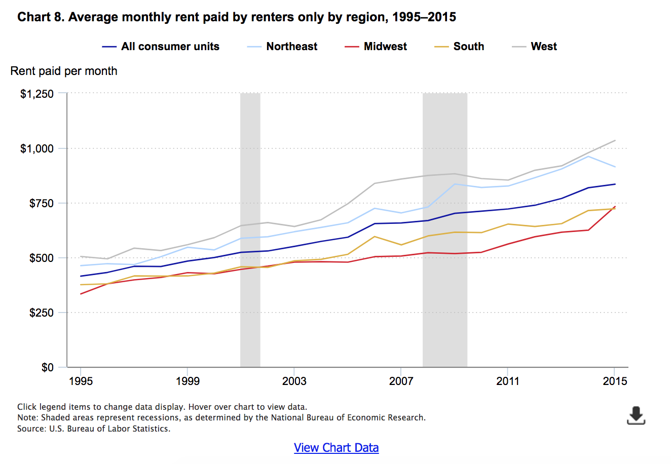
The pattern of monthly rent expenditures by region differed from the mortgage trend during the period studied (1995 through 2015).16 Unlike the outlays for mortgages, which showed a clear relationship to the bubble period, rents for most regions increased at a nearly linear rate. (See chart 8.) Interestingly, the one exception is the West. Not only did this region have the strongest changes in mortgage outlays during and after the bubble period, but rents followed a similar pattern, rising most sharply from 2004 through 2006, and continuing to increase unabated through 2009, after which they fell for the next 2 years. However, after 2011, the linear upward trend returned.
Effects on rents in urban and rural areas
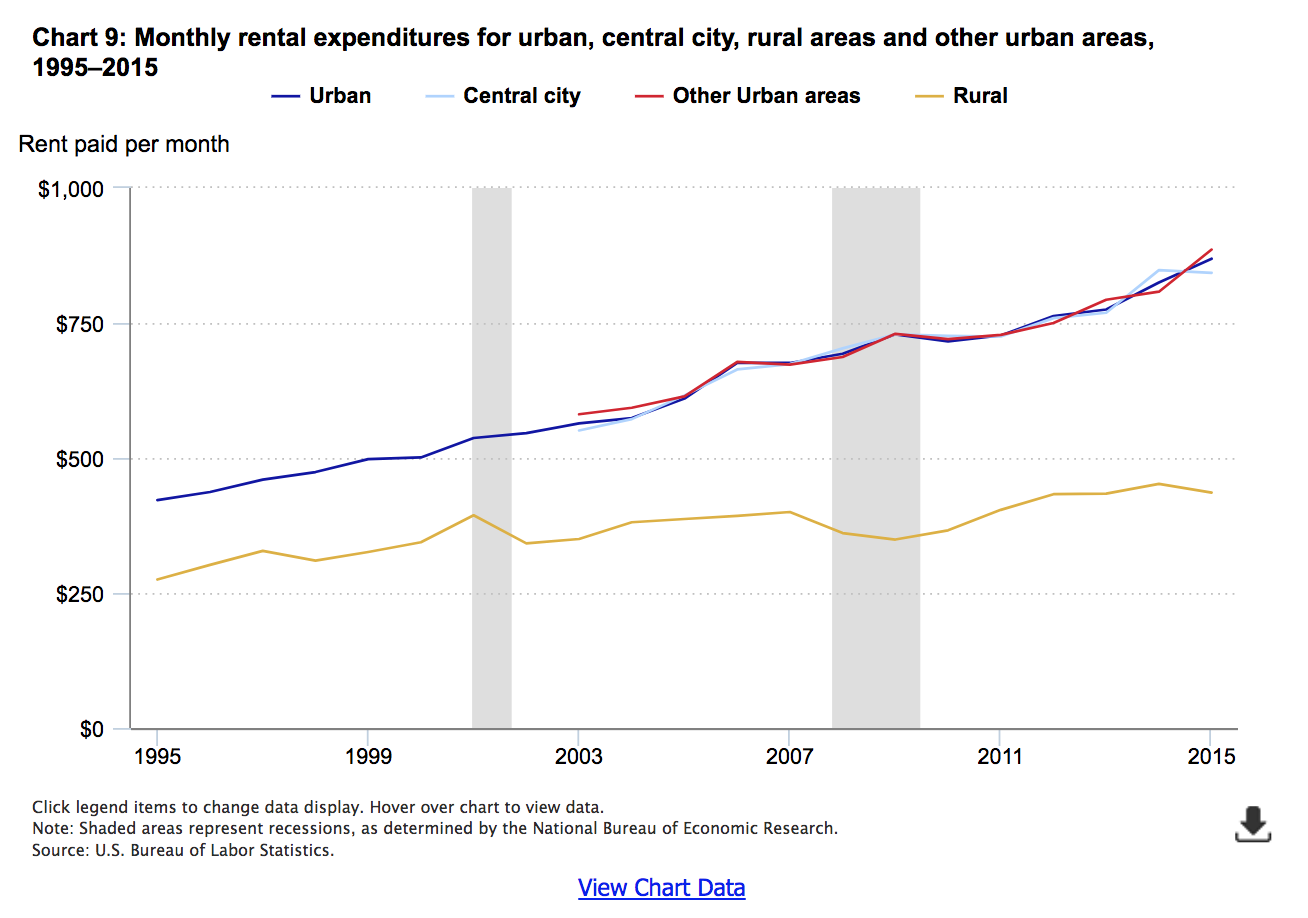
Graphing rent expenditures by the degree of urbanization (urban or rural) of a household’s residence yields interesting results. For urban areas, the trend in expenditures is almost perfectly linear from 1995 to 2015. (See chart 9.) That is, as with most of the regional expenditures, there is little evidence of the bubble affecting rent expenditures. Moreover, despite a higher percentage of renters in central cities (as shown in chart 4 demonstrating a lower percentage of homeowners in central cities), the levels of expenditures for rent are nearly identical for residents of central cities and other urban areas in the years for which these data are available.
However, rural renters are different. While the trend is also linear overall, the slope of the trend line is less steep for rural renters than urban renters, indicating that rents in rural areas increased more slowly over time. In addition, there is evidence of a post-bubble effect: from 2007 to 2009, rents in rural areas declined substantially, to levels not seen since 2003. Subsequently, they rose, but fell into line with the long-run trend line in 2011. Nevertheless, these results must be interpreted with caution, as the “post-bubble” rent decline and the Great Recession were coincident. That is, the decline may not be a direct result of the “bursting” of the housing bubble, but of indirect effects, such as higher levels of unemployment in rural areas, which would decrease income and therefore rents.17
Effects on rents in major metropolitan statistical areas
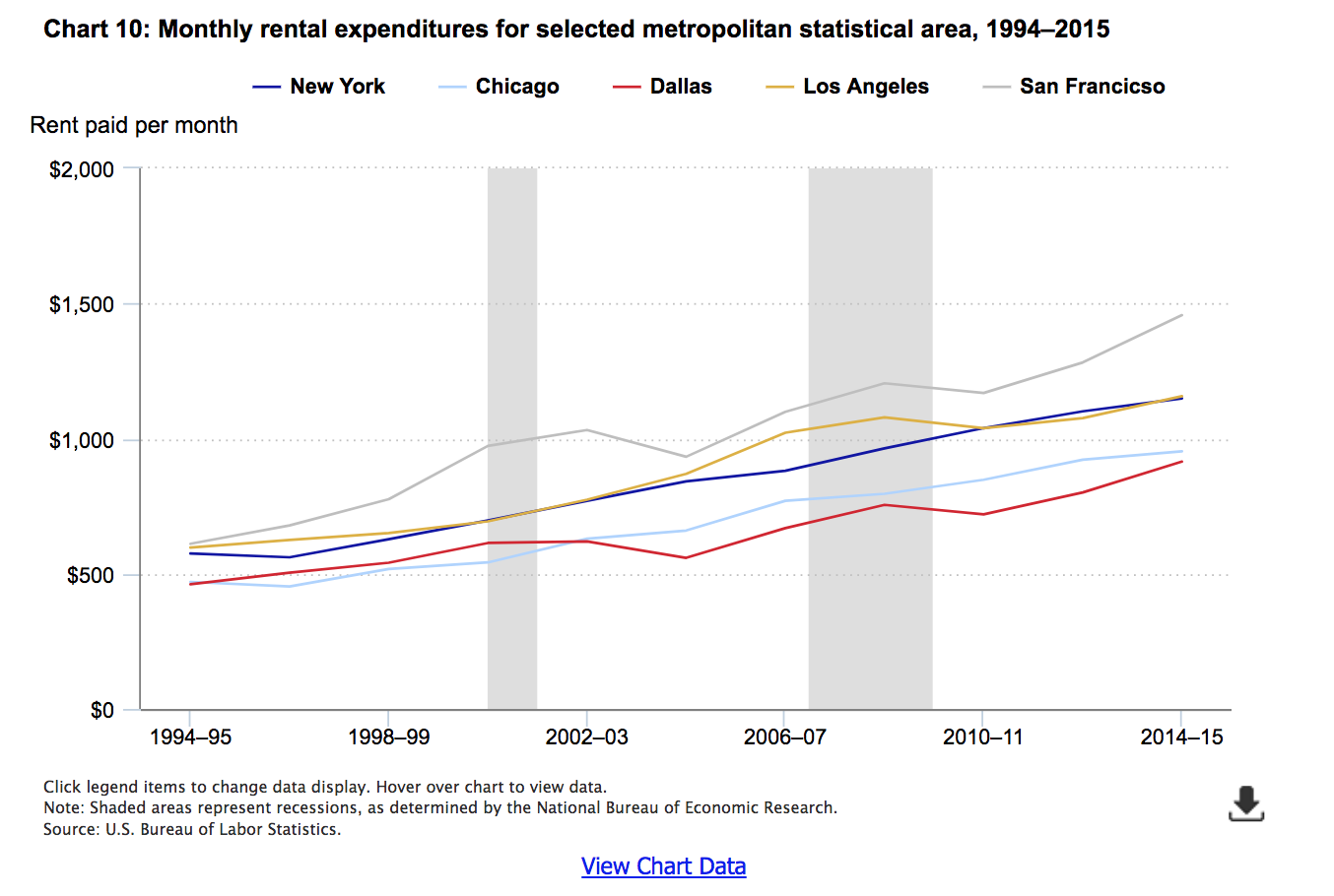
Chart 9 showed that urban consumers experienced similar levels of, and changes in, average rent expenditures before, during, and after the housing bubble. Does the same hold true regardless of location or size of the urban area? To find out, chart 10 compares rent expenditures in the largest MSAs within each region, similar to the way chart 6 compares owned dwellings expenditures across these MSAs earlier in this article.
Intriguingly, in some MSAs, such as New York and Chicago, the patterns follow those of total urban areas, shown previously—that is, a nearly perfect linear trend. For other cities, most notably San Francisco and Los Angeles, but also for Dallas, the patterns look more like those for homeowners—that is, demonstrating a visible bubble-and-burst effect.
Housing expenditures compared with other expenditures
The relationship of housing expenditures to a consumer’s economic welfare is easy to understand: given an annual income of a particular amount, the more that is spent on housing means the less that is available for spending on other goods and services, or for saving for the future (retirement, education, vacation, new vehicle purchase, or other goal). While this is true of any expenditure, for housing the relationship is particularly important, as housing traditionally constitutes a large share of total spending for the average consumer unit, and is not easily changed once established. For example, one can easily buy different types of groceries if food prices change; however, it is not so easy to renegotiate a rental or mortgage contract.
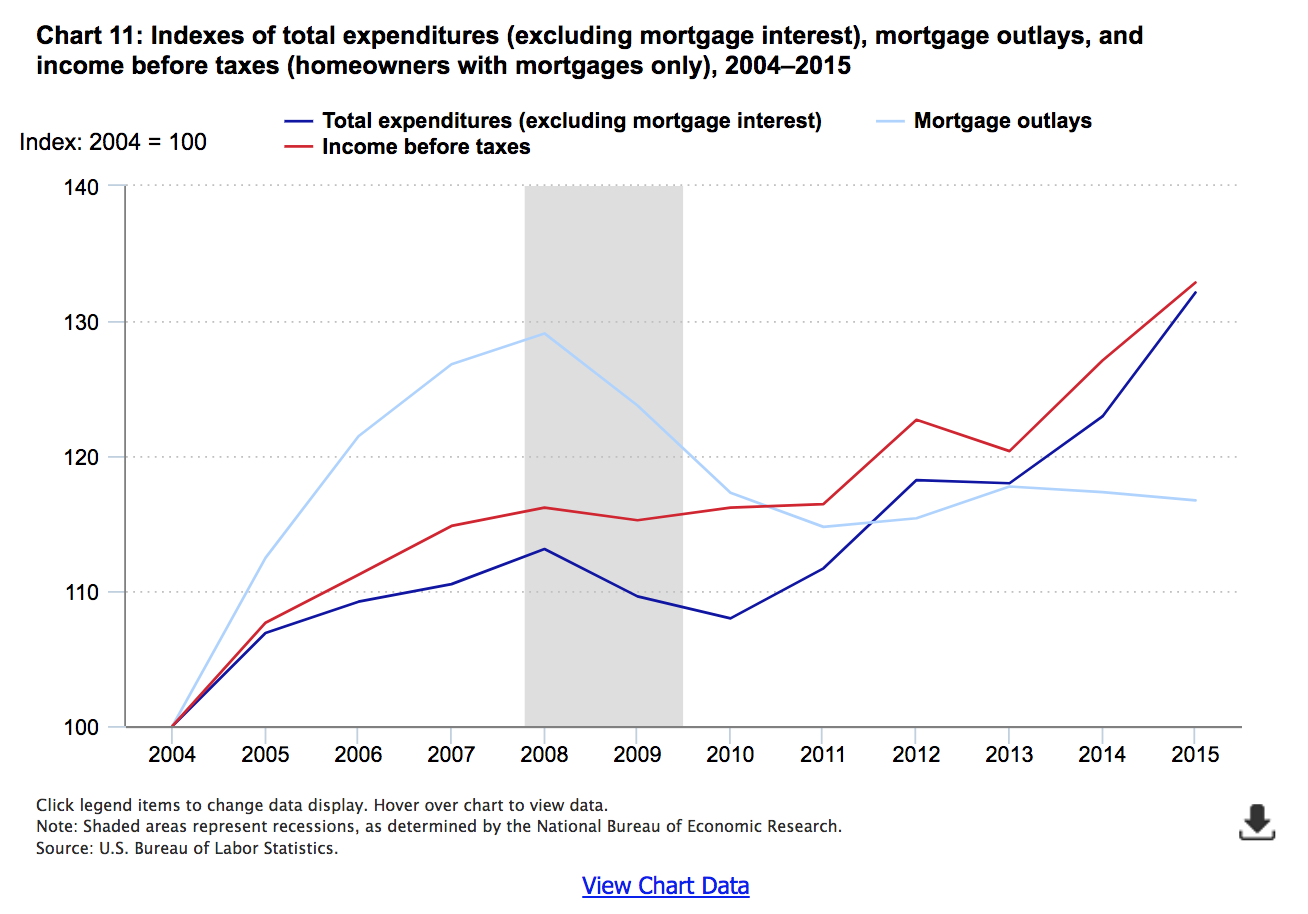
To start, it is useful to examine how housing and all other expenditures changed in relationship to each other. Charts 11 and 12 show that the patterns for homeowners with mortgages and renters were profoundly different. Note that because homeowners without mortgages were presumably less directly affected by the bubble than those with mortgages, they are excluded from the following analyses to clarify the comparisons to renters.
Charts 11 and 12 show the changes in each expenditure category (housing and all other expenditures) and income before taxes, relative to their values in 2004, prior to which time CE income data are not comparable.18 This is achieved simply by taking a ratio of the current year value to the 2004 value. In this way, an index value of 100 means that expenditures in the current year are equal to their 2004 levels. A value greater than 100 indicates an increase in expenditures over time, while a value less than 100 (not observed in charts 11 and 12) indicates a decrease in expenditures from the base period. Similarly, subtracting 100 from the index provides a measure of percent change from the base period. For example, the value of the nonhousing expenditures index in 2015 for homeowners with a mortgage is about 132, indicating these expenditures increased about 32 percent from 2004 to 2015.
As evident from chart 11, mortgage outlays rose much faster than income for homeowners who paid them from 2004 through 2008. That is, while mortgage outlays were 29 percent higher in 2008 than 2004, incomes before taxes for homeowners with mortgages were only 16 percent higher in 2008 than 2004. At the same time, nonmortgage expenditures increased (13 percent), but less than income. This indicates that homeowners with mortgages were disproportionately allocating their increased incomes to mortgage payments rather than other goods or services. However, this changed rapidly after the bursting of the bubble. Although mortgage outlays never fell to 2004 levels, by 2011, they were 15 percent higher than they had been in 2004, while income was 16 percent higher. At the same time, nonmortgage expenditures, which fell between 2008 and 2010, started to increase, growing at a faster rate than income. By 2015, both income and nonmortgage expenditures were about one-third higher (32 to 33 percent) than they were in 2004. In that same year, mortgage outlays were 17 percent higher than they had been in 2004.
Note that the reduction in total expenditures less mortgage interest (2008 through 2010) coincides with a period of declining mortgage outlays. Yet, at the same time, average income before taxes was comparatively stable. Because income is stable and mortgage outlays decrease, one might expect expenditures less mortgage interest to increase on average. The fact that they decrease instead may be evidence of a “wealth effect”—that is, even if the mortgage payment does not change, the lower value of the home may lead the owner to be more cautious about spending.19
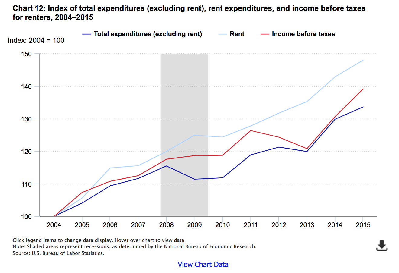
How housing expenditures compare to other expenditures: renters
In contrast to mortgage outlays, rent expenditures (chart 12) increased every year since 2004, except for 2010, when the index fell slightly (less than 1 point). Most interesting, while incomes actually fell for renters from 2011 to 2013, and total nonrent expenditures (food, apparel and services, healthcare, transportation, etc.) were stable, rents rose steadily; the rent index increased nearly 7 percentage points in this period, compared with a drop of nearly 5 percentage points in income. Rent expenditures also increased more in most years than nonrent expenditures, most evidently at the end of the recession (2009) when the rent index rose 5.0 points, and the nonrent expenditure index fell by 4.1 points.20 As a result, by 2015, rent expenditures had increased 48 percent, while nonrent expenditures increased 34 percent.
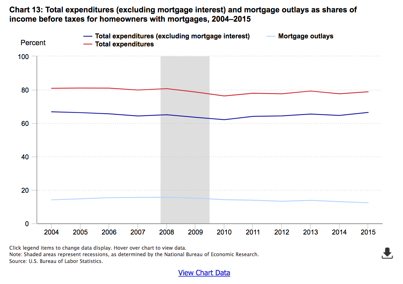
Income shares: homeowners with mortgage
Although income shares are not so variable as the relative growth rates, they are important because the more income homeowners allocate to housing payments (mortgage outlays), the less they have left over to spend on other goods and services, or to allocate for savings.
Chart 13 shows expenditures and outlays as shares of income. From 2004 to 2008, the share of income allocated to mortgage outlays increases nearly 2 percentage points, 14 to 16 percent, before falling to under 13 percent in 2015. This may not seem like a large change, but consider, for example, that average annual income for homeowners with mortgages was $51,130 in 2004. Even with no increase in income, a young homeowner with a typical 30-year mortgage would be able to save over $30,000 more (2 percent of $51,130 for 30 years) for retirement just by saving this 2 percent each year. And that is before including any compounding of interest. By 2015, incomes for homeowners with mortgages had risen to $67,547 on average. The same young homeowner could save more than $40,000 in this case.
At the same time, the share of income allocated to nonmortgage expenditures fell—from nearly 67 percent to about 64 percent by 2007, and rising slightly to 65 percent in 2008. The share continued to fall after the recession officially ended, bottoming out at 62 percent in 2010, before rising to 66 percent in 2015.
Over all, the combined share reached its lowest point in 2010 (76 percent of income) when both nonmortgage expenditures and mortgage outlays were declining. The decline in mortgage outlays more than offset the increase in nonmortgage expenditures from 2010 onward, as the share in 2015 (79 percent) was still lower than it was in 2004 (81 percent).
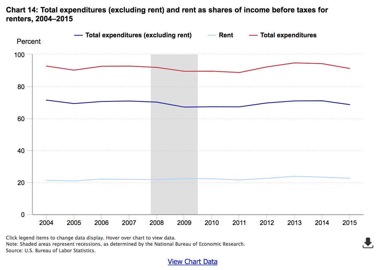
Income shares of rent
For renters, the share of income allocated to rent generally increased, albeit slowly, from 21 percent in 2004 to 23 percent in 2015 (chart 14). Nonrent expenditures accounted for 70 percent or more of income for most years between 2004 and 2008, but fell in 2009, the year in which the recession had technically ended. Nonrent expenditures stayed at about 67 percent each year from 2009 through 2011, returning to pre-recession levels in 2012, and remaining there subsequently.
Conclusion
Starting around 2002, the United States entered a period of rapidly increasing prices for owned homes, known familiarly as the “housing bubble.” Prices peaked around 2007, and the decline that followed is known as the “bursting” of the bubble, which coincided with a period of general economic decline known as the “Great Recession.” Given the historical importance of basic housing in the typical consumer’s budget (accounting for one fourth or more of the budget for most years between 1995 and 2015), it is reasonable to expect that there is a link between housing expenditures and general economic activity. Data from the Consumer Expenditure Survey bear out this expectation. For example, total expenditures less mortgage interest fell for the average homeowner at the same time housing prices passed their peak (i.e., starting in 2008). The reduction in total spending may have been caused by a “wealth effect” (even if one’s mortgage payment does not change, the lower value of the home may lead the owner to be more cautious about spending), which in turn plausibly contributed to general economic decline (e.g., unemployment increases as firms sell less).
Furthermore, while the “bubble” and its aftermath are often described as a national phenomenon, the data show that different areas experienced the bubble differently. For example, the bubble effects—in terms of mortgage outlays—are most evident in the West, which experienced pronounced increases in these payments from 2004 through 2007, with the largest increase at the beginning of the period (2004 to 2005). However, even within the West, the two largest MSAs exhibited patterns that were similar in shape, but different in magnitude. Starting at about the same level on average in 1994–95, expenditures in San Francisco were already a bit higher than those in Los Angeles in 2000–01, the final period before the onset of the bubble in 2002–03. Both experienced sharp increases during the bubble period and sharp decreases after, but the increases were more pronounced in San Francisco, while the decreases were more pronounced in Los Angeles.
At the same time, the effect on renters appears to be indirect. For example, average expenditures on rent generally increased before, during, and after the bubble, and at stable rates. That is, in most locations examined, there were no sharp increases or decreases in rent expenditures during the bubble. However, total expenditures less rent declined in 2009, and rebounded only slightly in 2010. This is similar to the pattern exhibited by homeowners, except that for them, total expenditures less mortgage interest declined in both 2009 and 2010. While renters may not have reduced nonrent expenditures because of a “wealth effect” related to homeownership, they may have reduced them for reasons homeowners shared, such as actual, or concerns about prospective, unemployment. However, this is speculative, as the CE data do not collect information about expectations or short-term unemployment.21
The data also show an increase in homeownership rates, starting with the earliest data examined (1995 in most cases), which peak in or around 2007, and fall thereafter. This is important to note because homeownership is generally considered to be an important element of economic welfare. After all, an owned home is an asset that can be sold for (hopefully) a capital gain that can be used to finance retirement or other activities. In the same way, one expects that the typical mortgage will be paid off some day, reducing “necessary” outlays for the consumer at that point, and thus freeing up money for other activities (saving, travel, etc.). However, to the extent that some owners purchased homes they could not afford, or that subsequently lost substantial value in the “burst” period, it is reasonable to conclude that they were in fact made worse off by the purchase of a home, or at least by the timing of it. If so, the effects were experienced, albeit in different degrees, in all sectors of the country examined here (various regions, urban and rural, central city and other urban, etc.).
Given the magnitude of the effects, direct and indirect, of the bubble and its bursting, the information presented herein is important for both consumers and policymakers. It may help consumers better assess the risk of purchasing a new home, as well as provide data for policy makers to consider in preventing, or preparing for, future bubbles.
This Beyond the Numbers article was prepared by Geoffrey Paulin, Senior Economist in the Office of Prices and Living Conditions, Email: paulin.geoffrey@bls.gov, Telephone: (202) 691-5132.
Source: Bureau of Labor Statistics
