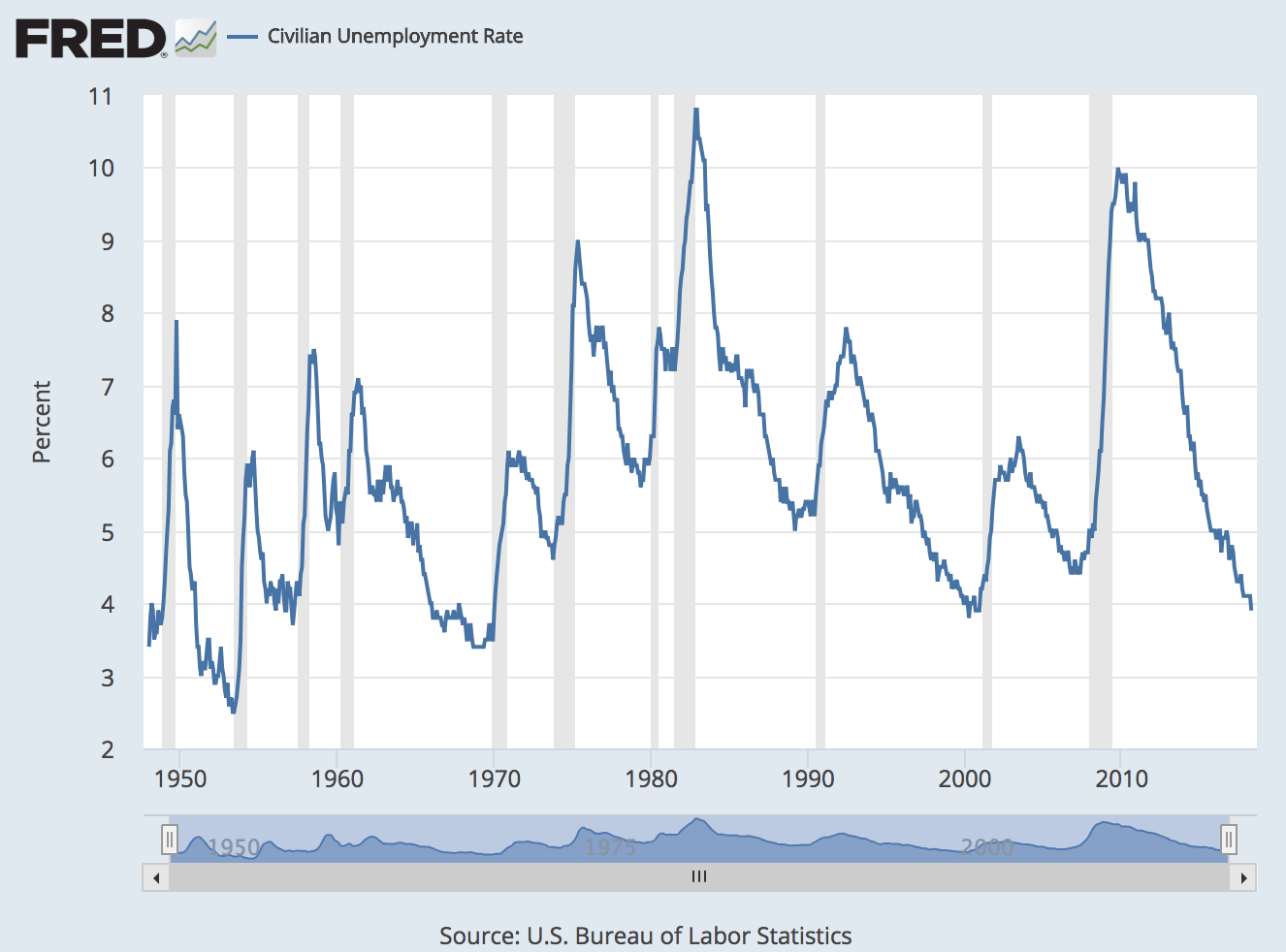
In a previous post, we discussed how the economic recoveries from recessions are longer and slower than the downturns that lead to those recessions. Today, we compare the sizes of recoveries across the economic history of the United States. In the graph above, which shows the unemployment rate, the current recovery is clearly remarkable: The drop from unemployment’s high point of 10% down to 3.9% (at the time of this writing) is 6.1 percentage points. The only recovery that comes close (in the time period shown here) is the 1983-89 recovery, with a 5.8-percentage-point decrease (10.8% to 5%). However, this sample is limited to only the ten recoveries since 1948.
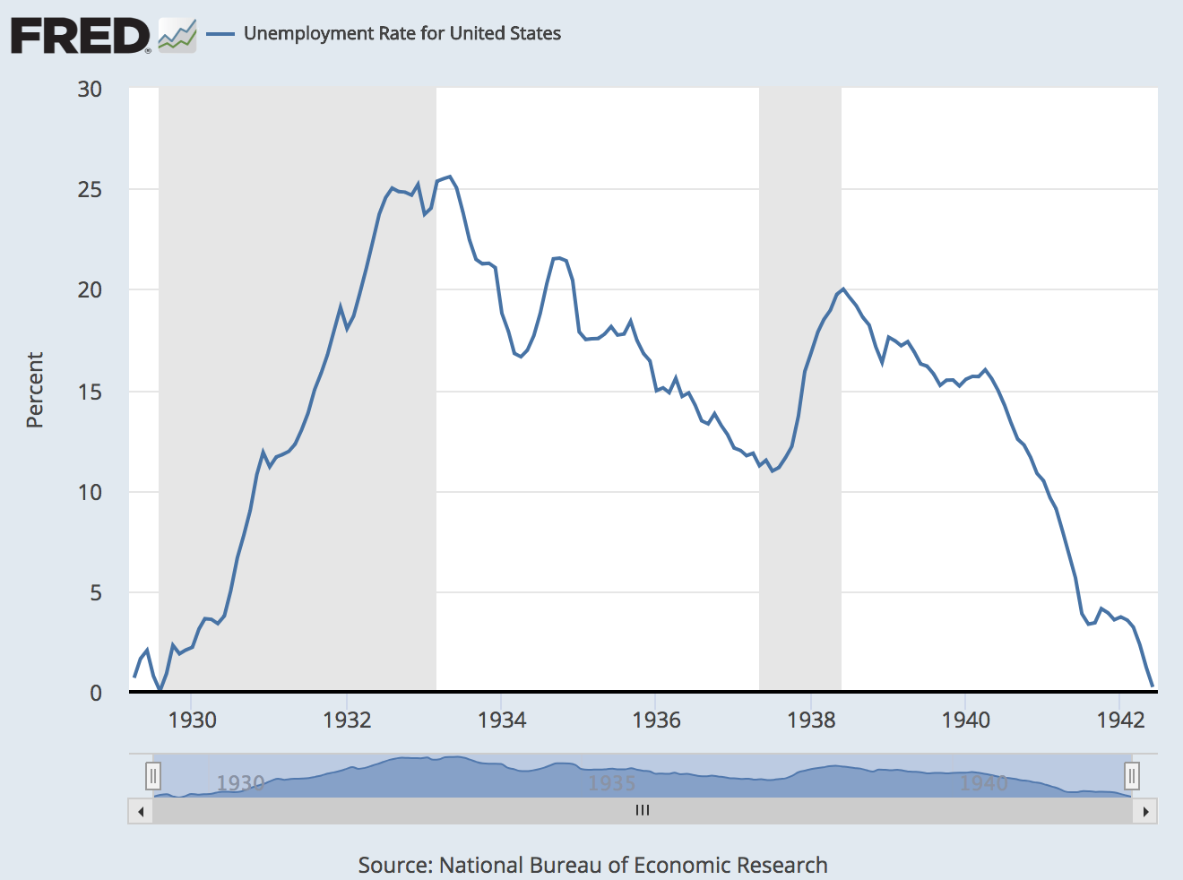
To go back farther, we need to use different data. Thank goodness FRED has some historical data compiled by the NBER on the unemployment rate! The NBER methods for compiling the data shown below aren’t entirely comparable to the BLS methods for the data shown above. In fact, the NBER series is a composite of three different series. But as long as we acknowledge which data sets we’re looking at, we should be able to make some generally fair comparisons. Here, the recoveries from the Great Depression stand out: First, the unemployment rate topped at 25.6% and then dropped to 11%. A 14.6-percentage-point drop. The second recovery went from 20% to 0.2%. A 19.8-percentage-point drop!
So, although the most recent recovery seems remarkable after WWII, it’s small compared with the recoveries before WWII. Even if in some sense we’re comparing apples and oranges, the oranges are a lot bigger.
How these graphs were created: Search for “unemployment rate” and choose each series individually: civilian unemployment rate (monthly, seasonally adjusted, starting in January 1948) and unemployment rate for United States (monthly, seasonally adjusted, starting in April 1929).
Suggested by George Fortier and Christian Zimmermann.
Source: FRED Blog


