
I have a column out later today, where I take (yet another) look at the bifurcated recovery. While researching some other data, I randomly found this chart. It shows on a state by state basis the spread between the top 1% and everyone else.
Deutsche Bank notes workers with a high school education or less were more worried about losing their jobs at the start of 2016 than they had been during the depths of the financial crisis in 2009. Whether that belief was rational or not, it surely was an element in the 2016 election (I have no idea if it was a determinative factor).
Here is another astounding data point: Average US household net worth is a whopping $692,100, but the median net worth of US households is a more pedestrian $97,300. That is quite telling in itself.
Meanwhile, someone else needs to overlay this data on an electoral map. It might provide some insight as to the true impact of beliefs about economic inequality and voting patterns.
How Much More Money the Top 1% Make than the Bottom 99%
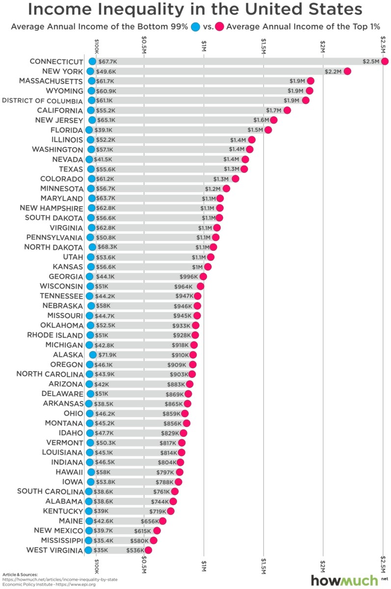
Source: How Much
