
The data series here from the New York Times is really amazing: You can pull up any metro region in the country, see if its emissions are increasing faster or slower than population. Its just a deep, astonishing data collection.
Emissions from driving in the New York metro area grew faster than population between 1990 and 2017, which means emissions per person have increased.
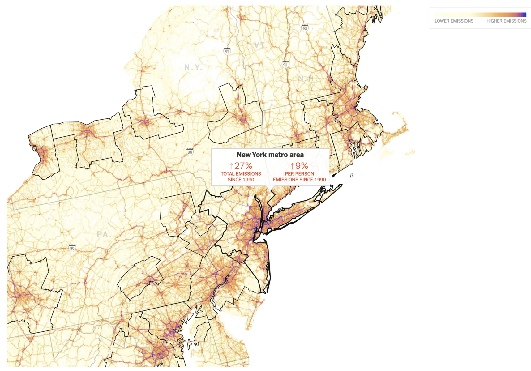
Source: New York Times
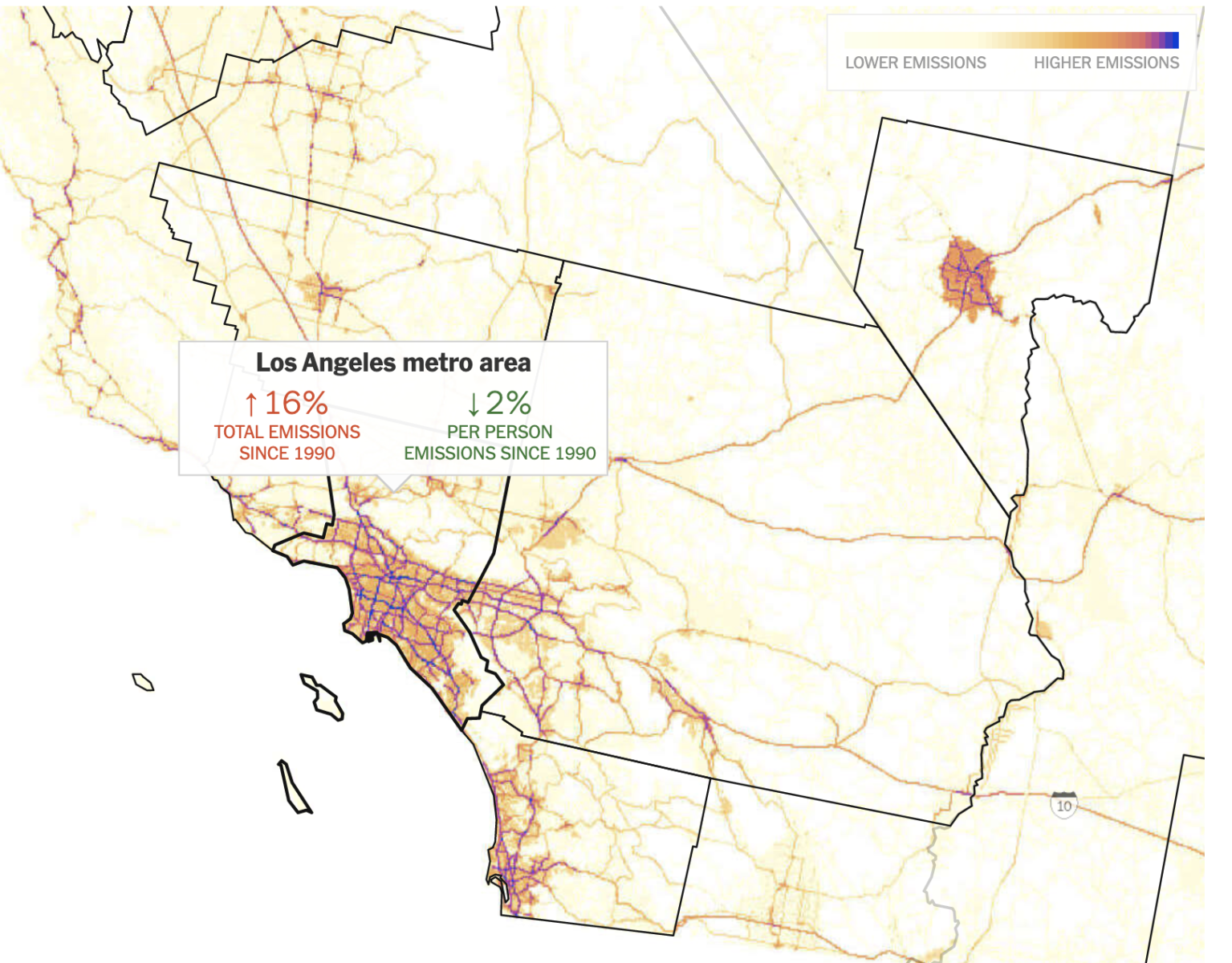
Emissions from driving in the Los Angeles metro area grew more slowly than population between 1990 and 2017, which means emissions per person have decreased
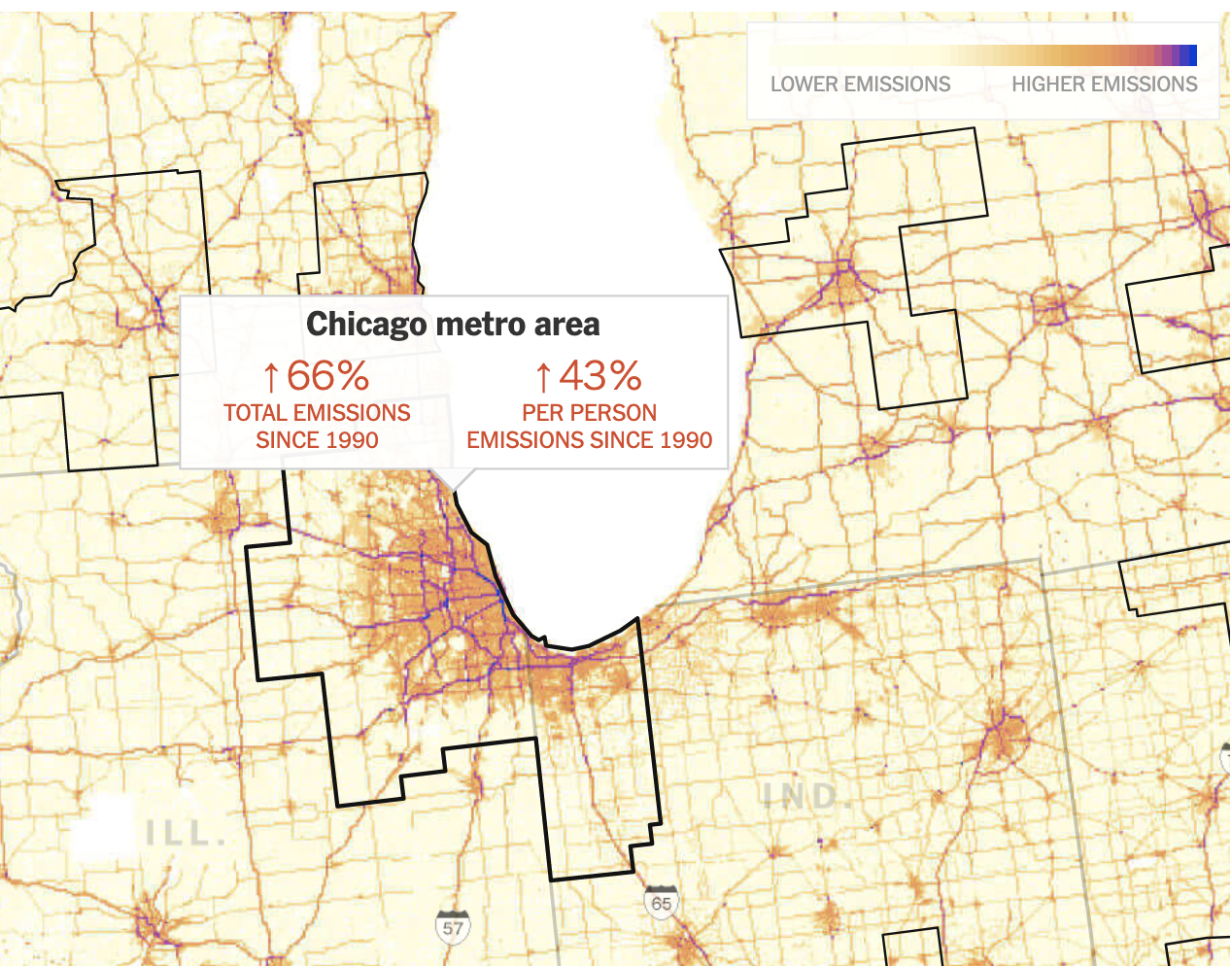
Emissions from driving in the Chicago metro area grew faster than population between 1990 and 2017, which means emissions per person have increased.
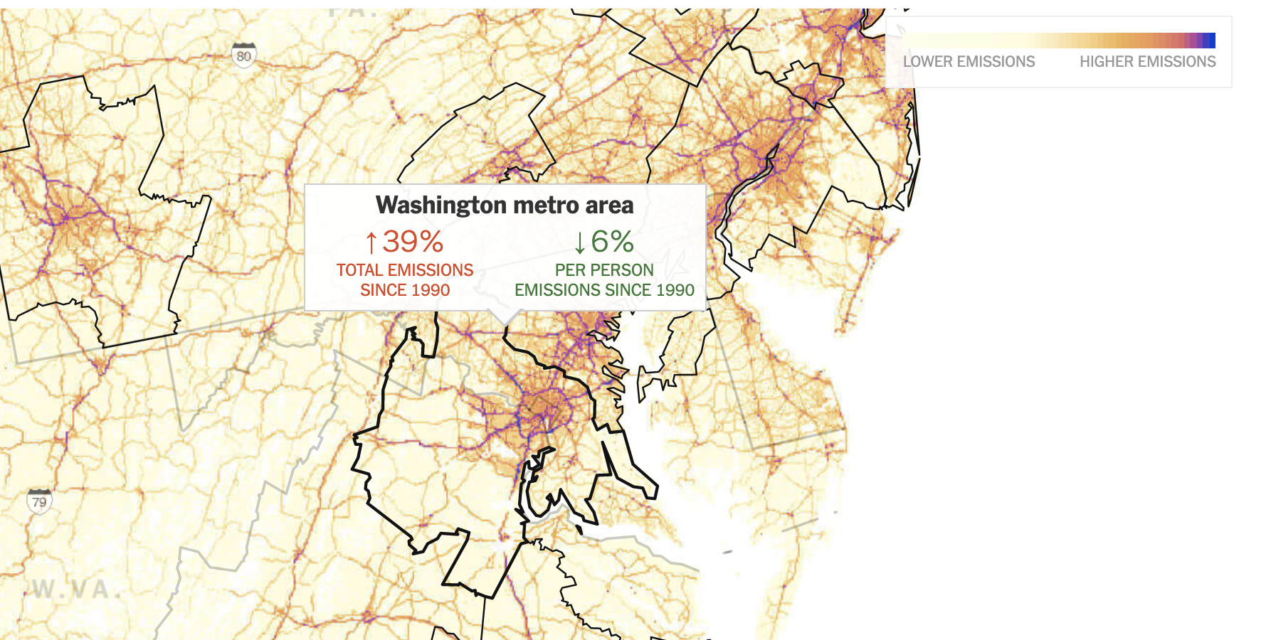
Emissions from driving in the Washington metro area grew more slowly than population between 1990 and 2017, which means emissions per person have decreased.
Source: New York Times
