
Source: Reventure
Let’s get to the caveats up front: Re:Ventures has been pretty bearish on housing the past few years, even forecasting a crash; their landing page claims “The US Housing Market is in a record Bubble in 2023;” this post suggesting “90% Chance: RECESSION in 2022?” has not panned out. Both of these perspectives stand inapposite to my views.
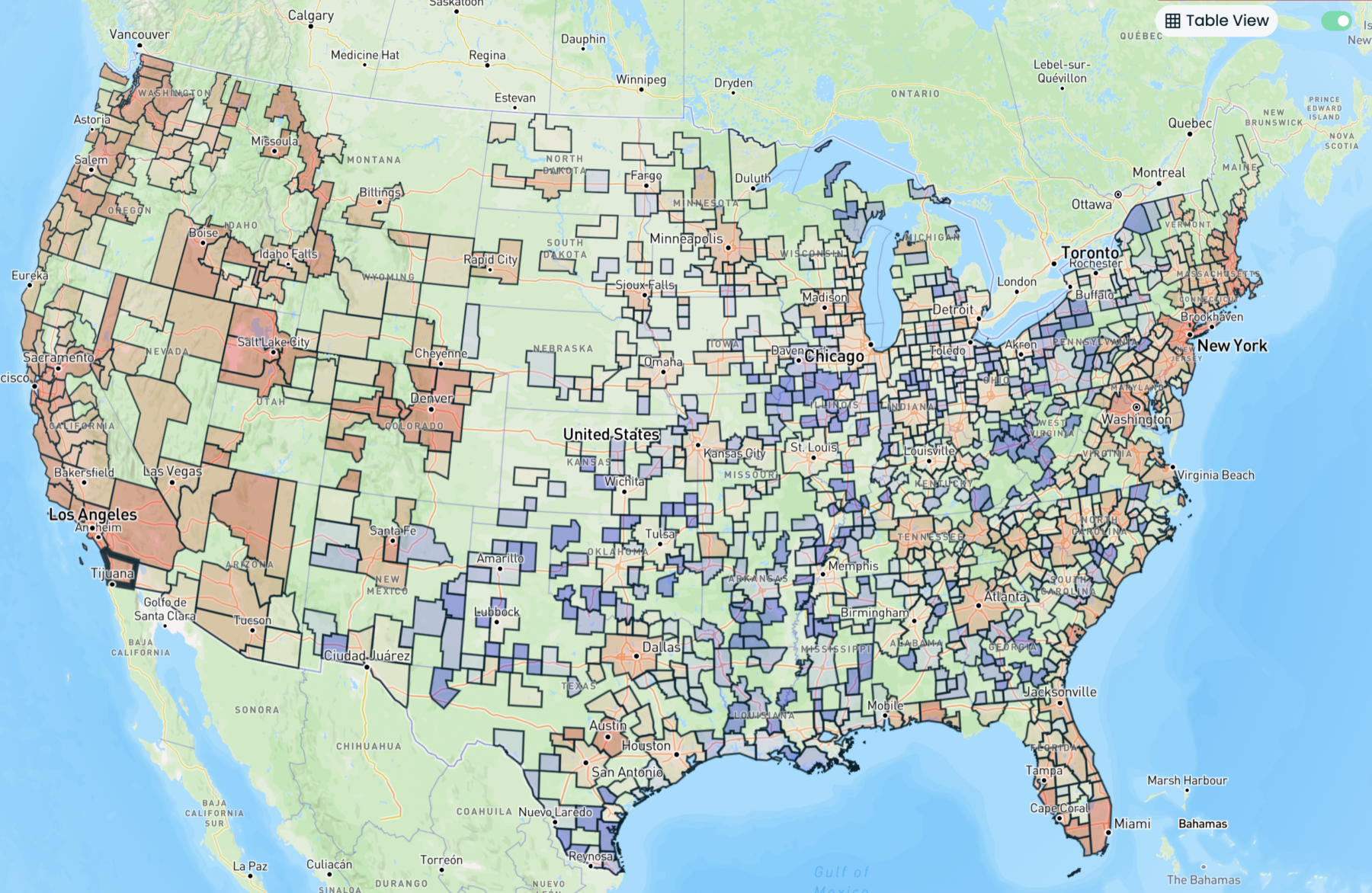
That said, I am willing to ignore their opinions because I find their data analytics so intriguing. As an example, check out the map above showing “Home Values.” Re:Ventures generates maps like these using data from Zillow — specifically, the Zillow Home Value Index (ZHVI). It’s hard to tell how Zillow assembles this data (see if you can make any sense of their methodology; I could not).
I like the idea that we should look at how home prices change within each price point rather than the mix of expensive and cheap homes together. I cannot tell if Zillow is using the selling prices of homes sold or if it is some combination of sales, listings, or Zillow’s estimates? (I honestly cannot decipher what’s what from their methodology disclosures).
With that weasely preface out of the way, consider the various ways these maps can show changes in residential real estate on a national, state, metro-area, county, and zip code level:
Home Value, Home Value Growth (YoY), Home Value Growth (MoM), For Sale Inventory, Sale Inventory Growth (YoY), Price Cut Share (%), Days on Market, Days on Market Growth (YoY), Monthly House Payment, Property Tax Rate, Building Permits, Building Permit (%), Mortgaged Home (%), Housing Units, Housing Units Growth Rate, Sales Inventory Growth (MoM), Inventory as a % of Houses, Rent for Apartments, Rent for Houses
There are similar tools for analyzing population changes: Population, Median Household Income, Median Age, Homeownership Rate, Poverty Rate, Payroll Jobs, Migration Total, Migration % of population.
They also offer a suite of premium analytic mapping tools that cover: Over/Under Valued %, Value/Income Ratio, House Payment as % of Median Income, % Crash from 2007-2012, Shadow Inventory %, Cap Rate, Buy vs Rent Calculator %, Rent as a % of Income.
I have not subscribed, but I have been playing around with the various tools, and they seem quite interesting. The key challenge, of course, is whether the underlying data from Zillow is worthwhile or not. If its good REAL sales data and not just modeled opinion, it looks like it has a lot of potential use.
As to the coming crash, my pal Jonathan Miller observes: “If you talk to brokers on the ground, there are far fewer investors than the prior boom. Heavy primary and second home demand.” This, plus the shortage of single-family homes due to underbuilding and cheaper mortgage lock-in, suggests that a housing crash is unlikely any time soon…
Previously:
Are We in a Recession? (No) (June 1, 2022)
What Data Makes NBER Recession Calls? (September 1, 2022)
The Post-Normal Economy (January 7, 2022)
What Recession? (June 26, 2023)
How Everybody Miscalculated Housing Demand (July 29, 2021)
