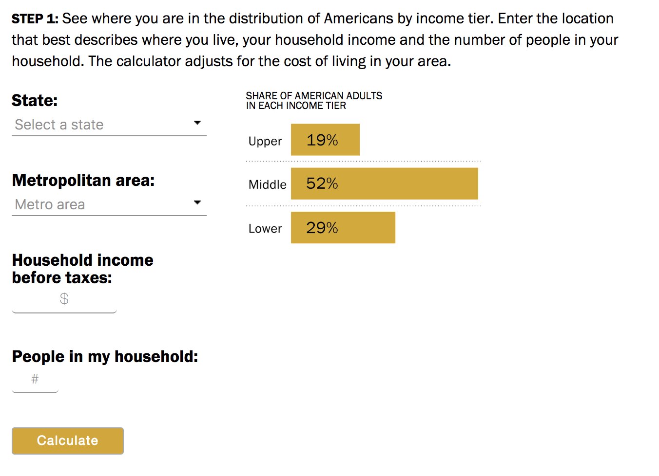
 I love these sorts of interactive income calculator’s: Are you in the American middle class? Find out with our income...
Read More
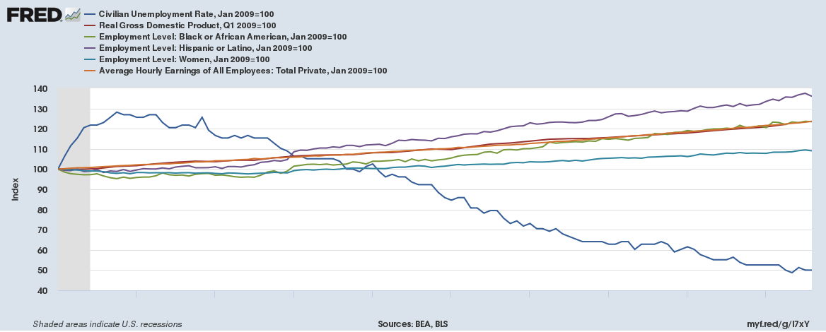 @TBPInvictus here, with a simple question: How much credit does Trump deserve for the current state of the economy? This should be easy...
Read More
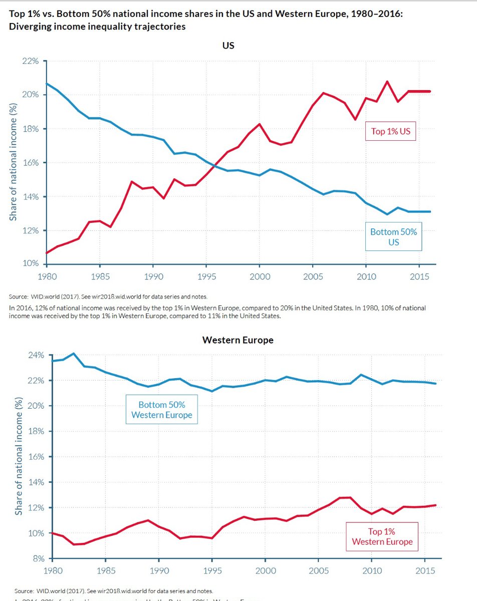 Fascinating comparison via Vox: Income inequality is a growing problem in the United States. The richest Americans have reaped...
Read More
 Interesting set of interactive graphics perfect for NFP day! via Wall Street Journal: Source: Wall Street Journal
Read More
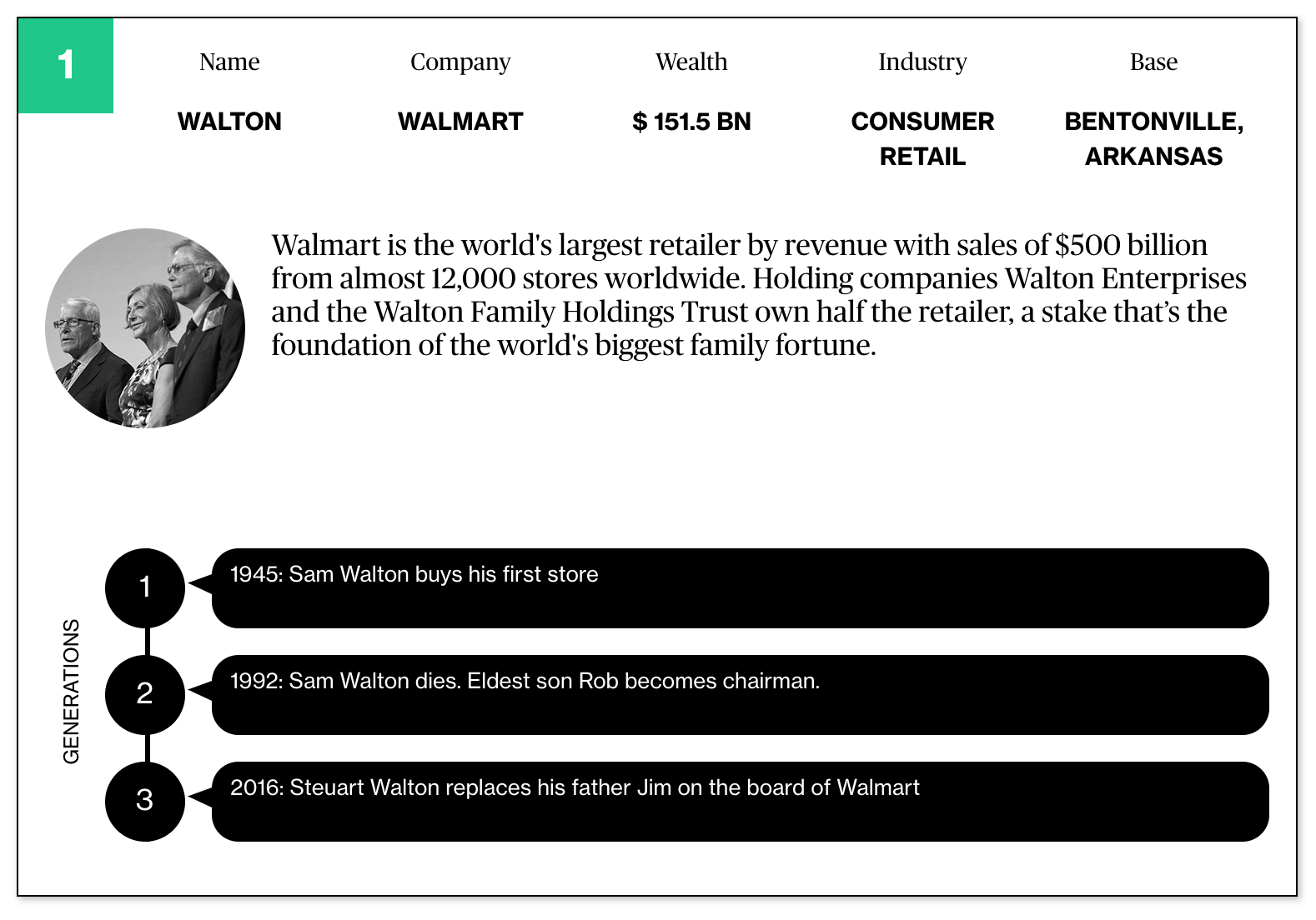 Bloomberg recently updated (no paywall) this giant set of infographics looking at the 25 biggest family fortunes. Whenever you see a...
Read More
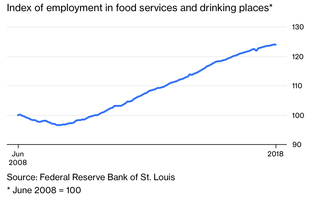 Where’s Your Raise? It Should Be Coming Pressures for bigger pay increases are building, but have yet to show up in the data....
Read More
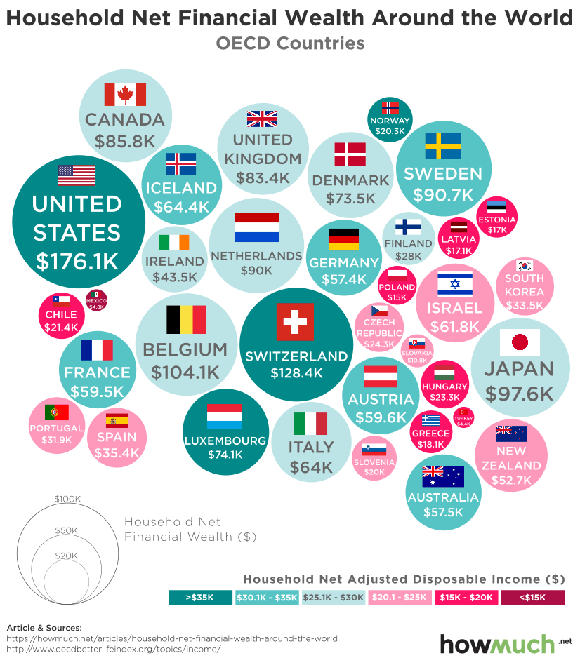 I am all about employment and wages this week: click for ginormous graphic Source: How Much These are the top ten countries...
Read More
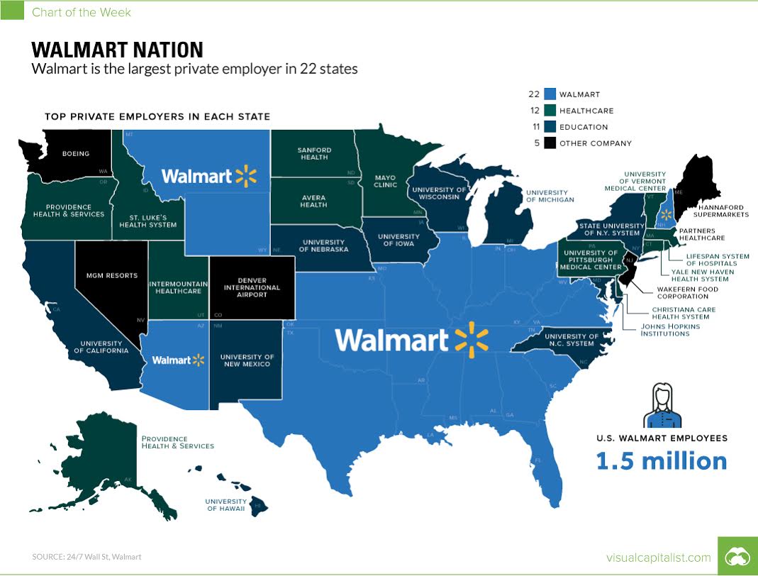 This map simply blows my mind: think about what this means for wages nationwide… Source: Visual Capitalist
Read More
