Fed-Driven U.S. Stock Advance Leaves Grantham Waiting for Bubble
by David Wilson
(Bloomberg) — Adjusting U.S. stock-market indicators for Federal Reserve policy since the 1980s shows a bubble has yet to come, according to Jeremy Grantham, Grantham, Mayo, Van Otterloo & Co.’s chief investment strategist.
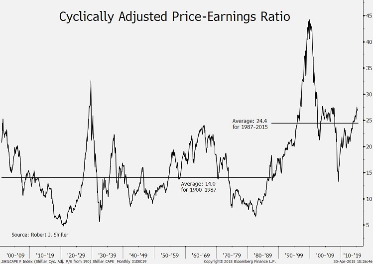
The attached chart highlights one gauge, Yale University Professor Robert Shiller’s cyclically adjusted price-earnings ratio, that Grantham cited yesterday in a quarterly letter to shareholders. The P/E is based on average earnings for the previous 10 years, rather than four quarters of profit.
Shiller’s ratio averaged 24.4 from August 1987, when Alan Greenspan was first appointed Fed chairman, through last month. The period was marked by “the Fed’s habit (as in ‘addiction’) of pushing the market up in order to get a wealth effect,” or growth in consumer spending that reflects higher asset values, Grantham wrote.
The average P/E for what the Boston-based money manager defined as “the Greenspan era” was well above the comparable readings for earlier periods. Stocks were valued at an average of 14 times profit from 1900 to July 1987, as the chart shows.
Using the more recent figure as a benchmark would suggest stocks are “well on the way to bubble-dom but, clearly enough, not there yet,” Grantham wrote. The latest reading was 27.1 as of yesterday, according to Shiller’s website.
Grantham reiterated a view that the Standard & Poor’s 500 would reach a bubble at about 2,250, or 7.9 percent higher than yesterday’s close. He added that the threshold may be 5 percent to 10 percent higher after accounting for the Shiller P/E and another gauge, known as Tobin’s Q.
Tobin’s Q is a ratio of companies’ market value to the replacement cost of assets. The indicator is named for its creator, the late James Tobin, another Yale economist.


“Fed Driven U.S. Stock Advance …”
Those who believe stock prices are contingent on Fed policy must have some mechanism in mind but I’m at a loss as to what it might be.
It certainly isn’t interest rates — e.g. these are generally lower in Europe and other locales with relatively poorer equity returns — or even liquidity as the ECB has expanded this considerably with only modest results (liquidity traps are a real b*tch).
The percentage of Fed bond acquisitions taken as a total of bond market action is insufficient in scale even if we posit that investors who normally trade bonds have all switched to equities AND, at the same time, something is keeping bond prices at historic highs (as noted previously the Fed’s purchases are insufficient to accomplish this) …
I suppose we could go with the Zero Hedge hypothesis that the Fed is secretly enticing or forcing member banks to purchase equities but if we are going to engage in such theorizing it is frankly more plausible, at least to my way of thinking, to postulate that we are seeing economic dark matter at work.
That isn’t the “Feds habit”. That is the global economic systems habit. All financial flows globally are dictated to boosting US consumption.
One way of seeing things is that share prices are moving towards a higher long term P/E path of around 20-25/1 that reflects the long term interest rate on capital of 4-5% in most western economies (at least according to Picketty’s historical series). Meanwhile “safer” assets return less than in the past because the pace of advancement of the technological frontier has slowed and so has the return than can be easily earned on invested capital. Central banks in this scenario would be setting rates very low simply because they would be operating in a naturally low-interest rates scenario.
Just for fun . . .
http://research.stlouisfed.org/fred2/graph/?g=1a3B
Thanks you for the article, Mr. Wilson and for posting it Mr. Ritholz. Is there a “hot” version of Mr. Shiller’s chart available and if so, where can I access it? I’d like to add it to my “toolbox” in order to continue monitoring that chart.
This appears to be a “hot” (live) chart of the Shiller chart. . .
http://www.multpl.com/shiller-pe/
Click in the second line of the second paragraph in this link:
http://www.econ.yale.edu/~shiller/data.htm
It’s an Excel file labeled “U. S. Stock Markets 1871-Present and CAPE Ratio.”
Professor Shiller updates it monthly, and I download it monthly. Note that S&P 500 values are monthly averages, not end-of-month closes.