Source: FRED Blog
FRED can help us make sense of the recent discussions about an inverted yield curve. But first, some definitions to get us started: The yield curve is the difference (or spread) between the yield on the 10-year Treasury bond and the yield on a shorter-term Treasury bond—for example, the 3-month or the 1-year. The yield curve is flattening if short-term rates are increasing relative to long-term rates, which is what’s been happening lately. The yield curve is inverted if short-term rates exceed long-term rates, making the spread negative. Inverted yield curves have historically been reliable predictors of impending recessions, which is why people are paying so much attention to the yield curve now.
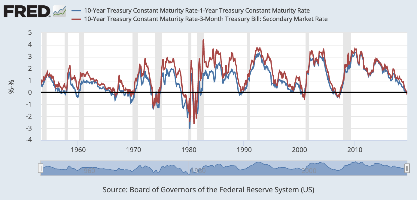
This FRED graph effectively illustrates that every recession since 1957 has been preceded by a yield curve inversion. (Note that the lag between the inversion and a recession varies: With the 10-year and 1-year yields, the lag is between 8 and 19 months, with an average of about 13 months.) A common interpretation is that the yield curve measures investors’ expectations of economic growth in the current period compared with economic growth in the future. According to this interpretation, a yield curve inversion implies that investors expect current economic growth to exceed future economic growth, indicating a recession is likely.
Of course, some question the strength of the relationship between U.S. yield curves and recessions. The graph shows that, in 1965, the yield curve inverted but a recession didn’t closely follow. So, although yield curve inversions are good predictors of recessions, they’re not perfectly correlated and the exact relationship isn’t completely understood.
In December 2013, the spread between long and short rates was very close to 3 percent. In September 2018, the spread was 0.44 percent for the 10-year and 1-year yields and 0.87 percent for the 10-year and 3-month yields. If the yield curve were to continue its downward trend from its previous high in December 2013, the yield curve would invert in August 2019 (using the 10-year and 1-year yields). Historically, this would predict a recession sometime in 2020. As the yield curve flattens, we can expect economists and financial markets will closely monitor its level and make many predictions about whether and when a recession will follow.
How this graph was created: On the FRED homepage under the search box, use the “Browse data by…” option to search under “Category.” From there, select “Interest Rates” under “Money, Banking, & Finance.” Select “Treasury Constant Maturity.” Find and select the monthly “10-Year Treasury Constant Maturity Rate” series. From the “Edit Graph” menu, use the “Customize data” section to search for “1-Year Treasury Constant Maturity Rate” and select the option with “Monthly, Percent, Not Seasonally Adjusted” and add to the graph. The latter series is labeled as series “b.” Under “Customize data,” type a-b into “Formula” box and select “Apply.” Now select “Add Line” and follow this same process using “3-Month Treasury Bill: Secondary Market Rate” as the “b” series.
Suggested by Matthew Famiglietti and Carlos Garriga.

