
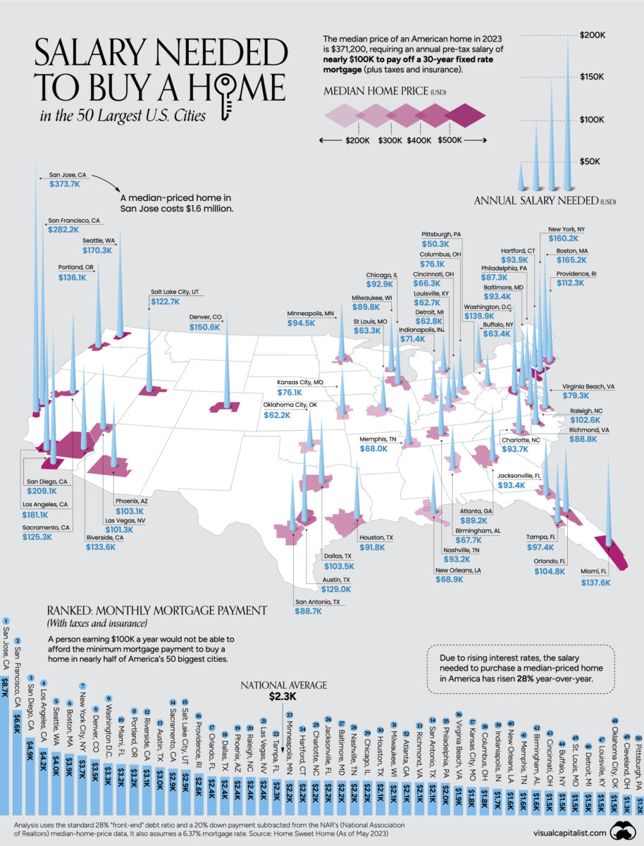
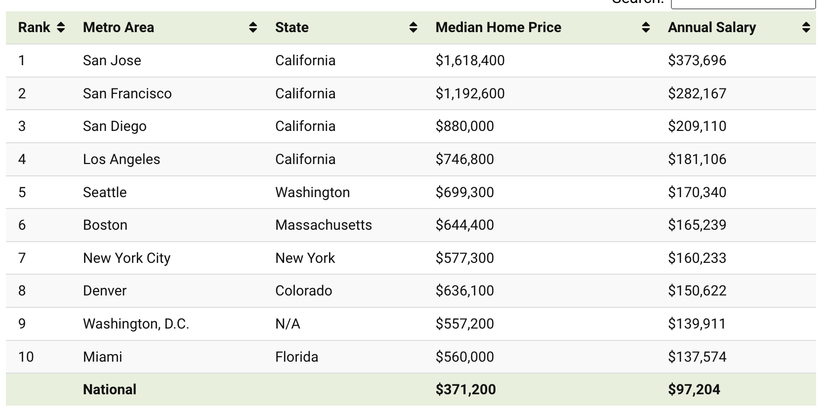
click for ginormous chart
While I am wrapped up working on a few projects today, I wanted to share this map/chart/table showing US real estate prices relative to income.
A lot of factors drive home prices — available supply, mortgage rates, inflation, salary/income growth, demand, etc. Its not as simple as many make it out to be.
It has also become obvious that the big shortage of single-family homes housing prices has kept prices elevated (although there are some signs that some aspirational pricing is softening.
Regardless, the boom during the lockdown has put home prices out of reach for most Americans in the most populous and often the most prosperous regions. Although it is primarily the Coasts where home prices are highest relative to salaries, there are pockets like Denver (#8) and Salt Lake City (#15) in the top 50.
The annual salary to buy a home in America’s 50 most populous cities.
Previously:
How Everybody Miscalculated Housing Demand (July 29, 2021)
Can We Untie Real Estate and Employment? (March 21, 2022)
U.S. Home Price Growth 1983-2023 (July 6, 2023)
Mapping Changes in US Home Prices (July 12, 2023)
National Association of Realtors Is Imploding (October 13, 2023)
Click for the full post on Visual Capitalist
