
A quick break from book authorship to share a fascinating set of data and charts, via Sam Ro. In his weekly missive, Sam points to some amazing charts from Global Financial Data. They are based on historical data that looks at 200 Years of Market Concentration.
You might be surprised at the findings.
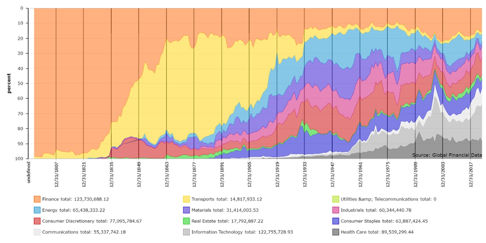
As the chart above shows, stocks experience long periods of time where market concentration is high. These reflect the economic dominance of one specific part of the economy or another for a very long stretch. Dr. Bryan Taylor, Chief Economist at Global Financial Data, breaks these into seven distinct eras over the past 235 years:
1790 to 1840 The Bank of the United States Dominates
1840 to 1875 The Rise of the Railroads
1875 to 1929 The American Commercial Revolution
1929 to 1964 The First Magnificent Seven
1964 to 1993 Free Trade Leads to Global Expansion
1993 to 2014 The Rise of Fall of the Stock Market
2014 to Present Technology Stocks Take Over
You might quibble with the precise starting points, but the idea is very solid: Major shifts in underlying economic growth engines will lead to a different group of stocks dominating the indices.
I suggest you go read the entire piece, here.
Spoiler alert: “Analysis of the past 150 years, there seems no reason to believe that the increased concentration of the past ten years is the harbinger of a major bear market. Increased concentration is a sign of a bull market and bear markets reduce concentration.”
Sources:
200 Years of Market Concentration
Bryan Taylor,
Global Financial Data May 22, 2024
The bottom line is looking up for stocks
Sam Ro,
TKer, June 16, 2024
