In the never-ending battle of market narratives, new ideas get introduced and old ideas are resurrected as necessary. One of the most persistent criticisms of US equities has been how narrow the gains have been, driven primarily by mega-cap tech stocks.
You probably know variations of this argument as “FAANMG!”
There is some truth to the claim that the biggest companies have been pulling markets along; YTD cap-weighted indices are substantially outperforming equal weight. The more interesting question is what does the relative performances of equal weight and market cap weight S&P500 actually mean? I find it more ambiguous and subject to interpretation than is widely believed.
Perhaps some historical data can add some context to the debate.
One of the most influential bodies of research about “How Market Tops Get Made” came from Paul Desmond of Lowry Research. He noted that markets get increasingly narrow by cap size (capitalization) as longer secular bull markets approach their ends. Specifically, we see smaller caps roll over, then mid-caps, then large caps; the last to fall are the mega-caps.
Desmond loved to ask professional portfolio managers “What percentage of stocks would you expect would be making new highs at the top day of the bull market when the Dow Jones was making its absolute high?” The typical answers were in the 60, 70, 80% range.
The actual answer was less than 6%. According to Demond, of the 14 major market tops between 1929 and 2000 inclusive, when the DJIA reached its absolute peak, the average percentage of stocks also making new highs on that day was 5.98%.
But this does not explain everything about whether markets are too narrow or not. We can explain – or rationalize, if you prefer – several contributors to the substantial gains FAANMG has enjoyed. Increasing global market share added to revenues, as new technologies and products added to profitability. The two-decades-long slide in significant anti-trust enforcement has helped each of these giants to dominate their specific sectors.
Which brings us back to the weighting of indices.
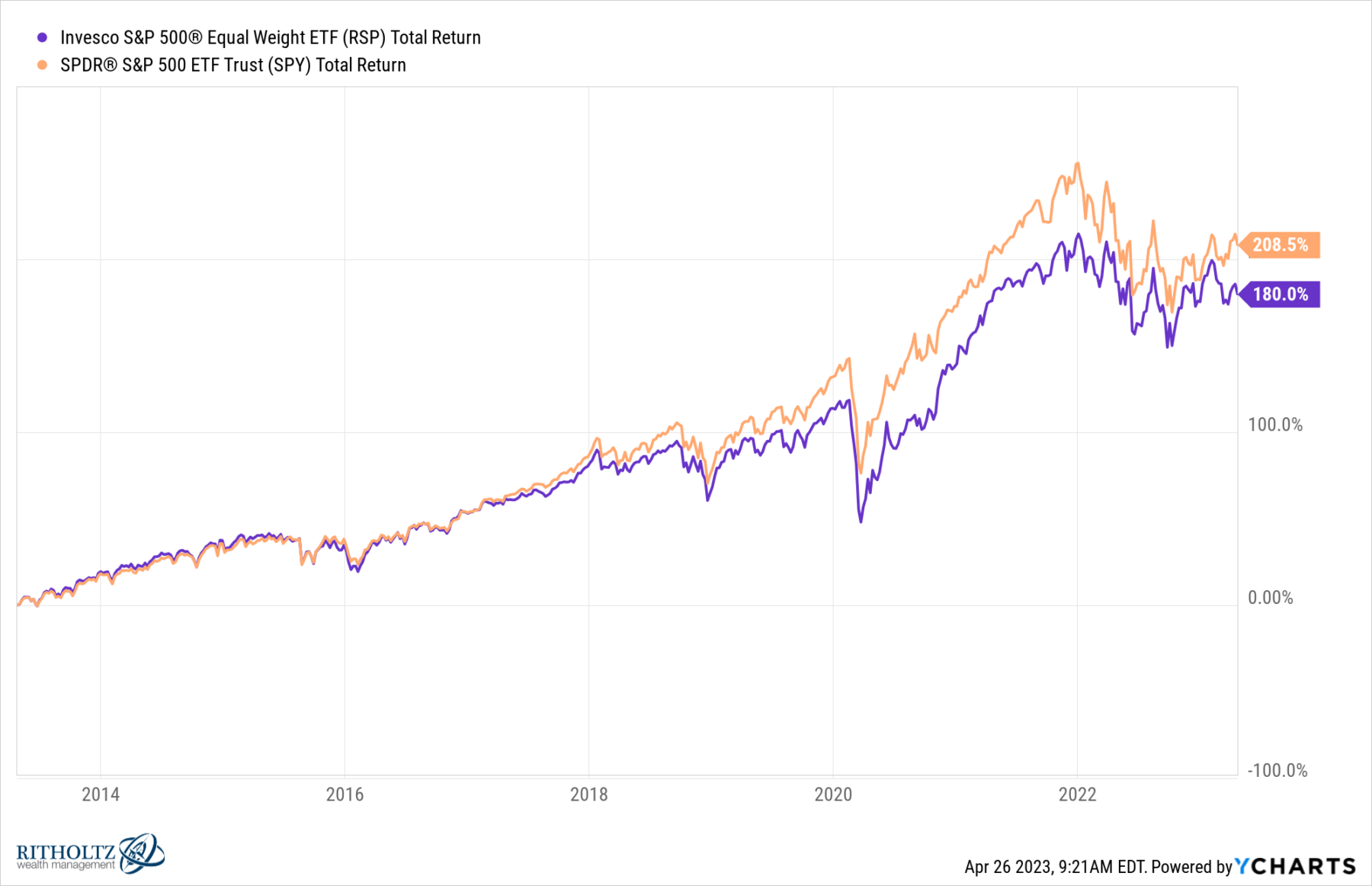
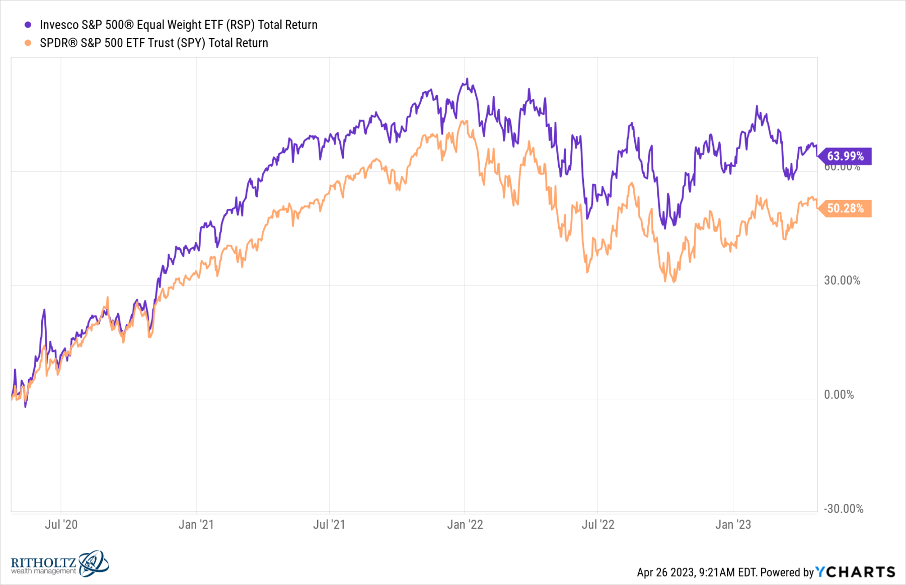
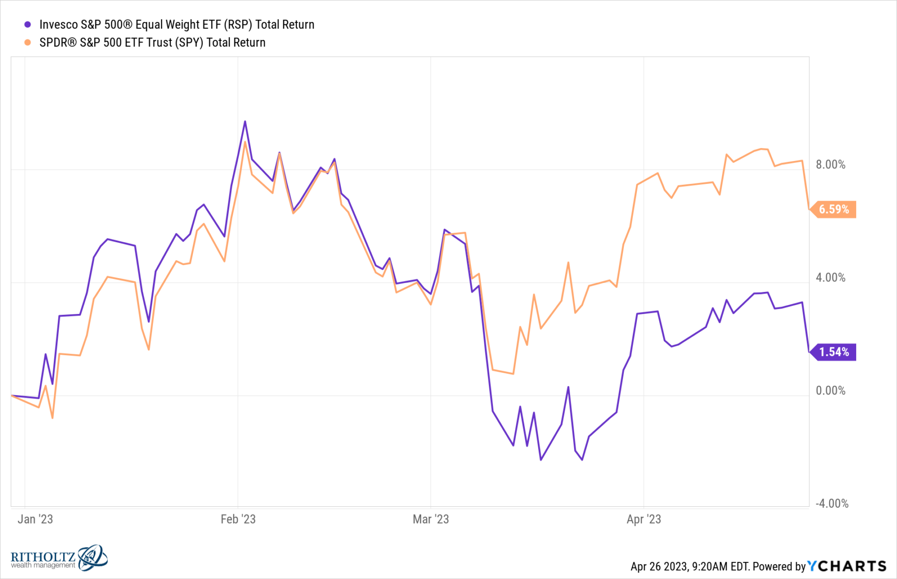
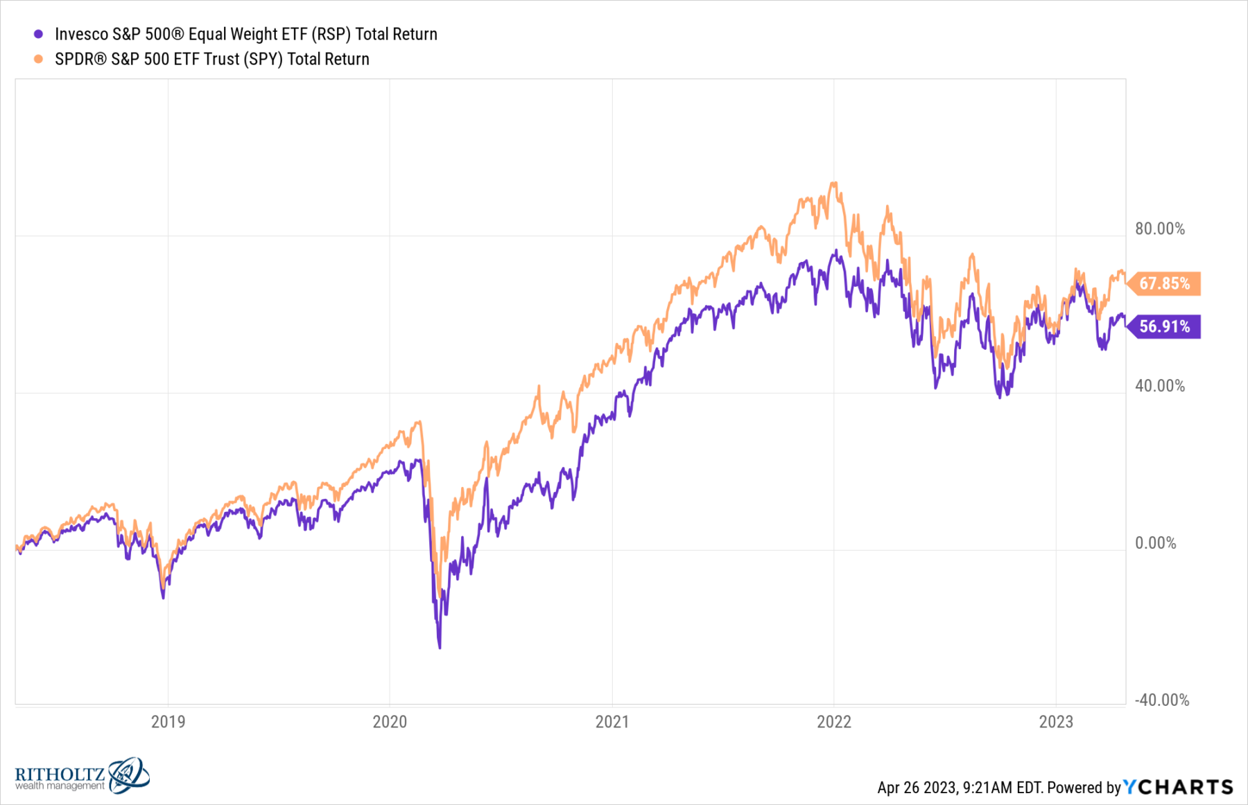
Let’s use 2 ETFs for our performance comparisons: SPY and RSP.1 Year-to-date, cap-weighted is ahead by 500 bps – 6.6% to 1.5%. But when we look back 3 years, the equal weight has nearly tripled that advantage: 64% to 50%. It is noteworthy that this period includes nearly all of the huge big-cap run-up following the pandemic bottom in March 2020 and the 30% crash tech stocks suffered in 2022. If we look longer term, the cap-weighted return to dominance: more than 10% for 5 years (67.9% vs 56.9%) and even bigger 28% over 10 years (280.5% vs 180.0%). See charts here.
There is always a good reason to notice when markets get too narrow at the end of a long bull market, especially as major indices make all-time highs. But that may be a different set of circumstances than what we are witnessing in recent mega-cap performance today.
Previously:
How Market Tops Get Made (March 12, 2014)
2021: Small, Medium & Large Cap Returns (January 4, 2022)
Top 5 Stocks: What Does This Mean? (December 16, 2021)
How to Mislead with Data, Large Company Edition (November 12, 2021)
See also:
This awfully fragile narrow no-good rally (FT, April 25, 2023)
MiB: Paul Desmond of Lowry’s Research (October 24, 2015)
Q&A: Paul Desmond of Lowry’s Reports & Part II (February 18-19, 2011)
___________
1. SPDR® S&P 500 ETF Trust (SPY) for market cap, and Invesco S&P 500 Equal Weight (RSP) for no cap-weighted.
Year-to-Date S&P 500: Market cap weight (SPY) versus Equal Weight (RSP)
5 Years S&P 500
10 Years S&P 500