Housing Bubble? What Bubble?
As real-estate buyers, lenders, and builders got swept up in speculation before the historic housing bust of 2006-09, prices soared even...
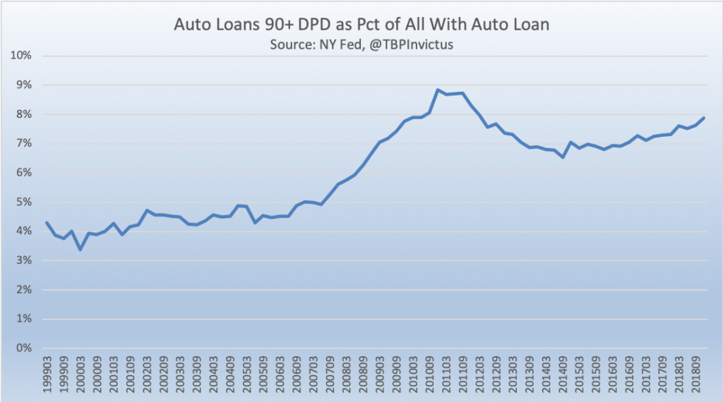 @TBPInvictus here: A throwaway line at the very tail end of a NY Fed blog post unfortunately got picked up lickety-split by all manner of...
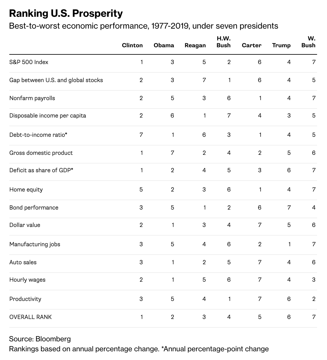 You know my views on Presidents and the economy: Too much credit for when things go right, too much blame when things go wrong. Still, I...
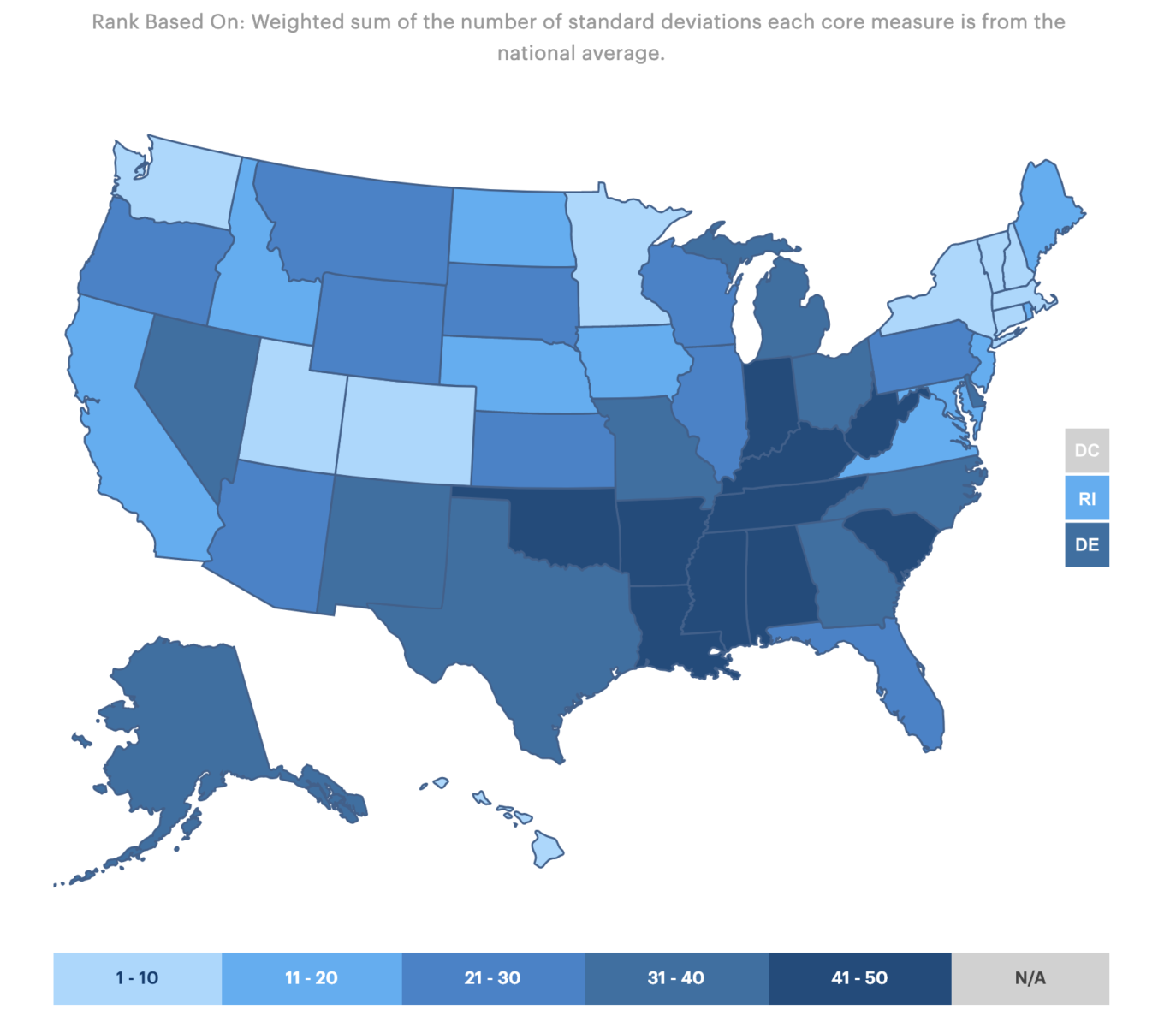 United Health Foundation analyzes the state of America’s health on a state by state basis. Their model is divided into five...
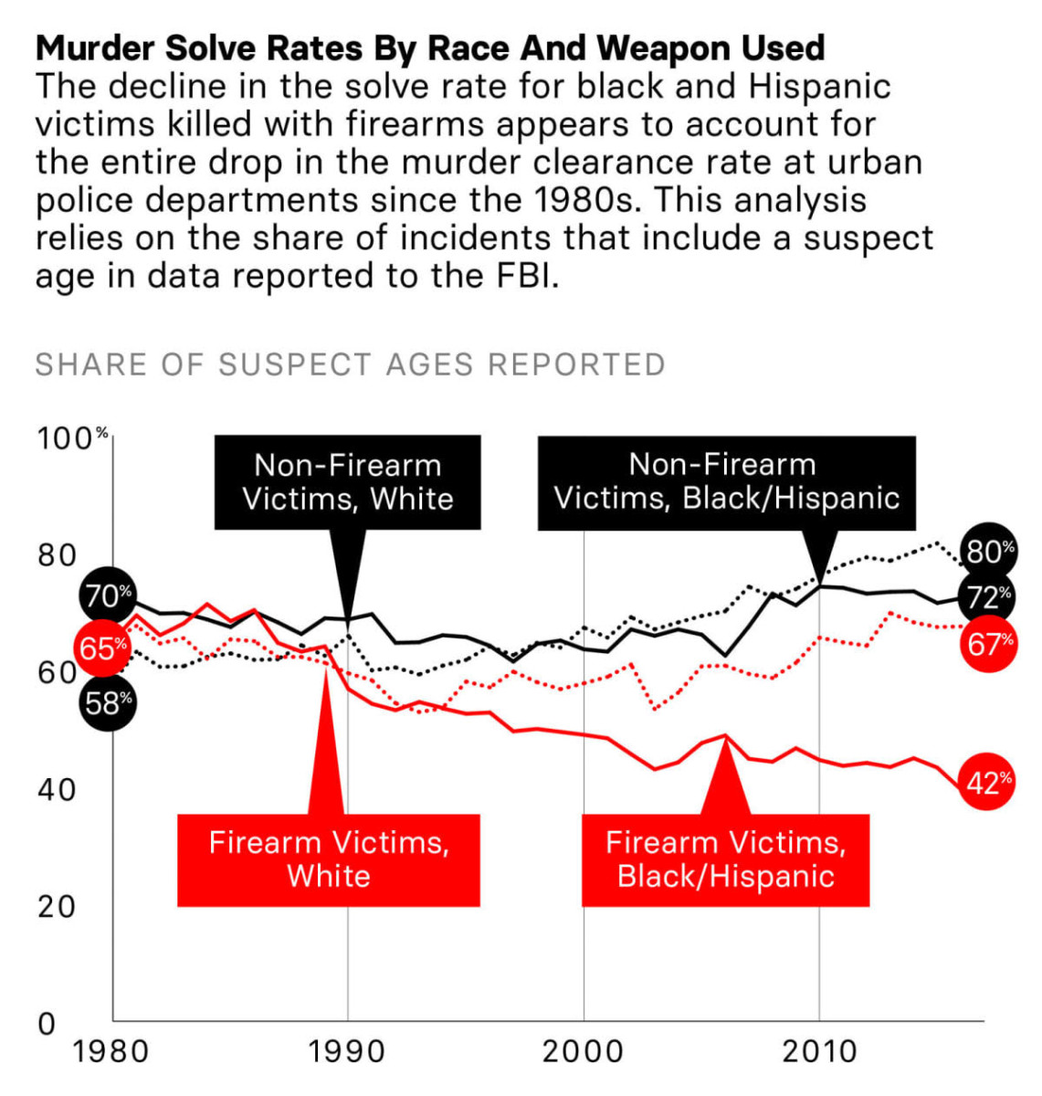 We know that the long term trend shows a falling crime rate. But as today’s WTF data point reveals, the long term conviction rates...
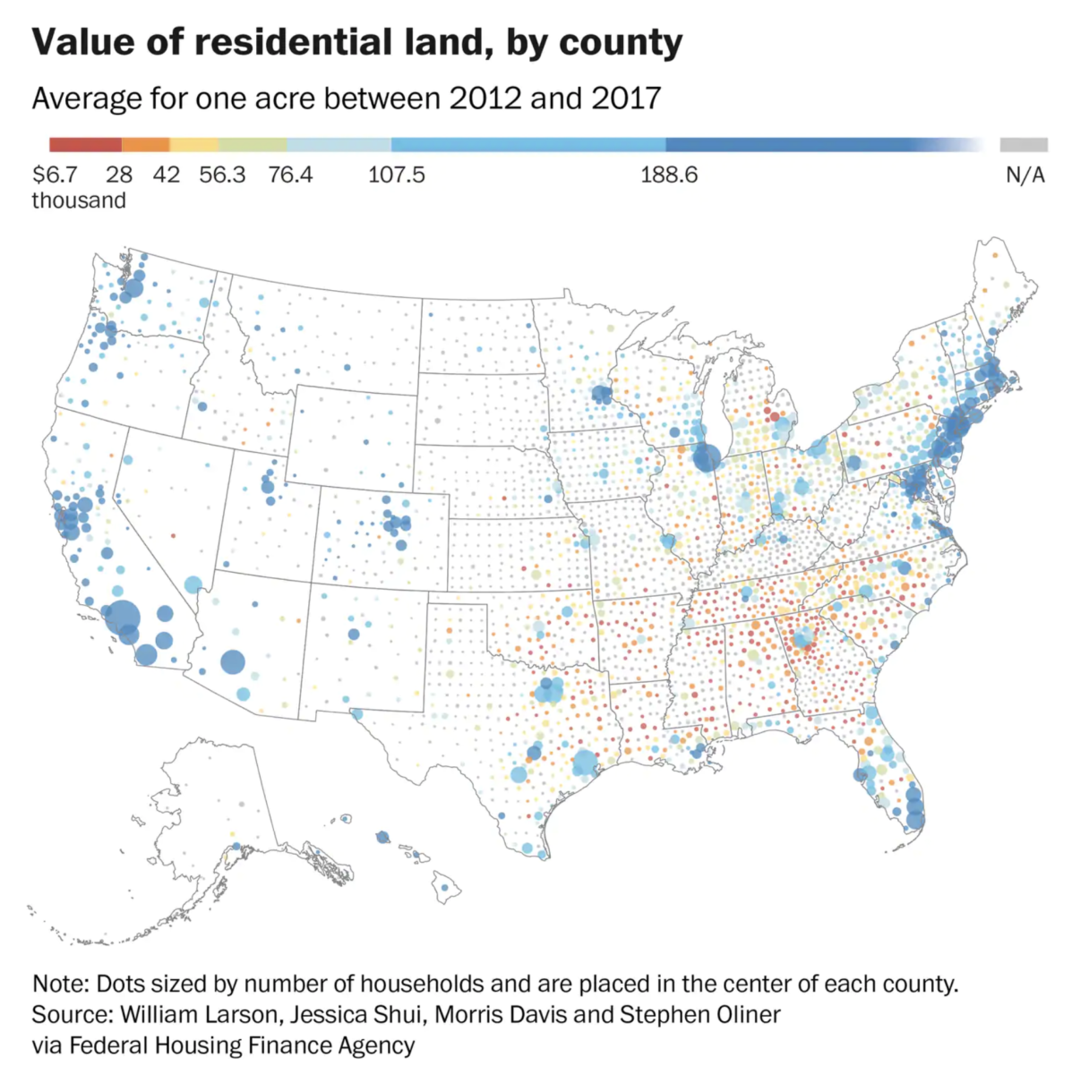 Very interesting data set showing the value of land, minus the structures built on it, across the country: “The analysis provides...
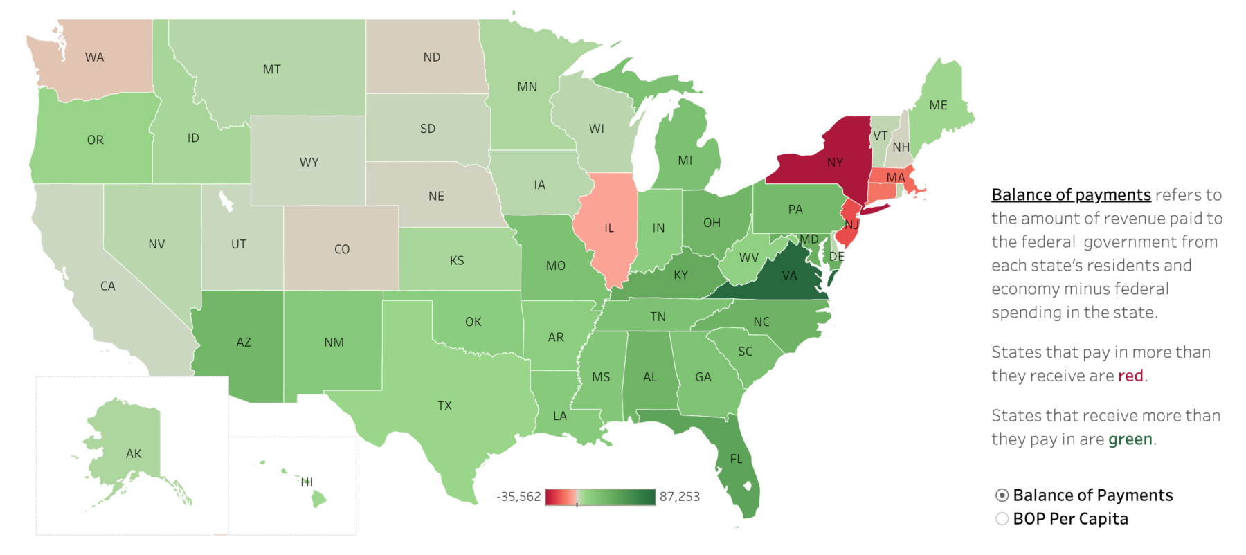 This is quite fascinating — and surprising: The folks who are most against government spending are also the biggest beneficiaries...
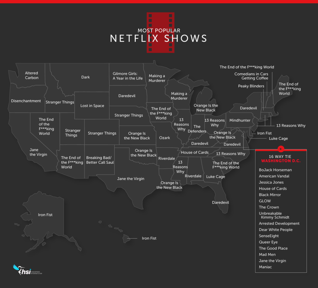 Via the Washington Post, this fascinating look at what’s most popular on a state by state basis: One of the core assumptions about...
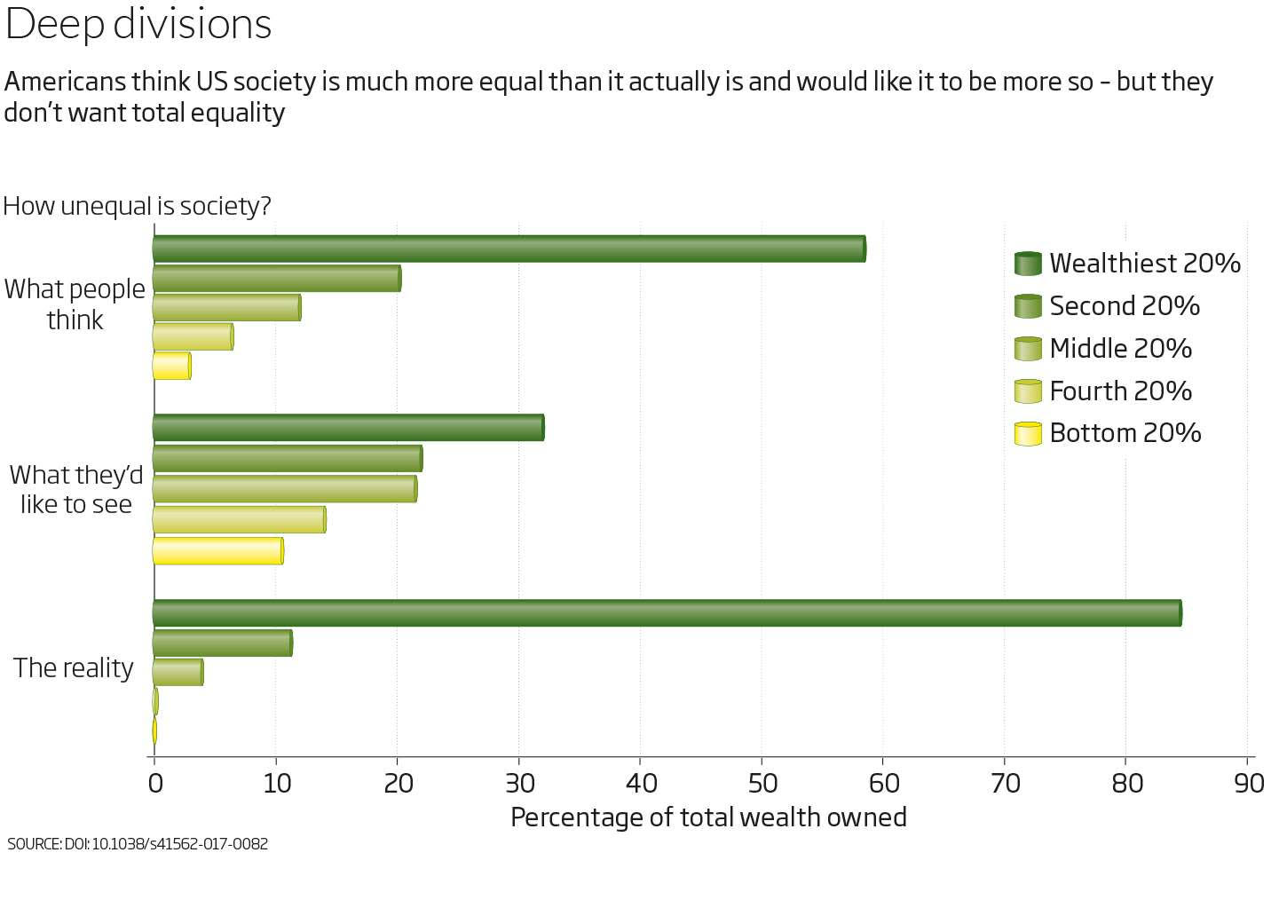 You’ve got the wealth gap all wrong. You think it is bad. The reality is its far far worse: The inequality delusion: Why...